
Color choices can make your kitchen feel like a warm hug or a loud mess.
These common traps help you plan smarter before paint, stain, or tiles commit you.
-
1. Choosing a “pretty” color without checking the light

Choosing a “pretty” color without checking the light That sunny yellow can look cheerful in a store, then flat and dull in your kitchen. Your cabinets and walls change depending on morning sun, afternoon shade, and evening bulbs.
Try testing color in more than one spot: near the sink, by a window, and on a wall that gets less light. You will notice how the same shade looks warmer or cooler in each area. This careful step saves money because you avoid repainting or swapping finishes.
For personalization, borrow tones from your favorite mug or dish set and match the “vibe” of that color. Many kitchens are trending toward warm whites with gentle undertones, because they stay flexible with new accessories. If you want to spend less, pick a mid-tone wall color and save the boldness for smaller items like a rug or canisters.
-
2. Ignoring undertones that clash with your floors or countertops

Ignoring undertones that clash with your floors or countertops Undertones are the hidden colors under the main color name. A “gray” can lean green or purple, and that can clash with warm wood floors or creamy stone.
Look closely at your countertop edge, backsplash stone, or tile glaze. If you see golden specks, you will usually like warmer cabinet and wall colors. If your surfaces have cool blues, choose colors that feel clean and balanced.
For action, bring home samples and place them next to the surfaces you already own. Take photos at different times of day so you can compare without guessing. This keeps your kitchen cohesive, which makes everyday cooking feel calmer and nicer.
-
3. Using too many colors without a clear “main player”

Using too many colors without a clear “main player” When everything is a star, the room can feel busy even if every color seems pretty. Your eyes jump around and your space may look smaller than it is.
Choose one main color for big areas like walls, cabinets, or the backsplash base. Then add one or two supporting colors for accents like hardware, shelves, or decor. The benefit is a kitchen that feels organized and easy to live in.
If you love variety, you can still do it—just keep most of the visual weight in one family. Try a warm white wall with a natural wood accent and one deeper color for contrast. Budget-friendly personalization can come from colorful towels, a statement light fixture, or framed art.
Right now, many people are enjoying “quiet neutrals” with natural textures and small pops of color. That trend works because it lets you change accents over time without major work. You will also spend less because you can swap accessories before you regret larger purchases.
-
4. Painting the ceiling the same color as the walls

Painting the ceiling the same color as the walls A same-color ceiling can make the kitchen feel heavy and close, especially in a room with lower height. Even if the shade is beautiful, the ceiling often needs a lighter touch to keep the air feeling open.
Many kitchens feel brighter with a slightly lighter ceiling tone, often a soft off-white. The benefit is instant lift, because light reflects upward instead of absorbing into flat color.
If you want a bolder look, consider keeping the ceiling neutral and using color on the walls or in the backsplash. That gives you drama where it matters most. For cost control, a ceiling repaint is usually simpler and cheaper than changing cabinets.
Personalization tip: match the ceiling to the dominant highlight color in your backsplash grout. This small detail makes the whole room feel “planned,” even when your style changes later.
-
5. Forgetting that small kitchens need smart contrast

Forgetting that small kitchens need smart contrast High-contrast color blocks in a small kitchen can make the room feel like it shrinks. Bright cabinet fronts against very dark walls can also create a “tunnel” effect.
Instead, keep contrast gentle by using similar lightness levels for nearby surfaces. For example, pair light cabinets with a mid-tone wall rather than a near-black wall. The result is a kitchen that feels roomy and friendly.
If you crave a bold look, add contrast through hardware, faucet finishes, or a patterned rug. This gives visual interest without overpowering the space. On a budget, you can change these accents faster than paint.
Current style favorites include creamy cabinets with matte finishes and warm metallic hardware. That look stays modern while keeping the room comfortable. A little contrast in the right places often feels more expensive than a wall-to-wall punch of color.
-
6. Picking a backsplash color that fights your cabinets

Picking a backsplash color that fights your cabinets A backsplash can either tie everything together or shout over your cabinet color. If the backsplash is busy, the kitchen may feel stressful instead of cozy.
Before you choose tiles, look at the cabinet surface and the countertop color at the same time. If your cabinets are warm, try a backsplash that shares the same temperature, like warm whites or soft beige. If your cabinets are cool, choose cooler stones and grays to match.
For a helpful trick, lay sample tiles on a counter or use cardboard cutouts taped to the wall. Compare them with cabinet samples under your real kitchen lights. This reduces the risk of “surprise mismatch” after installation.
Uniqueness idea: pick a backsplash that includes a small echo of one color from your hardware. For example, if your faucets are brushed nickel, you may like tiles with subtle cool flecks. This thoughtful match makes the whole kitchen look intentional.
Cost considerations matter too: if you want variety without big expense, choose a simple tile and add color with a patterned trim or under-cabinet lighting. That gives you personality while keeping the main installation simple.
-
7. Choosing cabinet paint without thinking about finish (matte, satin, gloss)

Choosing cabinet paint without thinking about finish (matte, satin, gloss) Finish changes how color looks, and it also changes how messy your kitchen looks. Glossy paint can show fingerprints, while matte can hide them but may look flat in some light.
For kitchens, many people like a durable satin or eggshell finish on walls and cabinets. These finishes are easier to wipe and usually look warm and modern. The benefit is color that stays pretty after real cooking life.
Before you commit, test the exact paint finish on a sample board and let it dry fully. Wet paint often looks different than cured paint. That simple step prevents disappointment and saves rework.
Personalization: pair a matte cabinet finish with brighter accents like a glossy kettle or glass canisters. The contrast feels stylish and feels good to use daily. If your budget is tight, focus on repainting the cabinets and update hardware first, because those changes are high impact.
-
8. Overusing red, orange, or neon shades
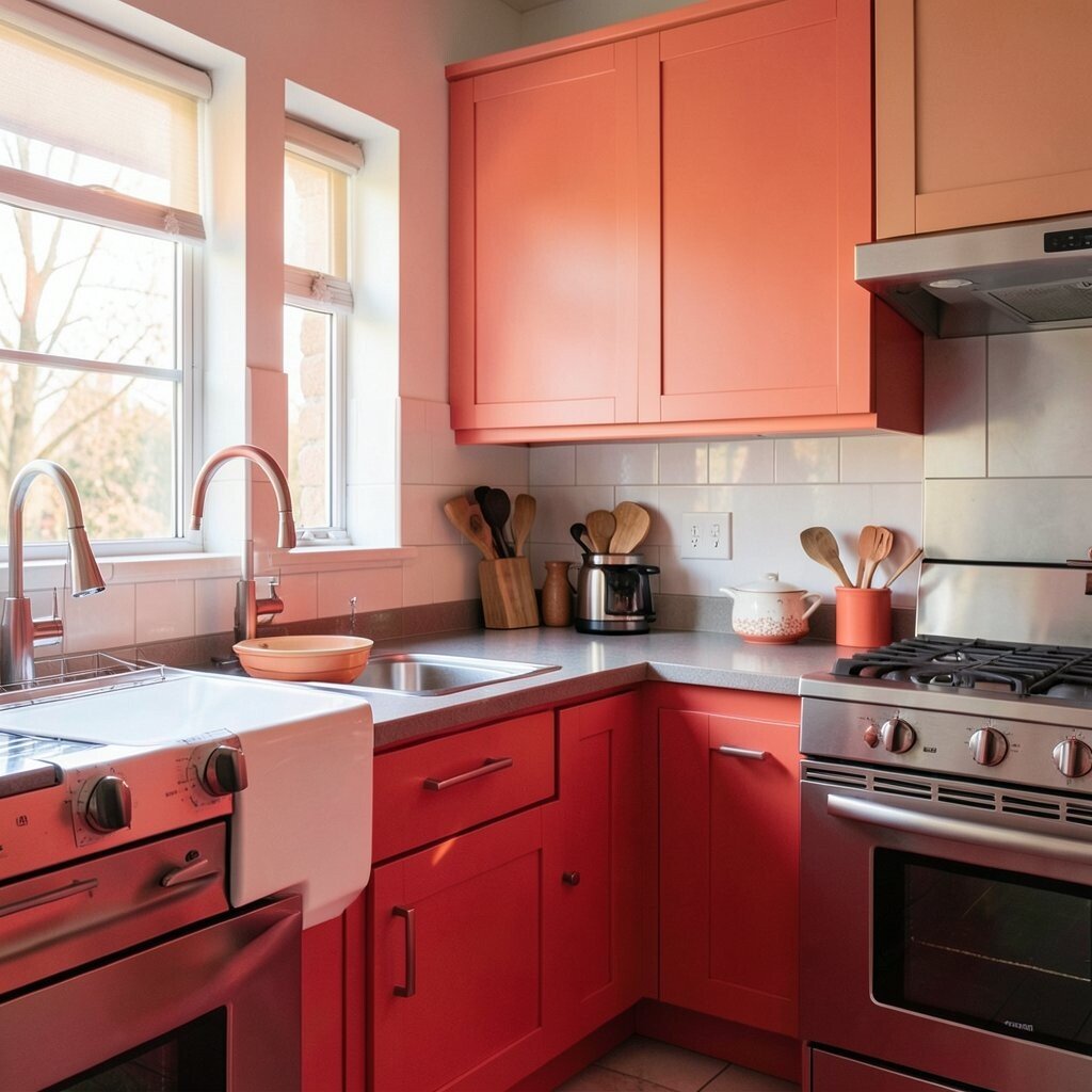
Overusing red, orange, or neon shades Bright reds and oranges can raise energy in the room, but they can also feel like too much. Neon shades can start to look outdated fast, especially when trends shift.
For a friendlier approach, use warm colors in smaller doses. Think of a terracotta bowl, a red runner, or a single accent wall behind open shelves. This gives you energy without overwhelming the whole kitchen.
Try balancing bold tones with calmer neutrals like cream, warm white, or natural wood. The benefit is a kitchen that feels lively but still restful while you cook and eat. You will also find it easier to coordinate future decor.
If you love color and want it to feel unique, choose one deeper shade as the hero, like deep wine or burnt orange. Then repeat it lightly in two places—like in barstools and in a framed print. Cost-friendly personalization like paintable frames is an easy win.
-
9. Matching everything to “white” without adding warmth

Matching everything to “white” without adding warmth White can be elegant, but too much of the wrong white can feel cold or clinical. Some whites look bluish, and your kitchen may feel less welcoming.
Look for warm whites with soft cream or beige undertones instead of icy blue tones. You will notice the difference when sunlight hits the walls and when you turn on warm bulbs at night. The benefit is a kitchen that feels cozy and inviting.
Personalization idea: add warmth with wood cutting boards, rattan baskets, and brushed finishes. These materials add “color” without needing more paint. Many current trends lean into natural texture, because it looks lived-in and stylish.
Cost considerations: if you cannot re-paint everything, upgrade your lighting. Swapping bulbs and adding under-cabinet lights can make your existing white look warmer. It is often cheaper than changing major surfaces.
Also, remember that grout and caulk choices can affect how white your kitchen feels. Pick grout that matches your desired warmth for the most seamless look.
-
10. Choosing black in large areas without enough contrast planning

Choosing black in large areas without enough contrast planning Black cabinetry or dark walls can look dramatic, but it can also make the room feel heavy if you do not plan carefully. If the kitchen lacks light, dark color may dominate and swallow detail.
To use black well, pair it with lighter elements like white counters, pale backsplashes, or bright trim. That balance keeps the space open while still giving you edge and sophistication. The benefit is high style without turning your kitchen into a gloomy corner.
For tips, limit black to one “anchor” area such as the island or lower cabinets. Then bring in warmth with wood tones or soft cream accessories. This approach often looks more designer than black everywhere.
Uniqueness idea: choose charcoal instead of deep black for walls if you want softness. Charcoal can hide dirt better than white but still keeps the room airy. Budget-friendly upgrades like a charcoal rug or black hardware can create the look without major changes.
Current trend: many kitchens are using matte black accents with warm natural finishes. That combo looks modern and still feels welcoming.
-
11. Overlooking how color affects stains, wear, and cleaning

Overlooking how color affects stains, wear, and cleaning Color is not just style—it is also how your kitchen handles real life. Dark surfaces may show dust and water spots, while light surfaces can show stains and smudges.
Think about where mess happens most: near the stove, around the sink, and on frequently touched cabinet doors. If those areas get splashed, pick colors and finishes that hide small marks. This saves you time and reduces the feeling that your kitchen always needs scrubbing.
Personalization tip: use a darker protective finish behind cooking areas and keep the rest of the kitchen lighter. Add a removable mat or runner in the dining path to protect flooring and reduce wear visibility. These small choices keep the kitchen looking good longer.
Cost considerations: spending a bit more on durable paint and quality sealants can prevent repainting later. Cheap finishes might cost less at first but can cost more when they need frequent touch-ups.
Current trend: homeowners are choosing practical matte finishes plus easy-clean backsplashes. It blends beauty with everyday function, which is what most kitchens really need.
-
12. Forgetting to coordinate paint color with hardware and fixtures

Forgetting to coordinate paint color with hardware and fixtures Cabinet color can look perfect until you add the faucet, knobs, and pulls. Then suddenly the metals may clash, making the kitchen feel less put-together.
Warm cabinet colors often pair best with warm metals like brushed brass, bronze, or warm copper tones. Cool cabinet colors can look best with nickel or chrome finishes. The benefit is a cohesive look that feels calm and well-matched.
Use samples: place a hardware piece and a faucet sample next to your painted sample swatch. This helps you see the real relationship between colors and metals. It also prevents the “I can’t return this” problem.
Uniqueness idea: mix metals on purpose, but only when the colors share a similar temperature. For example, warm brass with warm wood tones can look intentional. If your budget is tight, update just the hardware first and delay bigger changes.
-
13. Using trends you cannot live with every single day

Using trends you cannot live with every single day Trendy colors can feel exciting, but kitchens are used constantly. A color that looks great in photos might feel exhausting when you stand in front of it while cooking.
Pick a color you like in small increments first, like an accent wall behind open shelving or a decorative tile strip. This lets you test the vibe without committing the whole room. The benefit is confidence that grows over time.
To personalize, choose a timeless base and add trend through accessories. For instance, if bright sage is popular, you can add it with dish towels, a canister set, and a plant pot. Those items are easy to swap when your taste shifts.
Cost considerations: painting big areas for a short-term trend can feel expensive later. Accessories cost less, and they let you change the “mood” without major renovation.
-
14. Choosing flooring colors that don’t match your cabinet palette
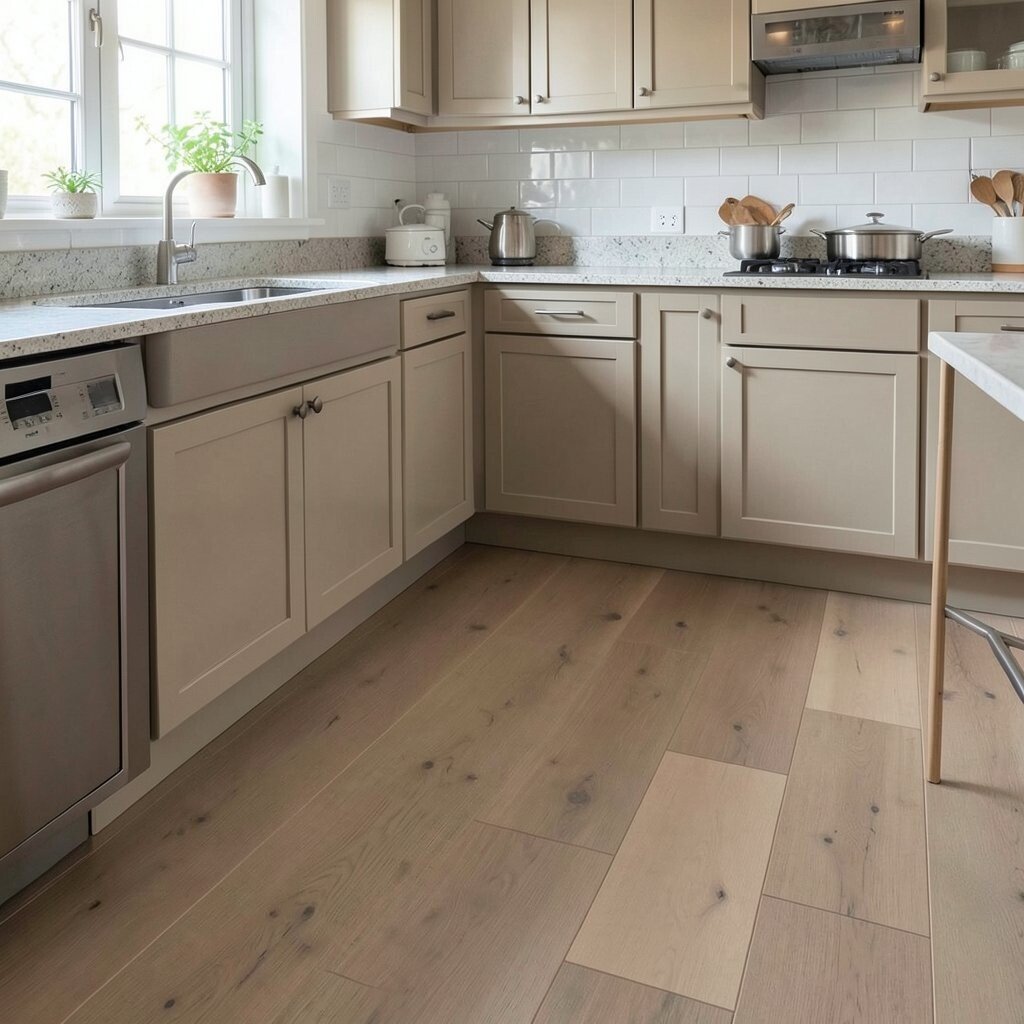
Choosing flooring colors that don’t match your cabinet palette Floors take up a lot of visual space, so they quietly steer the rest of the kitchen’s color story. If your flooring is very warm, cool cabinet colors may start to look awkward.
To avoid this, check the undertone of your flooring: look at the lighter grain, not just the darkest parts. Then select cabinet and wall colors that either match that warmth or complement it with gentle contrast. The benefit is a kitchen that feels naturally connected from room to room.
Try a simple test: tape paint swatches on the wall and stand with them while looking at the floor. Your eyes need to see the full scene, not separated pieces. This helps you spot clashes quickly.
If you want uniqueness and cost control, do not fight the floor—work with it. Choose a cabinet color that repeats one tone found in the floor. If you cannot change flooring, you can still upgrade the walls, backsplash, and hardware to bring everything together.
-
15. Overlooking color balance between upper and lower cabinets

Overlooking color balance between upper and lower cabinets Upper and lower cabinets can make or break the visual height of your kitchen. If both are very dark, the room can feel shorter and heavier.
Balance helps your kitchen “breathe,” and it can guide the eye around the space. A common friendly approach is using lighter upper cabinets and deeper lower cabinets. The benefit is a lifted, airy look while still keeping contrast where you want it.
Personalization idea: repeat the same color family but shift lightness. For example, warm off-white uppers with a caramel-toned lower finish can look rich without feeling too loud. You can also add a thin strip of color on the backsplash to connect the levels.
Cost considerations: if two-tone cabinetry is out of reach, you can mimic the effect with paint placement. Painting the lower kick area in a deeper shade and keeping the upper in a lighter shade can create that design feel. It is a clever way to get the look without a full custom build.
Current trend: many kitchens now use bright uppers and darker islands for a designer-style contrast. This plan works well in most homes because it stays visually comfortable.
-
16. Forgetting that grout color can change everything

Forgetting that grout color can change everything Grout is small, but it can strongly affect how a backsplash tile reads. White grout can make tile look crisp, while gray grout can make it look softer or more blended.
Pick grout that matches your goal: crisp lines for a clean look, or similar tones for a calmer “stone-like” feeling. If you want the tile to stand out, choose grout with a bit of contrast. If you want a quiet surface, choose grout that sits close to the tile color.
For tips, compare multiple grout samples against the tile in the same lighting. Many people choose grout based only on color swatches, but tile texture affects the final look. That is why holding samples on your wall is so helpful.
Uniqueness idea: choose a grout color that echoes a detail in your countertop, like tiny warm flecks or cool gray veins. That little link can make the kitchen feel custom-made. Cost considerations: grout and caulk upgrades can be affordable compared to swapping the entire backsplash.
-
17. Skipping a color plan for accessories and open shelving

Skipping a color plan for accessories and open shelving Open shelves show everything, so a lack of color planning can feel messy fast. If every item has a different shade, your kitchen can look chaotic even if the walls are perfect.
Try creating a color “rule” for shelves: group items by tone, or keep most items in two main colors. Then add one accent color for interest. This helps the shelves look curated instead of cluttered.
Personalization idea: use matching canisters, cookie jars, and a consistent label style for a neat look. Add plants in similar pot colors to make the shelf feel intentional and alive. This also makes cleaning easier because items feel like a set.
Cost considerations: start small with shelf liners, simple jars, and a few matching frames. You can build the look over time without spending one huge amount at once. Current trend: many kitchens now use warm-toned wood shelves with simple, neutral decor. It feels modern and friendly at the same time.
-
18. Not accounting for how paint and stain will look on cabinets over time

Not accounting for how paint and stain will look on cabinets over time Some colors change in meaning as your kitchen gets sunlight, steam, and cooking residue. Also, certain stains can deepen or lighten depending on the wood and finish.
Before deciding, check how your chosen color reacts to light and heat in your space. Ask your retailer about how the finish wears, and look for finish types meant for kitchens. The benefit is fewer surprises after months of real use.
Tips: use a small protected area test if possible, and choose cleaning products made for painted surfaces. Avoid harsh chemicals that can dull the sheen and shift the color’s appearance. Keeping care gentle helps your color look fresh longer.
For personalization, think about seasonal styling: swap table linens and wall art so your kitchen stays fun without repainting. Many people also add peel-and-stick accents in small areas like behind a coffee station. That gives you a quick style refresh on a budget.
Current trend: homeowners love layered looks—cabinets with warm tones, backsplashes with subtle texture, and lighting that makes colors glow. When you plan for time, your kitchen will stay beautiful, not just new.