
Some colors feel like a gentle hush. The right shade can make your room slow down with you.
-
1) Moonlit Blush

) Moonlit Blush Moonlit blush is a soft pink that looks like it came from dusk skies. It helps your eyes feel safe and relaxed, especially after a busy day.
Try it on pillow covers or a bed runner for an easy, cozy glow. Pair it with warm white bedding so the color feels calm, not loud. If you love change, add a small blush lamp shade and swap it seasonally.
-
2) Lavender Haze
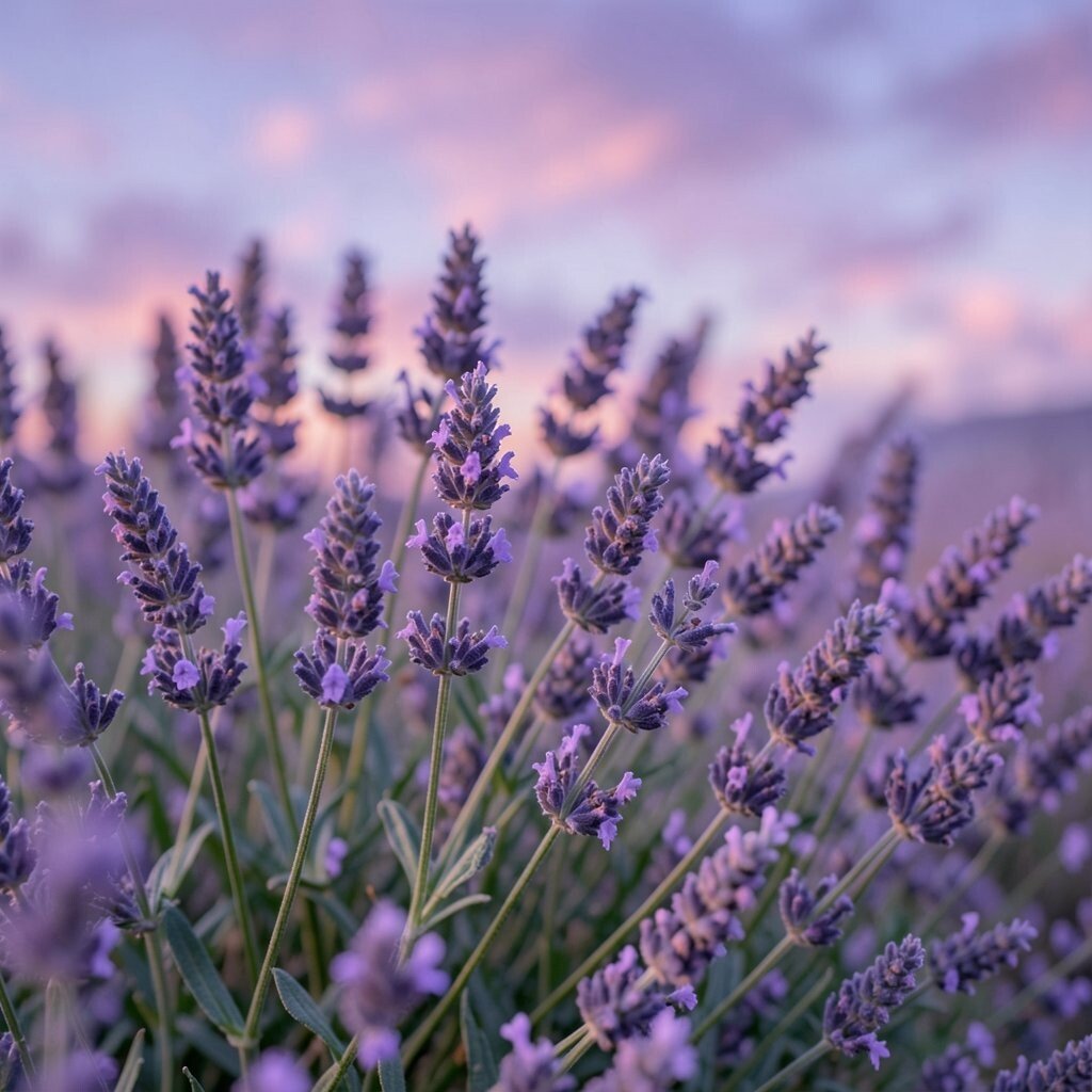
) Lavender Haze Lavender haze looks like a lilac cloud drifting just above the horizon. It brings a gentle, dreamy mood that many people associate with winding down.
For benefits, lavender shades can make your space feel softer and more forgiving. Use it in curtains or a throw blanket to soften hard corners and bright light.
To personalize, choose a slightly cooler lavender if your room gets lots of sun, and a warmer lavender if your room feels dim. Keep cost in mind by painting just one wall or using peel-and-stick wallpaper on a small area.
-
3) Dusty Rose Smoke

) Dusty Rose Smoke Dusty rose smoke is muted and smoky, like the last pink tint after sunset. It gives your room a “slow evening” feeling without looking too sweet.
This shade is great for calming nights because it sits between pink and neutral. Use it for a headboard wall, a dresser, or even a rug for a grounded look.
Personalization tip: match it with aged brass accents for a warm glow. If you want a trendier vibe, look for “rose smoke” textiles in home decor stores and online shops, since soft smoky tones are showing up everywhere lately.
For cost, start with affordable items like bedding, then upgrade to wall paint once you love the mood.
-
4) Periwinkle Twilight

) Periwinkle Twilight Periwinkle twilight is a cool blue with a hint of purple, like twilight turning to night. It feels airy, which can help your mind feel less crowded.
Add it with a light wall color, or choose periwinkle accents such as artwork and bedside storage. It pairs well with creamy whites and pale wood, making your room feel clean and calm.
To make it personal, try different shades in the same room by using lighter periwinkle on walls and deeper periwinkle in fabrics. If you want to spend less, look for matching pillow covers first, then build from there.
-
5) Deep Night Navy

) Deep Night Navy Deep night navy is rich and steady, like the sky right after the stars appear. It creates a cozy “nest” feeling, especially in bedrooms.
It helps calm nights because it adds visual weight and makes bright colors feel less intense. Use navy on a single accent wall or on darker curtains for a dramatic but soothing look.
Personalization idea: soften navy with blush, gray, or pale gold. For budget options, pick navy in smaller items like a throw blanket, since dark shades can show texture and look expensive even when the fabric is affordable.
-
6) Smoky Charcoal Plum

) Smoky Charcoal Plum Smoky charcoal plum blends dark gray with a muted purple glow. It looks elegant and a little mysterious, like velvet after dark.
This shade can benefit sleep vibes because it is not flashy. It feels grounded, which helps your brain relax when the day ends.
Try charcoal plum in a textured way, like a knit blanket or a matte wall finish. For personalization, add small pops of soft teal or dusty pink so the room stays playful.
-
7) Celestial Seafoam

) Celestial Seafoam Celestial seafoam is a light, minty green that looks fresh like ocean mist. It makes your space feel cooler, calmer, and gently renewed.
Benefits include a refreshing mood without turning your room into a “daytime kitchen.” Use it for a small area like a closet door, a nightstand makeover, or a bathroom vanity.
To personalize, choose seafoam curtains if you want privacy and softness. If cost is a concern, consider repainting one small piece of furniture instead of changing the whole room.
Current trend note: soft mint and seafoam tones are popular in calm, spa-like bathrooms and airy bedrooms, so you can find plenty of matching items in stores.
-
8) Twilight Teal Veil

) Twilight Teal Veil Twilight teal veil is a muted teal that feels like foggy water under moonlight. It brings a peaceful, quiet energy that works well for bedtime routines.
This shade can help with relaxation by balancing cool tones with warmth from nearby neutrals. Pair it with warm white bedding and natural wood for a comforting contrast.
For personalization, use teal in layered ways: a teal lamp base plus teal accents in pillows. If you want something budget-friendly, start with a teal-toned rug runner or removable wallpaper behind a reading chair.
-
9) Soft Gray Cloud

) Soft Gray Cloud Soft gray cloud is a gentle, light gray that feels airy and calm. It is a great option when you want calm without adding too much color.
One benefit is that it pairs with almost anything, which makes styling easier. Add color through accents like art, bookshelves decor, and throw pillows.
Personalization idea: choose a slightly warmer gray if you like cozy evenings, and a cooler gray if you prefer a crisp, clean look. For cost considerations, gray is often a smart paint choice because you can keep updating with new textiles rather than repainting.
-
10) Warm Cinnamon Night

) Warm Cinnamon Night Warm cinnamon night is a dusty, earthy brown with a gentle glow. It feels like soft lighting and cozy blankets, even in plain rooms.
This shade helps calm nights by adding comfort and stability. Use it in wood tones, woven baskets, or a patterned curtain that includes cinnamon hints.
Personalization tip: pair cinnamon with cream and muted green for a natural, grounded vibe. If you want to keep it budget-friendly, look for cinnamon-toned bedding and rugs first, then build your room around those.
Trend note: earthy “warm neutrals” are still going strong, especially in rooms that aim for calm and clean textures.
-
11) Rosewood Ember

) Rosewood Ember Rosewood ember is a warm reddish-brown that looks like dusk firelight. It feels rich, inviting, and a little romantic.
For benefits, it can make your space feel snug and protected. Use it on a dresser, a picture frame wall, or a headboard panel for a dramatic focal point.
Personalization ideas: combine rosewood ember with cream, charcoal, and soft gold accents. If cost matters, try staining a small piece of furniture rather than buying expensive new items.
-
12) Night Sky Violet

) Night Sky Violet Night sky violet is deep purple that feels like a starry evening. It adds mood while still staying elegant and calm.
Benefits include making the room feel more private and cozy. Use it on curtains, an accent wall, or even a statement chair so it feels like an evening spotlight.
To personalize, add tiny specks of silver or gray in decor to mimic star shimmer. For cost, start with a violet throw or a set of pillow covers since fabric updates often cost less than paint.
Current trend: jewel-tone accents, like violet and sapphire, are popular in “cozy dark” bedroom styling.
-
13) Saffron Dusk Glow

) Saffron Dusk Glow Saffron dusk glow is a muted golden yellow that feels gentle, not bright. It gives your room a warm evening light, even when the sun is gone.
This shade helps calm nights because it supports a soothing warmth. Use it on lamp shades, artwork, or a soft knitted throw.
Personalization idea: pair it with cool blues or soft grays to keep the mood balanced. For budget, pick one “golden” item you will always use, like a bedside lamp or a small rug, then coordinate the rest with neutrals.
-
14) Evergreen Whisper

) Evergreen Whisper Evergreen whisper is a muted deep green that feels like pine trees at night. It brings a steady, grounded calm that many people love before sleep.
Benefits include a relaxing nature mood, which can make your room feel like a quiet retreat. Use it in bedding patterns, curtains, or a textured wall finish.
Personalization tip: add light wood, cream, and simple greenery decor to keep it from feeling too dark. If you want to save money, choose evergreen in accessories first, since greens can be easier to swap than major renovations.
-
15) Pale Moon Butter
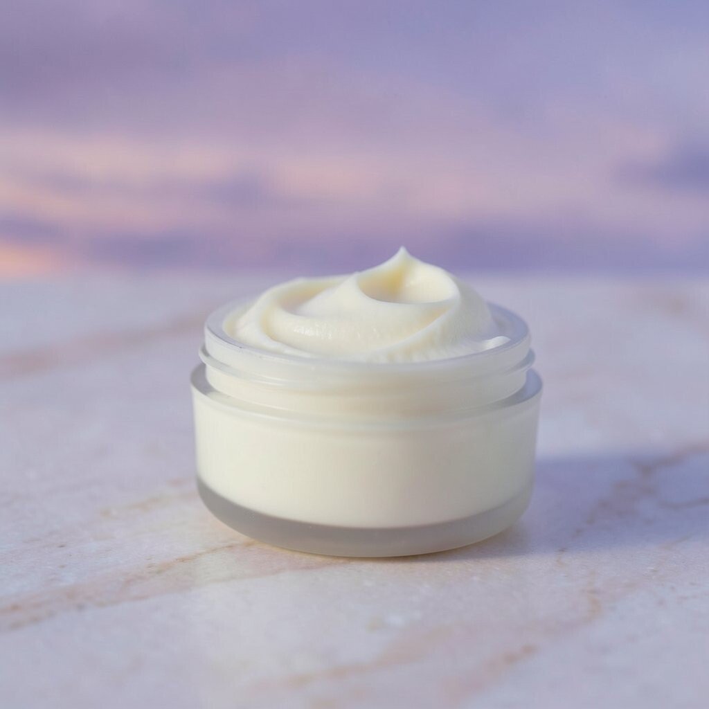
) Pale Moon Butter Pale moon butter is a soft creamy yellow with a dreamy, pale look. It feels calming and gentle, like warm tea at bedtime.
The benefit is that it brightens your room without looking harsh. Use it on walls, bedding, or a soft runner in the hallway that leads to your bedroom.
Personalization ideas: add accents of lavender, powder blue, or light gray to keep the palette calm. For cost considerations, paint can be your best value, but if you are renting, use peel-and-stick wallpaper in butter tones for a quick refresh.
-
16) Stormy Sand Taupe

) Stormy Sand Taupe Stormy sand taupe is a smooth, gray-brown shade that feels like beach sand after rain. It makes your room look calm, grounded, and quietly stylish.
This shade helps calm nights because it is neutral and easy on the eyes. It also makes other colors look more gentle, which is perfect for a twilight-inspired setup.
Personalization tip: pair taupe with soft blues and muted pinks for a gentle contrast. For cost, taupe works well with many budget-friendly textures, like faux leather, woven baskets, and simple cotton curtains.
Trend note: taupe and sand tones are popular because they mix well with both modern and cozy styles.
-
17) Twilight Pearl White

) Twilight Pearl White Twilight pearl white is not stark; it is a creamy white with a cool, pearly feel. It makes rooms look clean and calm while still feeling warm.
Benefits include making your space feel bigger and brighter, which can reduce nighttime worries. Use it for walls, ceilings, or trim so your room has a steady, soothing backdrop.
Personalization idea: add layers of texture, like a chunky knit blanket or a soft velvet pillow, so the white does not feel plain. If you want cost control, choose one room first, and keep the rest of your home neutral until you are ready.