The page can feel alive before you even write a word. A strong layout graphic can make your ideas feel like they already belong in the world.
In this list, you’ll find creative layout concepts you can sketch, mock up, or build today.
-
1. The Split-Screen Story Board
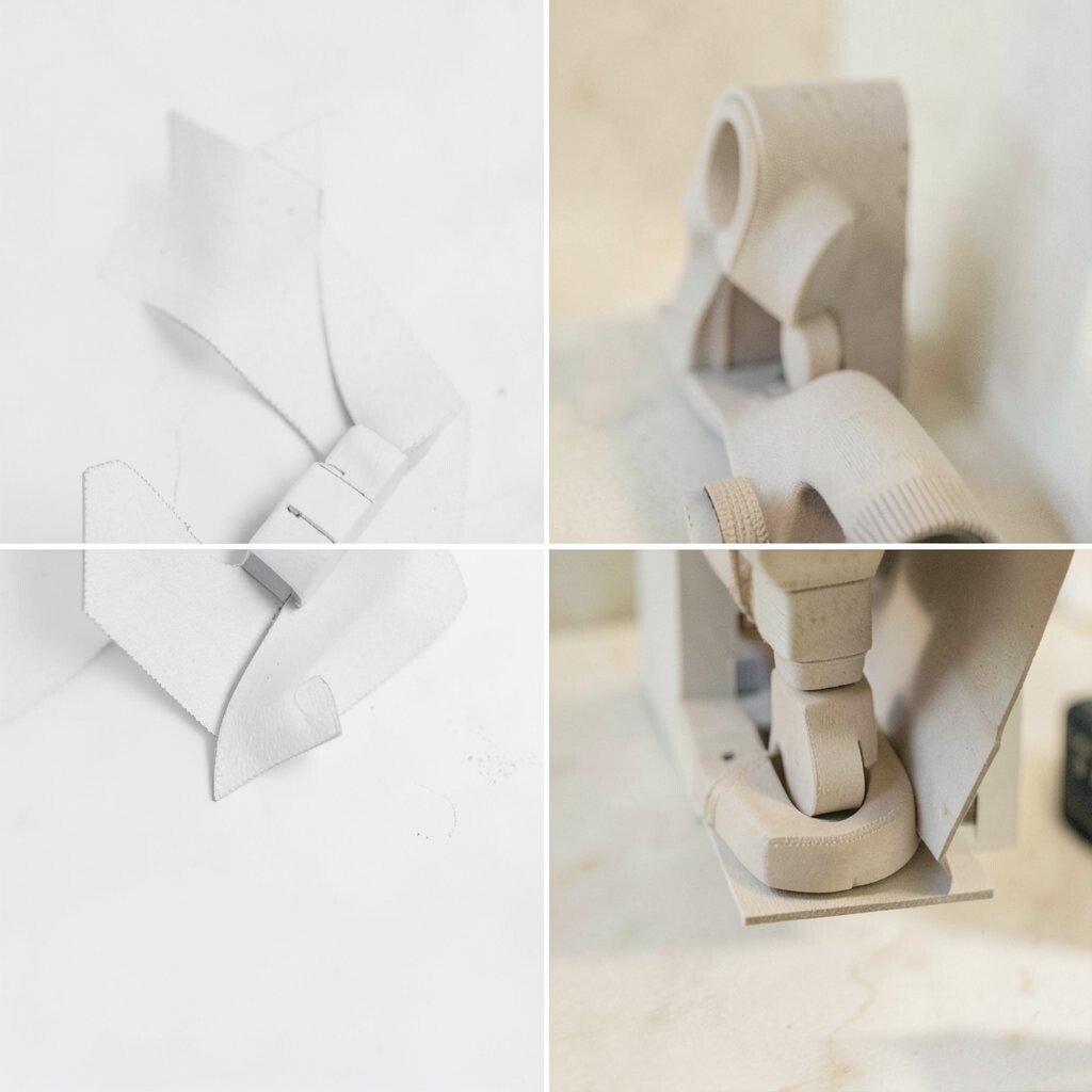
The Split-Screen Story Board Imagine a layout divided into two steady halves, like a before-and-after conversation. Each panel holds a different visual moment, so your viewer instantly sees what changed.
Use thick divider lines, soft gradients, or dashed arrows to guide the eye from left to right. This graphic helps you plan a message, show progress, and keep details organized. For a personal touch, swap the colors with your favorite palette and match the typography to your vibe.
For best results, keep the content simple inside each half and use one clear focal object per panel. If you’re working on a budget, start with paper thumbnails or free design templates. A current trend is using gentle motion cues, like arrowheads and subtle drop shadows, to mimic animation without heavy tools.
-
2. The Mason Jar Mood Board Layout
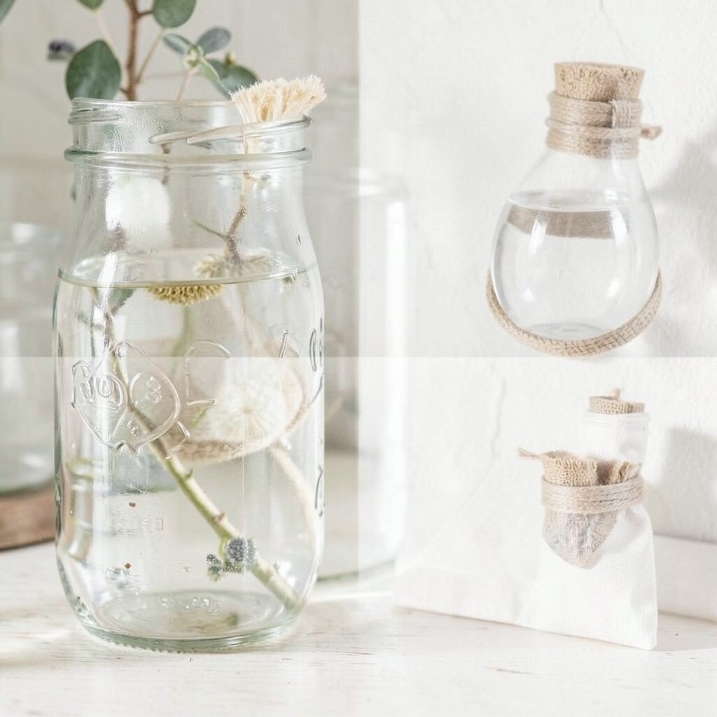
The Mason Jar Mood Board Layout Picture a grid that looks like glass jars, each one filled with a color, texture, or mini image. The jar outlines give your page a playful, collected feeling.
Place a small label under each jar to explain the idea behind it. This makes your message easier to scan and helps your brain connect concepts quickly. You also get a clear benefit for teamwork, because everyone can point to one “jar” and agree faster.
Try personalizing with jar themes, like “morning energy” or “cozy nights,” and use icons that match your life. If you’re cost-minded, use inexpensive color swatches, stickers, or cut-out pictures. A friendly trend right now is using textured backgrounds, like paper grain or faux film, to make layouts feel more human.
-
3. The Orbit Map Landing Page
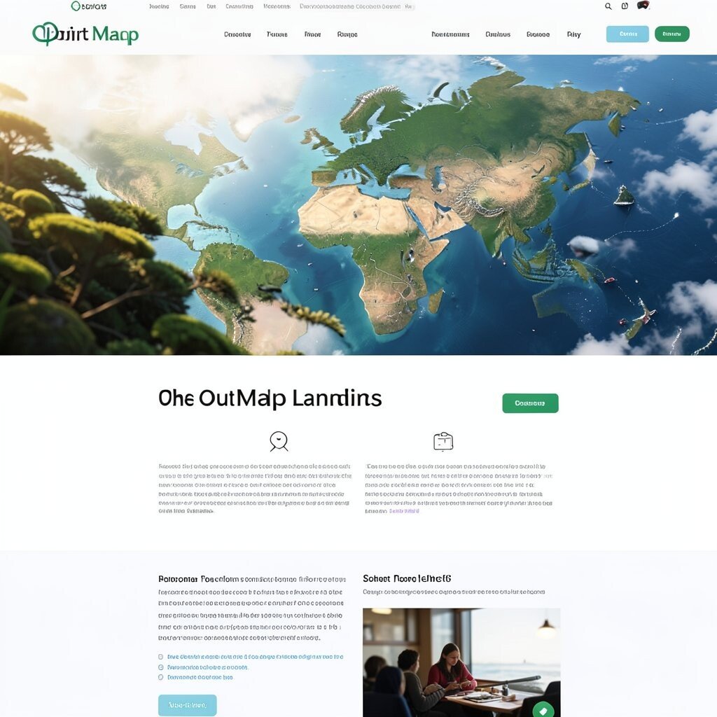
The Orbit Map Landing Page Think of a central circle with smaller circles orbiting around it like planets. Lines connect the circles, creating a tidy path for attention.
Put your main idea in the center, and then use the orbit nodes for features, steps, or questions. This layout graphic is great because it gives a “big picture” first, then details second. It also feels unique, since the structure naturally suggests relationships.
For tips, keep the orbit distance consistent and choose one icon style for all nodes. Personalization can be simple: swap the center shape, like using a hexagon instead of a circle, or change the planet colors based on your brand mood. If you’re building digitally, use smart guides so the spacing stays neat.
Budget note: you can draw the orbit map with basic shapes in any free editor. A current trend is “soft tech,” where elements float with gentle shadows and rounded edges instead of sharp, harsh lines.
-
4. The Recipe Card Product Layout
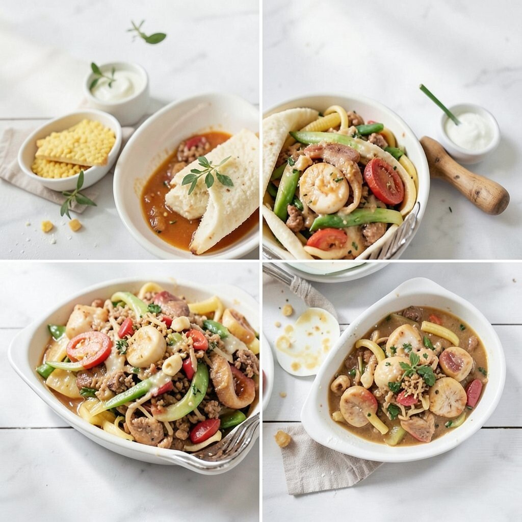
The Recipe Card Product Layout Imagine your content arranged like a classic recipe card, with a bold title, ingredient list, and step sections. Even without photos, it looks organized and inviting.
Use the “ingredients” area for key points and the “steps” area for how-to information. This layout benefits users because it tells them what to expect and how to use it. It’s also a fun way to make your topic feel friendly, not complicated.
Personalize by changing the paper style, like linen, kraft, or notebook lines, and add small doodles along the margins. If costs matter, print on plain paper and decorate by hand, then scan it. A trend you’ll see often is using readable hierarchy—big headings, clear labels, and calm spacing—so the page feels easy to follow.
-
5. The Gallery Wall with Captions
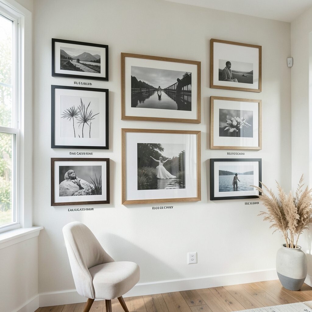
The Gallery Wall with Captions Picture a wall of framed rectangles, each holding a mini visual or sketch. Under each frame, a short caption explains what the viewer should notice.
This concept makes your ideas feel like a curated set, which is great for portfolios and event pages. It also supports faster browsing because people can skim the captions and then zoom in mentally. To keep it unique, vary frame sizes and add one “hero frame” that stands out more than the rest.
Try personalization by using your own photo corners, vintage frame styles, or a consistent border pattern. If you’re on a budget, start with a small set of images and reuse them across variations. Right now, many layouts trend toward clean minimal frames paired with bold typography and bright accent colors.
-
6. The Timeline Thread Graphic
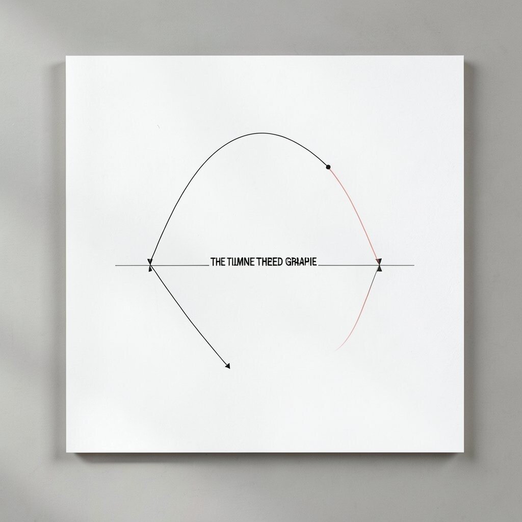
The Timeline Thread Graphic Think of a winding line running through your design, like a thread stitched across fabric. Tiny dots mark moments along the path, and each dot holds a short label.
This layout helps you show progress, story order, or steps without making the reader hunt for context. It also feels powerful because it turns “history” into something you can visually follow. For a tip, keep the timeline direction consistent and avoid cramming too many labels close together.
Personalize with themed milestones, like “idea,” “prototype,” and “launch,” and choose icon shapes that match each stage. Cost considerations are easy here: you can draw the timeline with a few lines and circles in free software, then add text. A current trend is using “micro dates” and small badges instead of long paragraphs near each step.
-
7. The Newspaper Column Layout
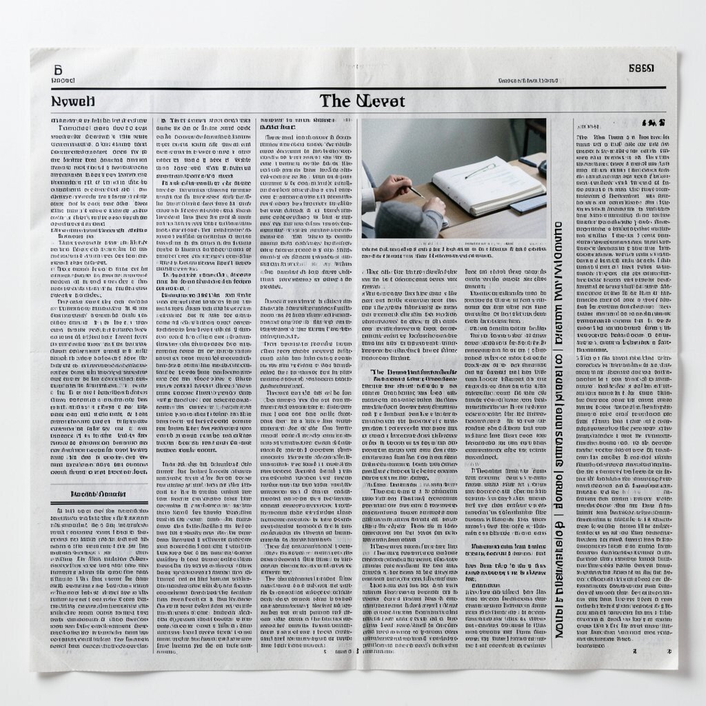
The Newspaper Column Layout Imagine your page broken into vertical columns, like a friendly newspaper. Headers are bold, and each section looks ready for quick reading.
Use one column for the main message and the other columns for side notes, quotes, or small visual blocks. This layout benefits users by creating natural reading flow and clear section boundaries. It’s unique because it brings structure with personality, especially when you add tasteful grid lines and playful icons.
For tips, keep line length shorter in each column so the text feels airy. Personalize with a “press style” font pairing or a color block for “breaking news.” If you want to save money, use free font families and simple shapes—no need for premium assets.
-
8. The Map Legend with Swatches
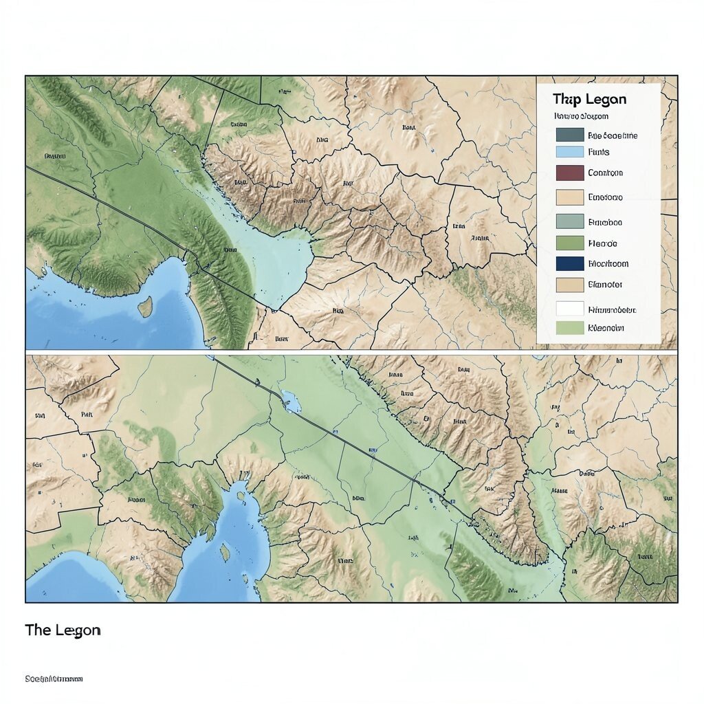
The Map Legend with Swatches Picture a layout that looks like a hiking map: a large “terrain” area on the top and a “legend” panel on the side. Each legend item shows a tiny swatch and a label.
This concept is great for comparing options, categories, and themes because the legend acts like a cheat sheet. It also feels unique because it borrows structure from real maps. For a tip, use consistent swatch sizes and keep labels short so the legend stays readable.
Personalize by naming the swatches like real places—“Sunset Trail,” “Rainy Dock,” or “Quiet Corner.” If you’re thinking about cost, you can use simple shapes as swatches and create a map-like background with a free texture. A trend that’s popular now is “data-to-style,” where charts and legends are designed to feel artistic instead of cold.
Also, try adding one “route line” that connects two swatches to show a recommended path. That small detail can make the layout feel like it’s guiding someone, not just showing information.
-
9. The Poster Stack with Depth
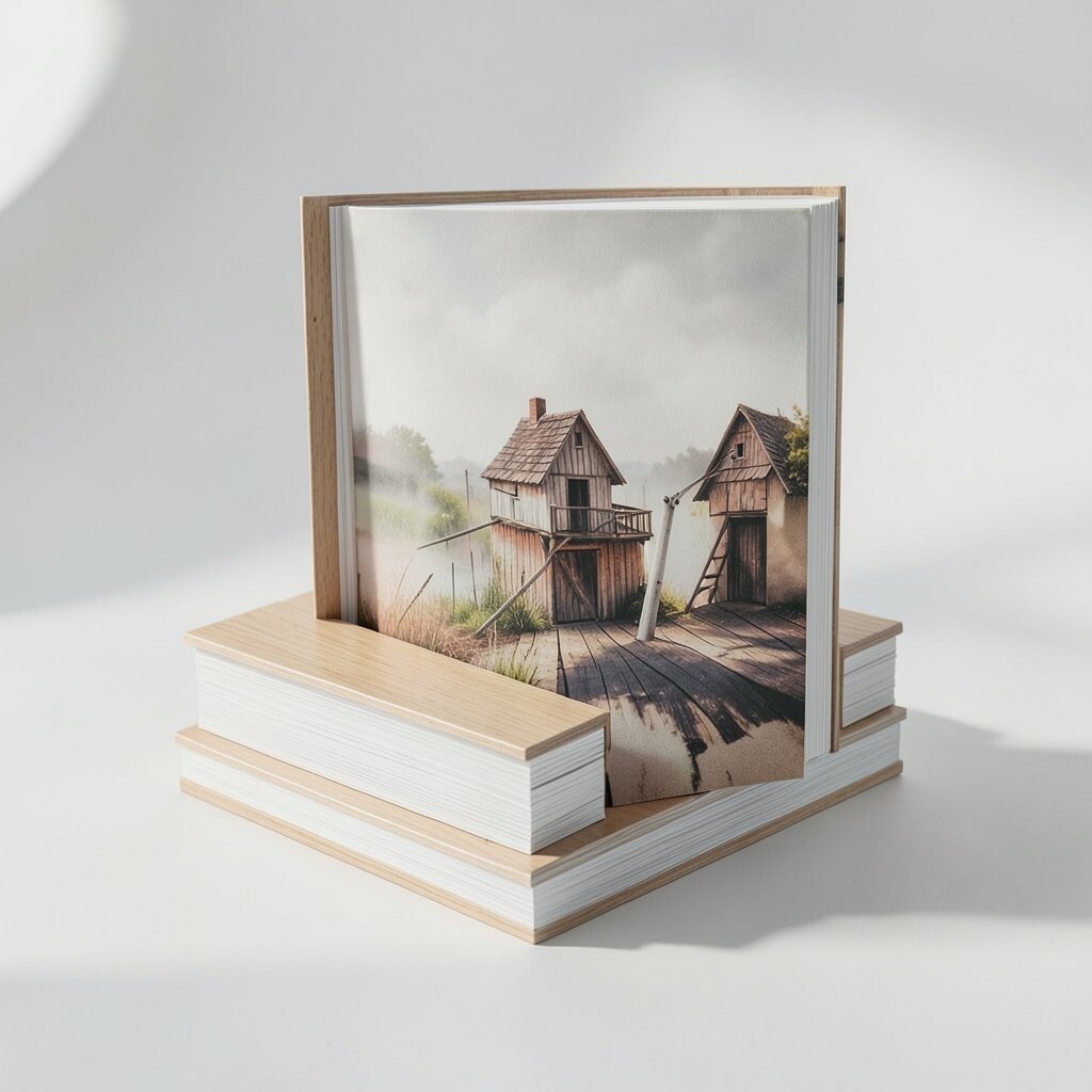
The Poster Stack with Depth Imagine multiple posters slightly offset behind each other, like a stack leaning against a wall. The top poster is sharp, while the back layers are a bit softer.
This layout graphic works well for announcements and campaigns because it creates a strong visual hierarchy fast. It also feels unique through depth, because the viewer’s eyes naturally move from front to back. For tips, keep the color themes consistent across layers so it doesn’t look messy.
Personalize by adding tiny dates, event titles, or your own signature doodles to the bottom corner. Cost considerations are friendly here: you can create the “stack” effect with basic layers in free tools. A current trend is “layered minimal,” where depth is used subtly with blur and spacing, not with heavy textures.
-
10. The Sticky Note Task Wall
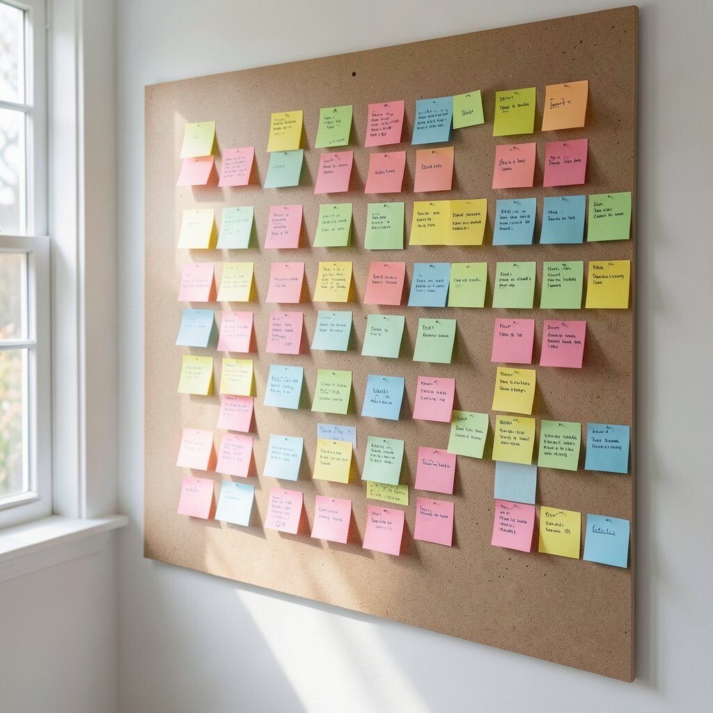
The Sticky Note Task Wall Think of a wall filled with sticky notes, each one tilted just a little. Some notes overlap, and each note has a short action phrase.
This layout benefits productivity because it encourages quick scanning and clear next steps. It’s also unique because the chaos looks intentional, like a creative mind captured on paper. For tips, keep a readable font size, even if the notes rotate.
Personalize by using your own system, like color for priority levels or icons for categories. If you’re budget-focused, make it with paper sticky notes, then scan and edit the image. A trend right now is “analog-inspired design,” where layouts look handmade while still being clean and structured.
-
11. The Fashion Lookbook Grid
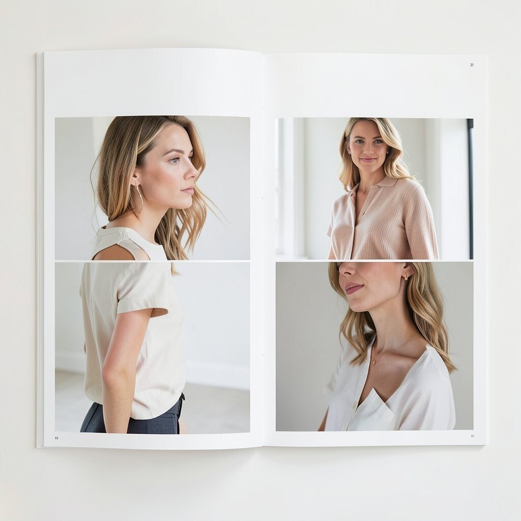
The Fashion Lookbook Grid Imagine a clean grid like a fashion magazine, with full-bleed images and small captions for each look. Spacing is wide, and everything feels polished.
This concept layout graphic is perfect for showcasing ideas that need style and mood. The benefit is that it makes your content feel premium without being complicated. It also stays unique because the captions and cropping choices shape the story.
For tips, pick one consistent caption format, like a short title and a tiny tag, then repeat it across the grid. Personalize by changing the crop style, like using rounded corners for one section and sharp corners for another. Cost note: you can build this with free placeholders first, then swap in real images later.
A current trend is using “negative space first,” where the grid breathes and the text stays calm. That approach helps your visuals stand out even on busy screens.
-
12. The Puzzle Piece Feature Layout
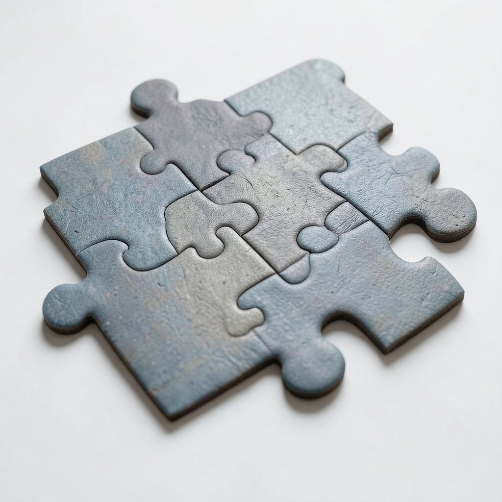
The Puzzle Piece Feature Layout Picture your page built from puzzle pieces that interlock, each one containing one feature. The shapes make the structure feel playful and connected.
This layout benefits people because it visually teaches “how parts fit together.” It’s unique because the design itself communicates unity, not just the text. For tips, make sure each puzzle piece has equal weight so no part feels less important.
Personalize by naming puzzle pieces with your own categories, like “tools,” “tips,” or “results.” If you’re keeping costs low, you can create puzzle-like shapes using simple vector tools or even paper cutouts. A trend you’ll see often is friendly geometry—rounded, playful shapes instead of strict rectangles.
One more idea: add a subtle outline color to each piece so the grid stays clear on both light and dark backgrounds. That small move can make the layout feel more professional.
-
13. The Chalkboard Quote Menu
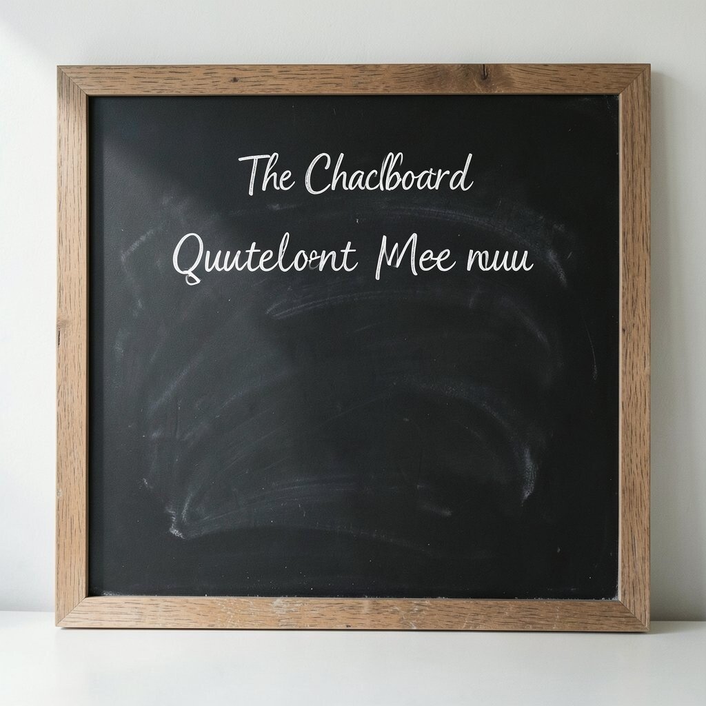
The Chalkboard Quote Menu Imagine a chalkboard background with handwritten-looking headings and menu-style sections. Small doodles—like stars or leaf shapes—float around the text.
This layout graphic is great for sharing ideas in a warm and human way, like a workshop flyer or a community page. It benefits users by making the page feel approachable and easy to read. The uniqueness comes from the “menu” structure, where each section is its own mini moment.
For tips, keep the text short and use consistent line breaks so it looks like real chalk. Personalize with color chalk highlights for key words or your theme colors. Cost considerations are also manageable: free chalkboard textures exist, or you can use a simple dark background and add chalk fonts.
-
14. The Window Frame Product Teaser
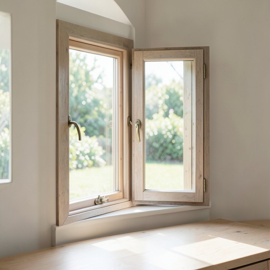
The Window Frame Product Teaser Picture a big window frame on the page, with a bright scene inside and a shaded border around it. The “glass” area is where your main idea lives.
This concept layout graphic gives you instant focus because everything points inward to the window. It benefits people by reducing clutter and improving readability. For tips, keep the outer frame calm and let one interior element be the hero.
Personalize by changing the “window view” style—like a sunset gradient, a photo collage, or a minimal illustration. If costs matter, use one strong image and simple shapes for the frame. A current trend is using bold framing with subtle gradients and clean shadows, which makes simple designs feel modern.
You can also add little “curtain” elements at the corners to make the layout feel richer without heavy graphics.
-
15. The Blueprint Component Layout
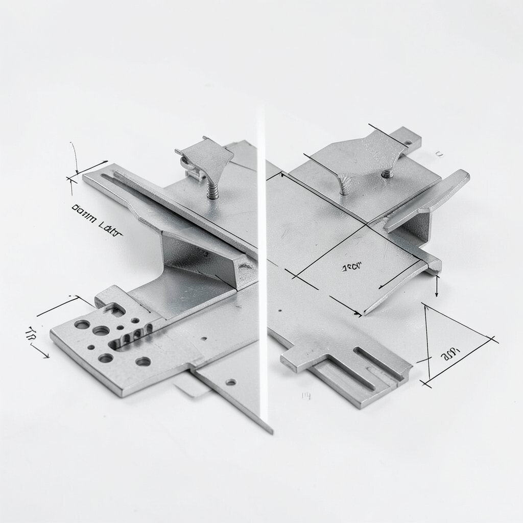
The Blueprint Component Layout Imagine a blueprint style page with labeled sections, measurement lines, and neat callouts. It looks technical, but you can still make it creative.
This layout is amazing for showing components, plans, or systems because the callouts guide attention step by step. It benefits learners and teams by making each part feel defined and easy to reference. The uniqueness comes from the blueprint language—lines, boxes, and labels—turned into something fun and stylish.
For tips, use a limited color set like navy, gray, and one accent color, and keep the text readable. Personalize by labeling sections with your own project names, like “module A” and “module B,” or using playful component names. Budget note: you can create blueprint lines with free vector tools and reuse the same style across multiple pages.