Your space can look like a storybook page. The right layout can make everyday tasks feel fun.
-
1) The Split-Screen Story Layout
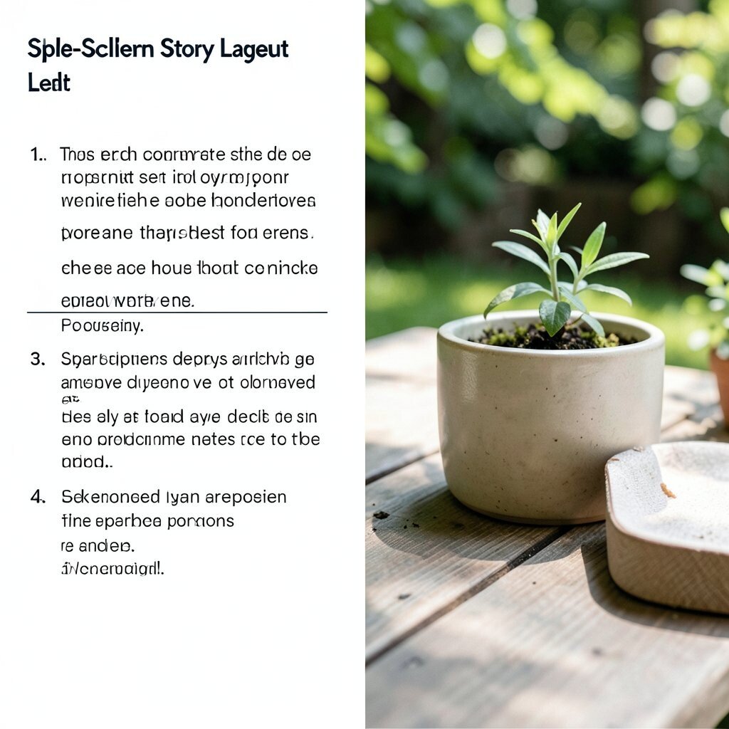
) The Split-Screen Story Layout Imagine your page like two movie scenes playing at once. The left side shows calm ideas, and the right side shows action steps.
Use this layout for posters, landing pages, or even a mood board wall. It helps visitors understand your main point fast because the eye knows where to land.
To make it work, keep one side for visuals and one side for short text.
Try pairing a bold background on one half with a lighter background on the other. -
2) The Layered Card Stack
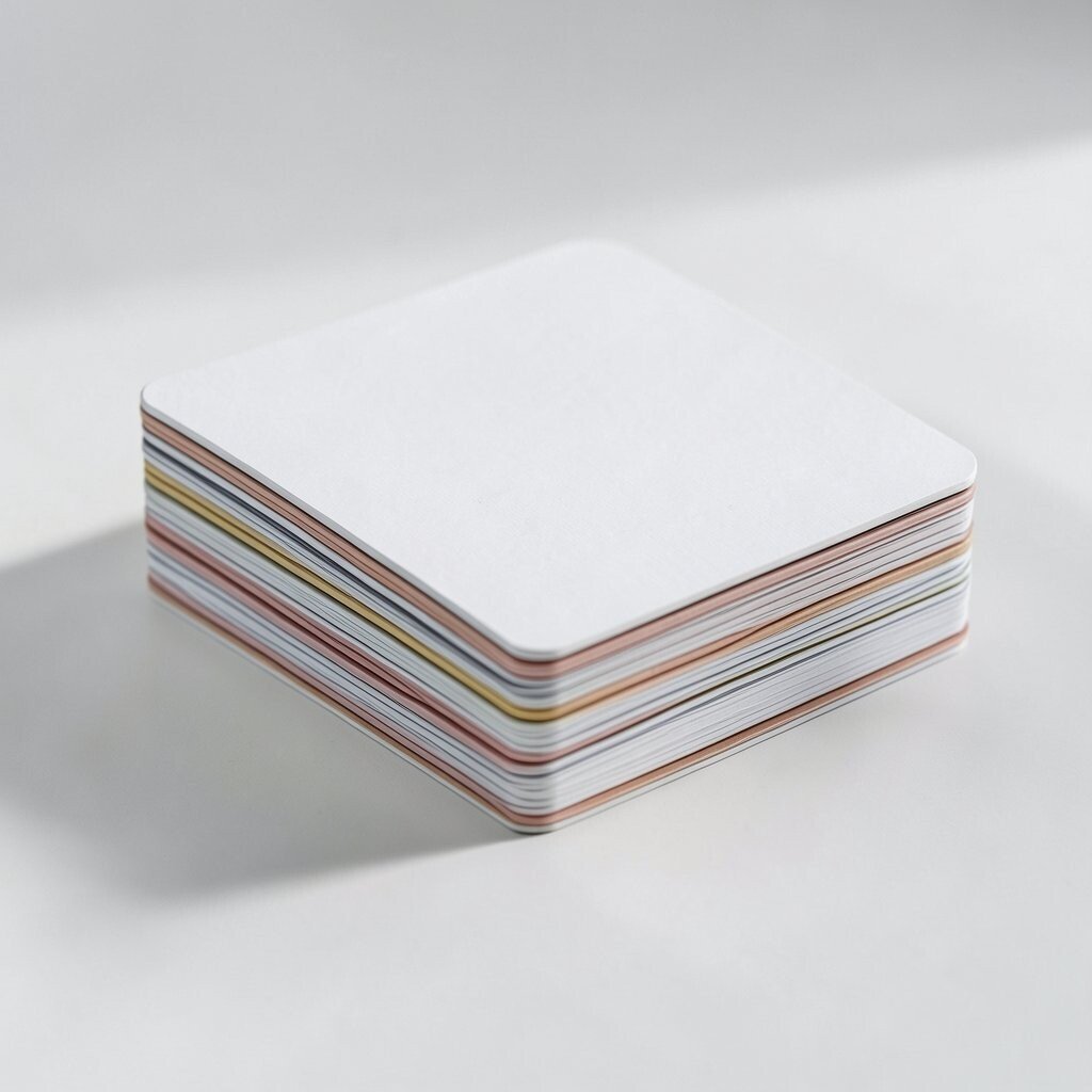
) The Layered Card Stack Picture a neat stack of paper cards, each one slightly tilted and full of color. When you scroll or glance, the cards feel like they are floating.
This layout is great for portfolios, product lists, or workshop schedules. It creates a clear order while still looking creative.
For the best effect, keep spacing consistent and let each card hold one idea only.Choose a color palette with one strong accent and two quiet supporting tones. If you have a small budget, make the cards with simple rectangles and shadows in a design tool.
Personalize by adding tiny icons that match your theme, like paint drops for art or leaf shapes for wellness. -
3) The Spiral Path Showcase
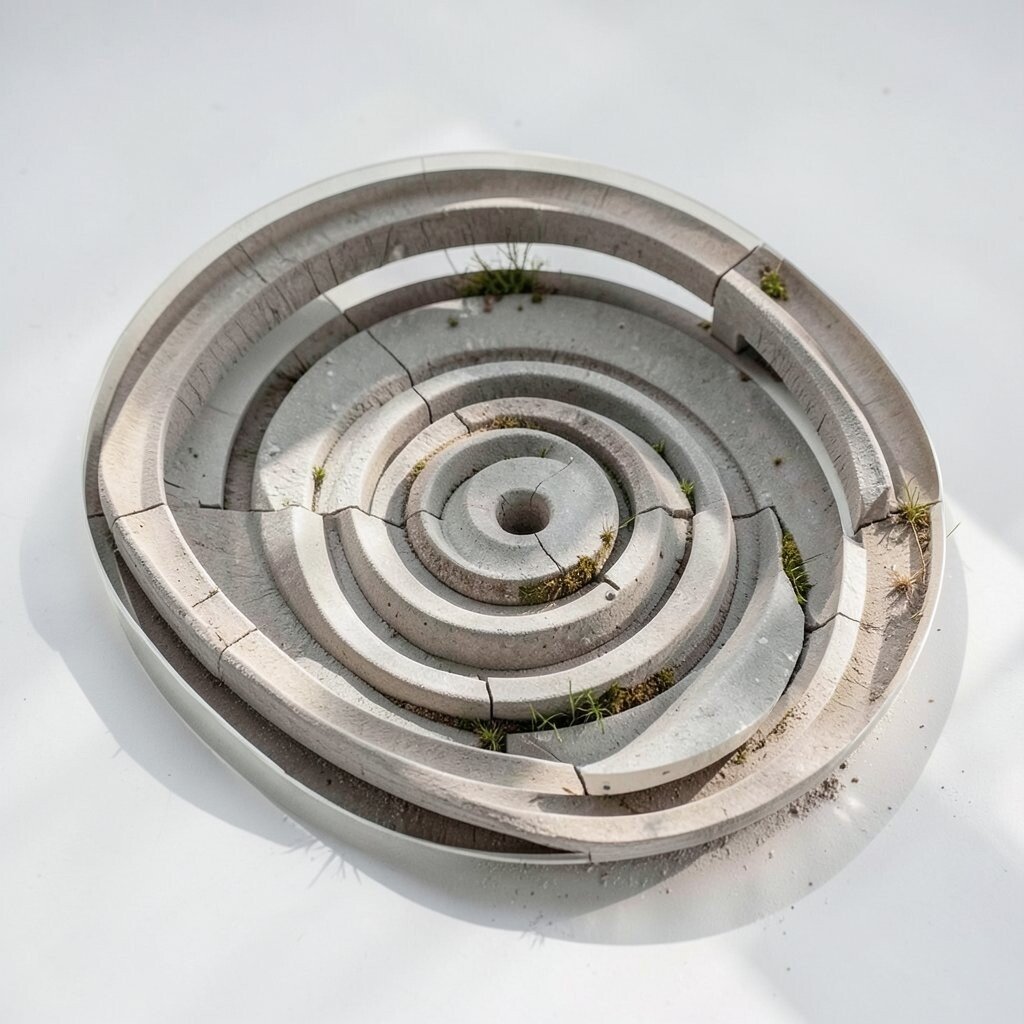
) The Spiral Path Showcase Think of a spiral made from stepping stones, guiding eyes from the center outward. Each stop has a message, like a mini adventure map.
This concept works well for long-form content, lesson plans, or galleries. It gives a sense of movement without needing animations.
Make the center your “big idea,” then place supporting items on the next turns.For tips, use arrows subtly or vary border styles so people can follow the path. Consider using soft gradients so the spiral feels smooth and not harsh.
Cost stays low because you only need basic shapes and good spacing. -
4) The Magazine Grid With Big Headlines
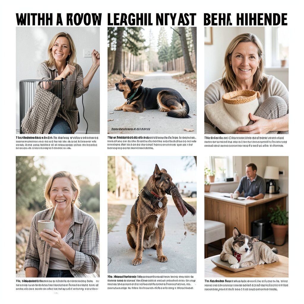
) The Magazine Grid With Big Headlines Imagine a magazine cover layout inside your screen or wall frame. Some blocks are small, but one block is always loud and clear.
This layout is perfect for blogs, event pages, or brand boards. It helps your content look professional because the grid keeps everything tidy.
Try using one oversized heading and several smaller cards under it to show hierarchy at a glance. -
5) The Corner-Glow Focus
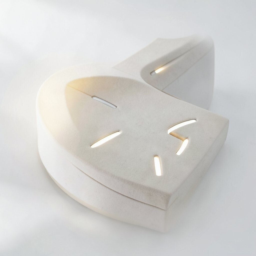
) The Corner-Glow Focus Picture a spotlight that lives in the corner of your layout. The glow points toward one key section like a gentle nudge.
Use this for calls to action, pricing sections, or featured projects. The benefit is strong focus without clutter.
Keep the glowing area limited so it feels special, not noisy.For personalization, match the glow color to your brand or to the mood you want, like warm orange for cozy or cool blue for calm. If you want to keep costs down, use a simple radial gradient effect and a single accent icon.
A current trend is “soft glow” visuals, so this concept fits what many modern designs use today. -
6) The Timeline Ribbon
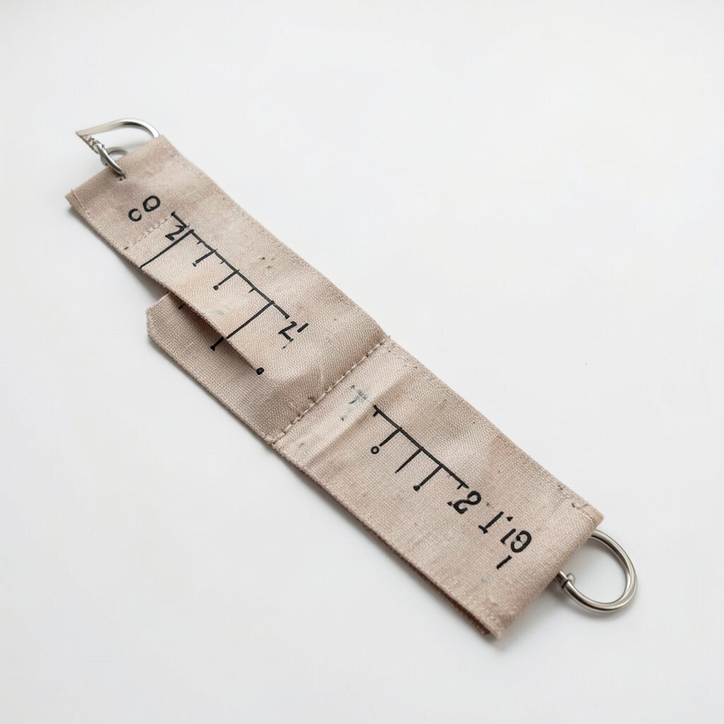
) The Timeline Ribbon Imagine a ribbon that winds across the page, like a parade banner. It holds dates, steps, or milestones in order.
This layout is perfect for process pages, case studies, or project updates. People love seeing progress because it feels reassuring.
Keep each milestone short and add one supporting visual, like a simple photo frame or icon badge.If you want to save money, reuse the same icon style for every step instead of making new artwork each time. Personalize by swapping the ribbon colors for seasons or themes.
A fun tip is to let the ribbon end with a “next step” card that looks slightly brighter than the earlier ones. -
7) The Circle Carousel Gallery
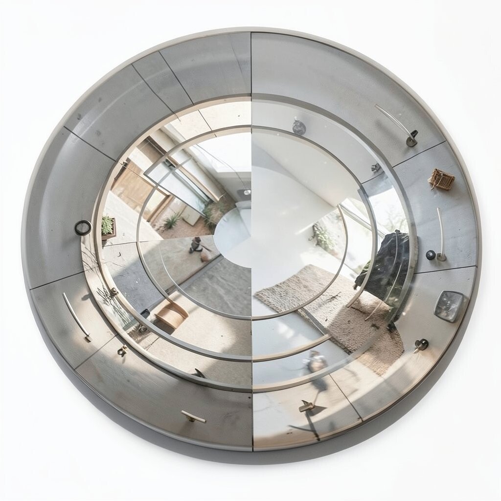
) The Circle Carousel Gallery Picture items placed around a circle, like a merry-go-round made of photos and labels. Each segment feels connected but still distinct.
This works well for product highlights, reading lists, or skill showcases. The benefit is that it feels playful while still organized.
To keep clarity, use consistent segment sizes and keep text short.Consider pairing the circle with a calm center area for a summary or short quote. Personalize by choosing a theme like “planet system,” “music beats,” or “sunburst days.”
For cost control, you can create the circle using a basic shape and simple dividers rather than expensive graphics. -
8) The Contrast Banner Stack
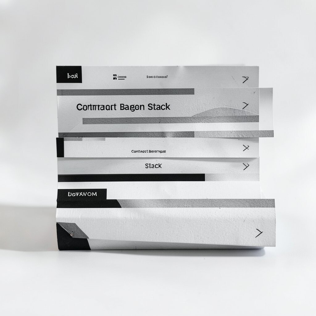
) The Contrast Banner Stack Imagine a set of horizontal banners stacked like layers of frosting. Each banner has a different color and a different job.
This concept is great for landing pages, event flyers, or community newsletters. It helps readers scan quickly because the banners create clear stops.
Use one banner for the main message, one for benefits, and one for details.For tips, keep your text centered in each banner and use a clean font size rule. If you want variety, switch banner colors but keep the same style of padding and borders.
Personalize by adding small patterns inside each banner, like tiny dots or diagonal lines.Costs are friendly because you can build banners with simple blocks. Also, current trends often favor bold stripes and clear sectioning, so this design fits the vibe.
-
9) The Storyboard Panels
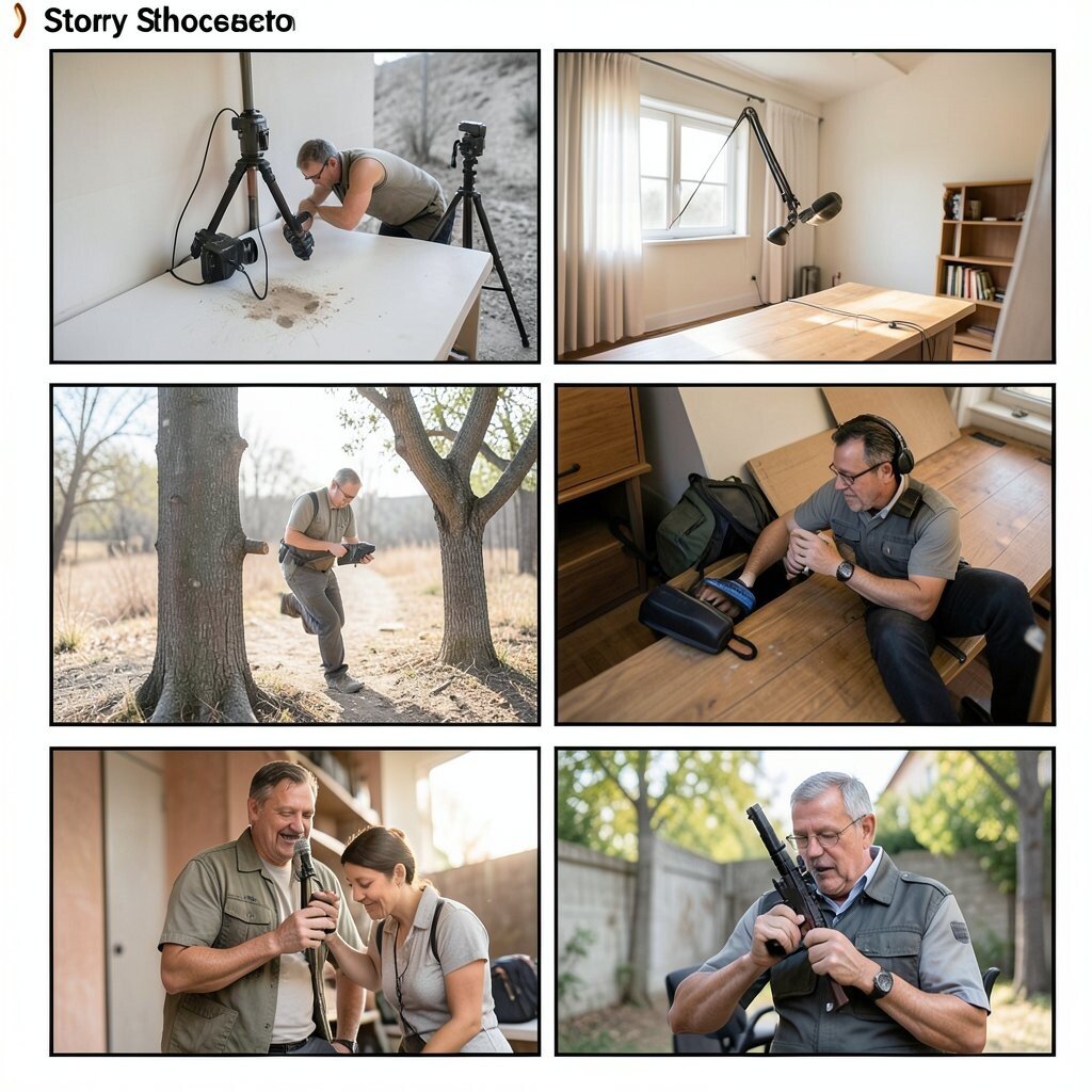
) The Storyboard Panels Think of your layout as a comic strip, with panels that show actions in order. Each panel holds a small visual moment.
This layout is perfect for teaching, product walkthroughs, or “how it works” sections. People learn faster when they can see steps in pieces.
Try using a consistent frame style and keep each panel focused on one action only. -
10) The Minimal Hero With Side Notes
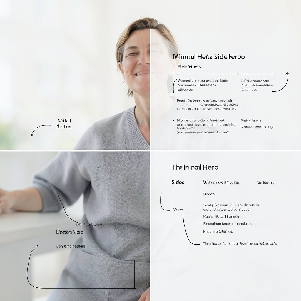
) The Minimal Hero With Side Notes Imagine one big hero image that grabs attention, then neat side notes that give extra detail. The layout feels calm, like a gallery wall.
This concept works great for portfolios, art sites, and personal branding pages. The benefit is that your main work stays in the spotlight.
Keep the side notes short and sweet, with bullet points or tiny labels.Personalize by matching side note colors to your image palette. If budget is tight, use one strong photo and simple text styling instead of many graphics.
A current trend is clean layouts with lots of breathing space, so you will look modern without extra cost. -
11) The Puzzle Piece Sections
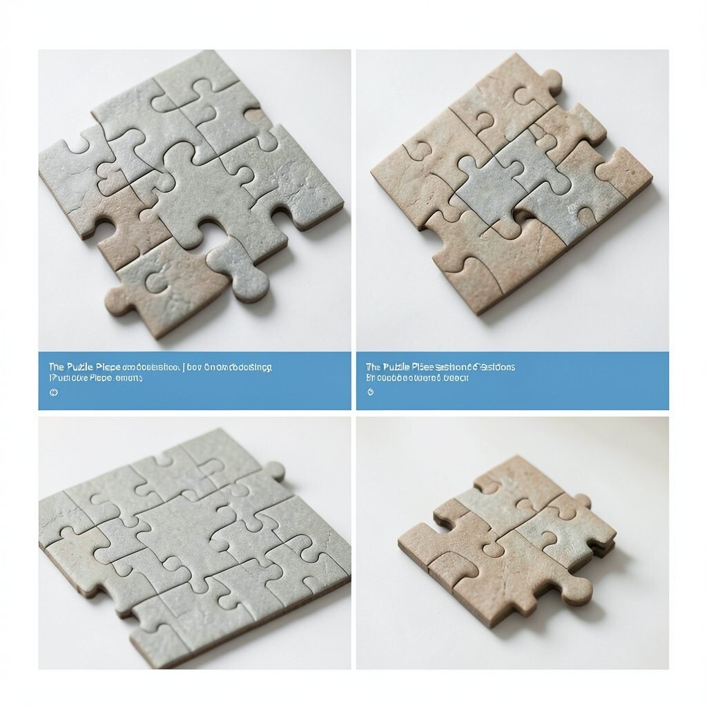
) The Puzzle Piece Sections Picture sections shaped like puzzle pieces, each one clicking into the next. The whole page feels like one complete picture.
This is a fun option for a recipe index, a learning hub, or a services menu. It highlights that each section matters and connects.
Make sure the “puzzle edges” don’t make reading harder; keep text inside safe areas.For tips, use one consistent shape style and vary colors per piece. Personalize by using your theme colors and small icons that feel like “pieces,” such as tabs, gears, or leaf corners.
Cost considerations are good because you can mimic puzzle shapes with simple borders and rounded corners. -
12) The Floating Tiles Market
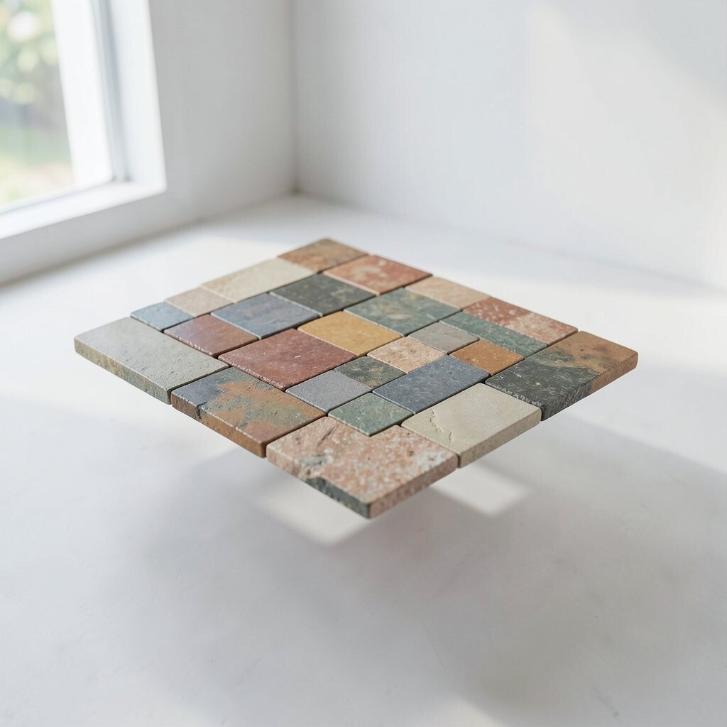
) The Floating Tiles Market Imagine a busy street market, but everything is neat and aligned. Tiles float in rows, like little stalls showing ideas.
This layout is ideal for collections, blog categories, and resource lists. The benefit is a lively feel without losing structure.
Keep tile sizes consistent and use one tile style for all items.Tips: add hover-like emphasis using subtle color change or shadow, even in static designs. Personalize by labeling tiles with your tone, like “quick wins,” “favorite picks,” or “tools I use.”
For costs, start with a template and swap only images and titles.Current trends often include tile-based discovery panels, so this concept stays relevant while still feeling creative.
-
13) The Radial Star Burst Pages
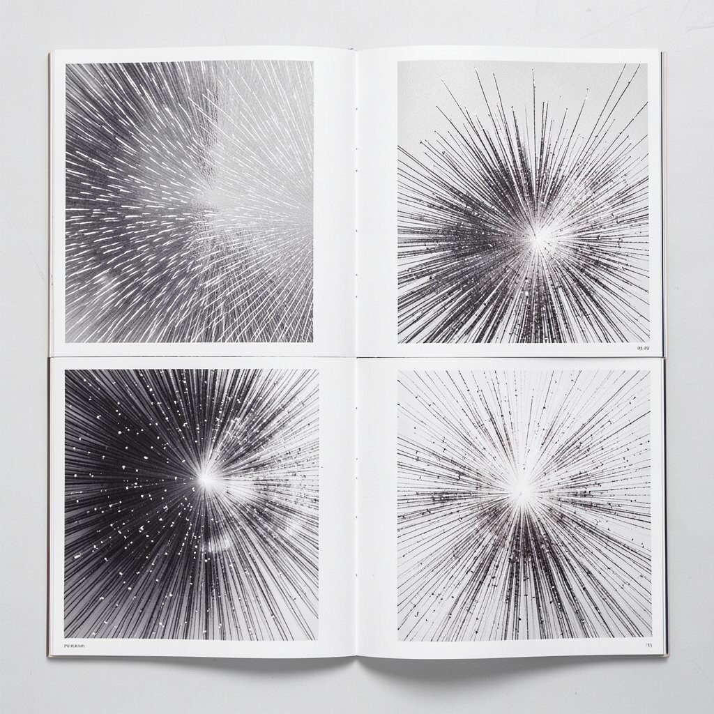
) The Radial Star Burst Pages Picture a starburst shape coming from the center, like rays of light. Each ray holds a theme, a benefit, or a key feature.
This layout works well for event agendas, product benefits, or “top reasons” sections. The benefit is clear emphasis, because everything radiates from one core idea.
Keep each ray short and use simple icons to reduce reading time. -
14) The Folded Map Layout
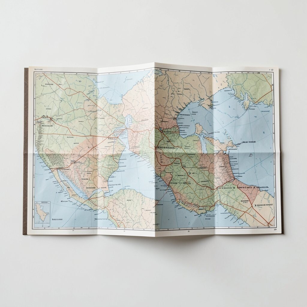
) The Folded Map Layout Imagine your content as a folded paper map, with creases that guide the eye. Sections feel like they open up as you move along.
This concept is great for travel content, studio classes, or brand story pages. It adds charm because it looks tactile and handmade.
For tips, use “crease lines” as thin borders and keep the text aligned to the fold directions.Personalize by adding small stamps, like “route,” “note,” or “favorite spot.” If your budget is low, you can use simple line art and muted colors to mimic paper texture.
A current trend that fits here is the return of craft-style design, where layouts look less digital and more personal. -
15) The Mirror Symmetry Showcase
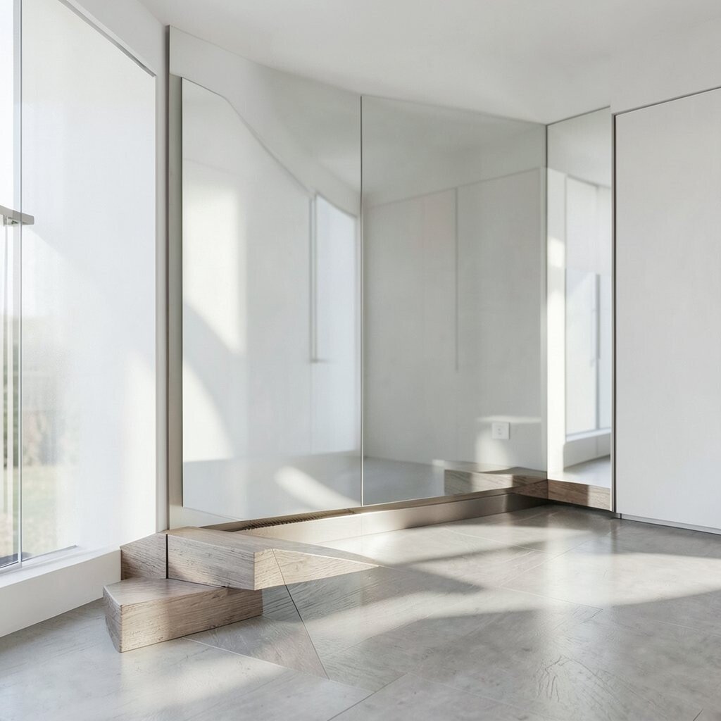
) The Mirror Symmetry Showcase Picture a layout that balances left and right, like a calm mirror. Each side can show a different view of the same theme.
This layout is excellent for before-and-after content, dual pricing, or paired comparisons. The benefit is a strong sense of order and fairness.
Use a center divider line and keep alignment strict so symmetry feels intentional.Tips: choose one side for your story and one side for your proof, like photos or stats. Personalize by selecting different accent colors per side while keeping the same overall style.
Cost considerations are simple because you mainly need alignment, spacing, and a few images or icons.