Color can change the mood of a page in an instant. When you pick well, your design feels like it was made just for people.
-
1. Start With One Feeling
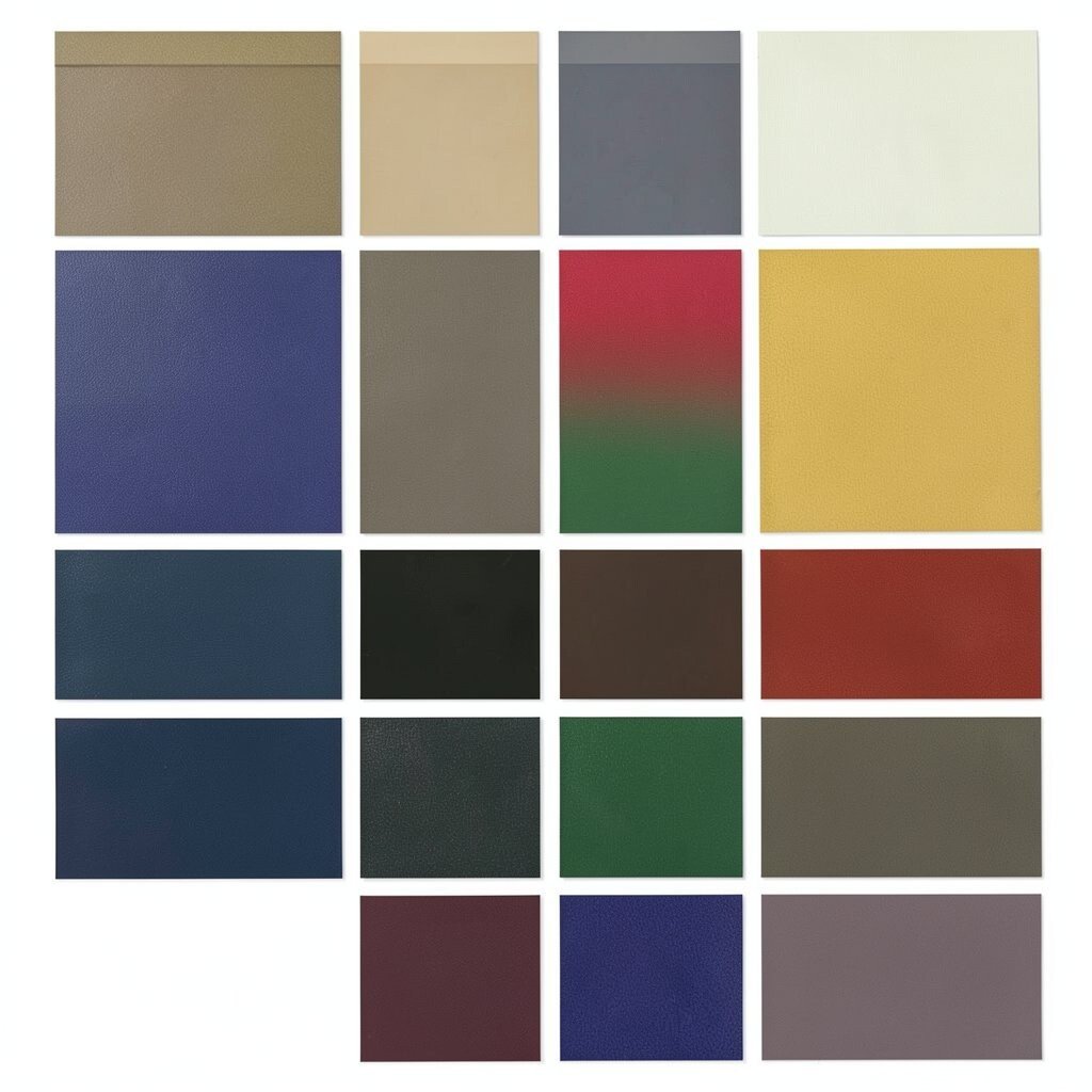
Start With One Feeling Think about how you want people to feel when they land on your design.
Picture a scene in your mind: warm sunlight, rainy streets, cozy bedtime, or bright playground energy.Then choose a main color that matches that feeling.
For example, soft greens often feel calm, while bold reds can feel urgent and exciting.
If your design is for friends, a friendly palette will look inviting instead of harsh. -
2. Choose a Color Family You Love
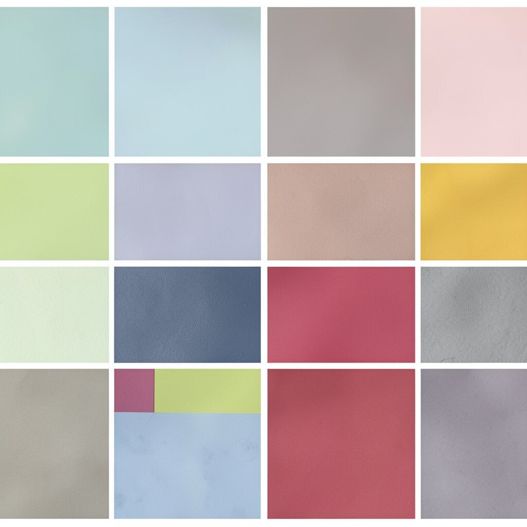
Choose a Color Family You Love Pick a color family first, like blues, oranges, pinks, or earthy browns.
You can see these families everywhere in nature, art, and clothing, which makes them easy to trust.A blue family might look cool and steady, with gradients that feel airy and clean.
An orange family can glow like sunset, making buttons and headings feel more alive.To keep it personal, save a few colors you already enjoy in real life.
Maybe it is your favorite hoodie, your kitchen tiles, or the leaves outside your window.
Use those as your starting clues, not strict rules. -
3. Use a Simple “Main, Support, Accent” Plan
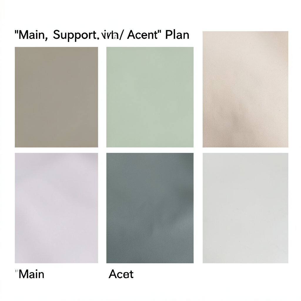
Use a Simple “Main, Support, Accent” Plan A good palette usually has a main color, a support color, and one accent color.
This structure helps your layout feel organized instead of chaotic.The main color covers big areas like backgrounds or big blocks.
The support color supports text, cards, and secondary areas so everything stays readable.The accent color is the “wow” color that catches the eye for links, icons, and important buttons.
Try keeping the accent to small spots so it stays special.Tip: If everything feels important, nothing feels important.
Let only one or two elements do the talking at a time. -
4. Build a Scale From Dark to Light
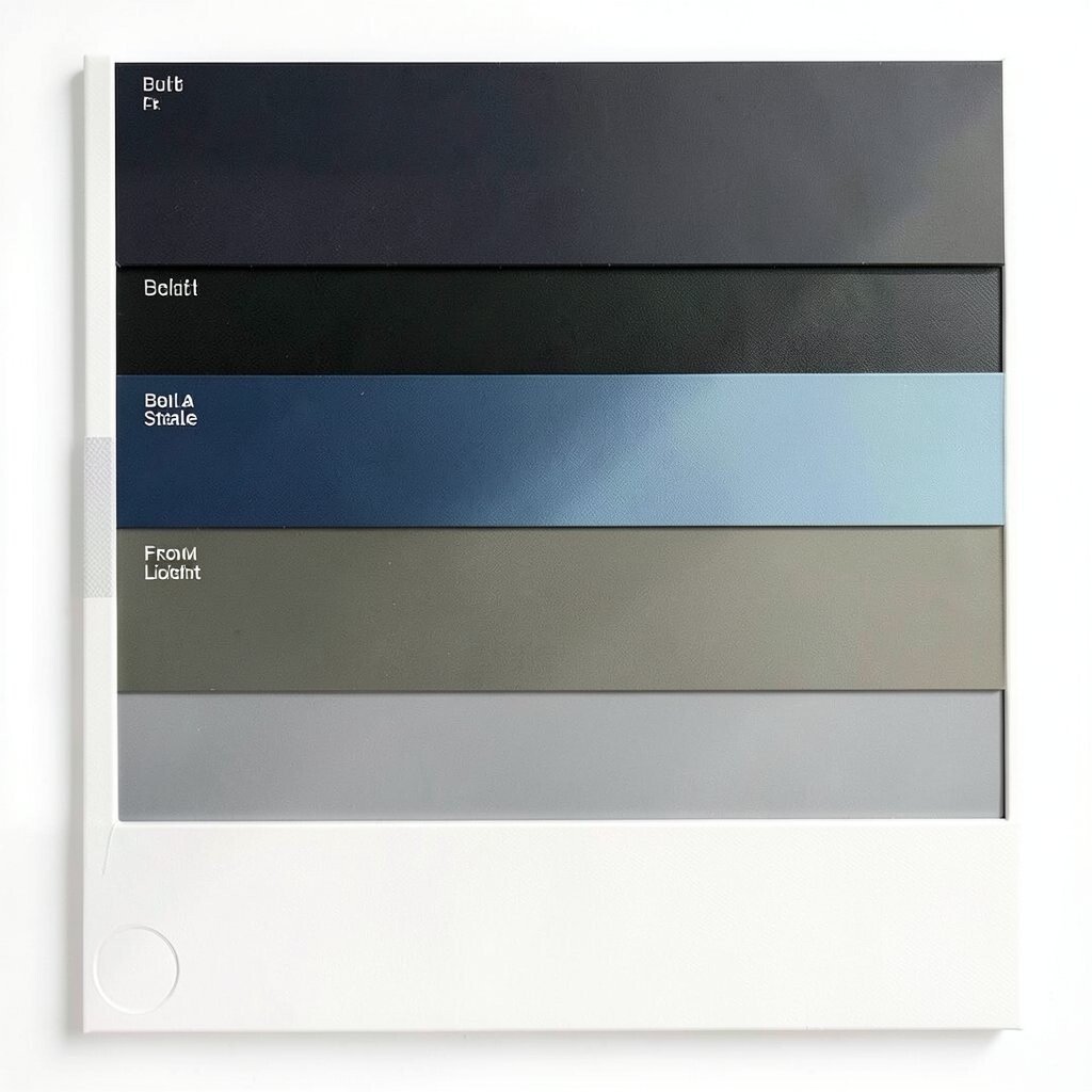
Build a Scale From Dark to Light Create contrast by planning a scale that goes from light to dark.
You want easy-to-read text and smooth-looking shadows.If your design has a light background, pick darker shades for headings and body text.
If your design uses a dark theme, choose lighter shades for readability and add gentle background tones for comfort. -
5. Match Warm and Cool Colors on Purpose
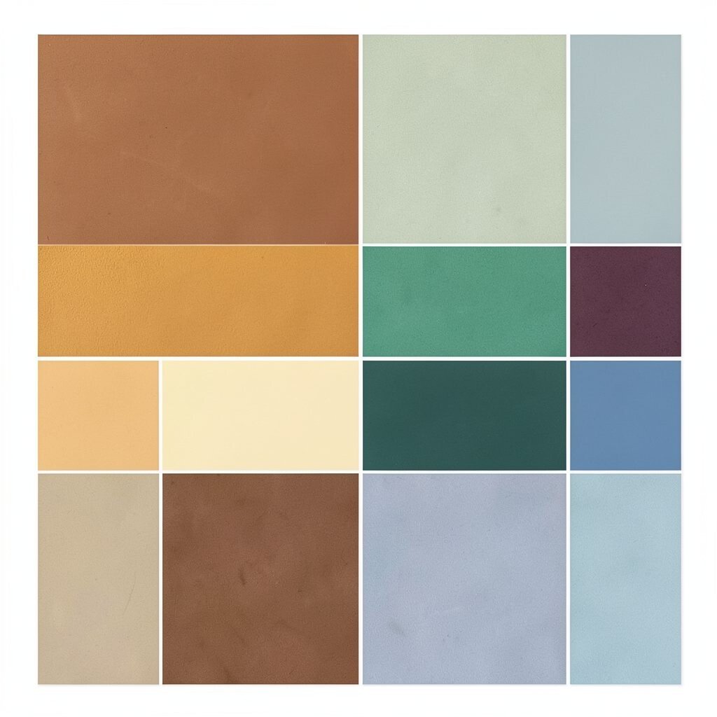
Match Warm and Cool Colors on Purpose Warm colors like red, orange, and yellow feel lively and near.
Cool colors like blue, teal, and purple feel calm and far.When you mix them, aim for balance instead of random pairing.
Put the warm color in the part you want to feel bold.Then use cool colors for backgrounds so the design feels steady.
This kind of pairing often makes layouts look more “designed” without extra work. -
6. Look at Real Photos for Instant Inspiration
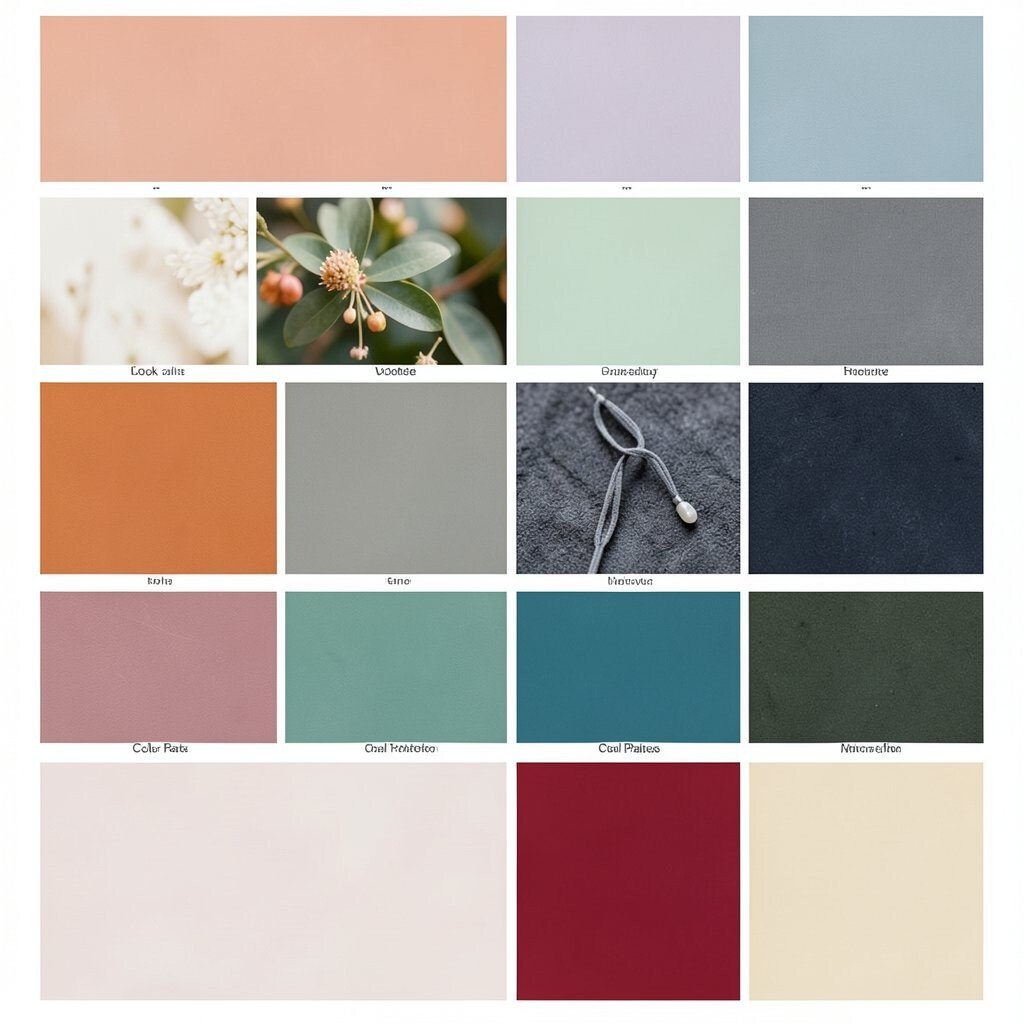
Look at Real Photos for Instant Inspiration Find a photo with a mood you like, then notice how the colors work together.
The sky, shadows, and highlights often hide a perfect set of palette hints.Try this: pick one color from the brightest area, one from a mid-tone, and one from a deep shadow.
This gives you contrast that already looks natural.You will also get a uniqueness boost because your palette comes from real scenes, not just color charts.
For cost, use free photo sites or your own pictures from travel and nature. -
7. Use a Color Wheel, But Keep It Flexible
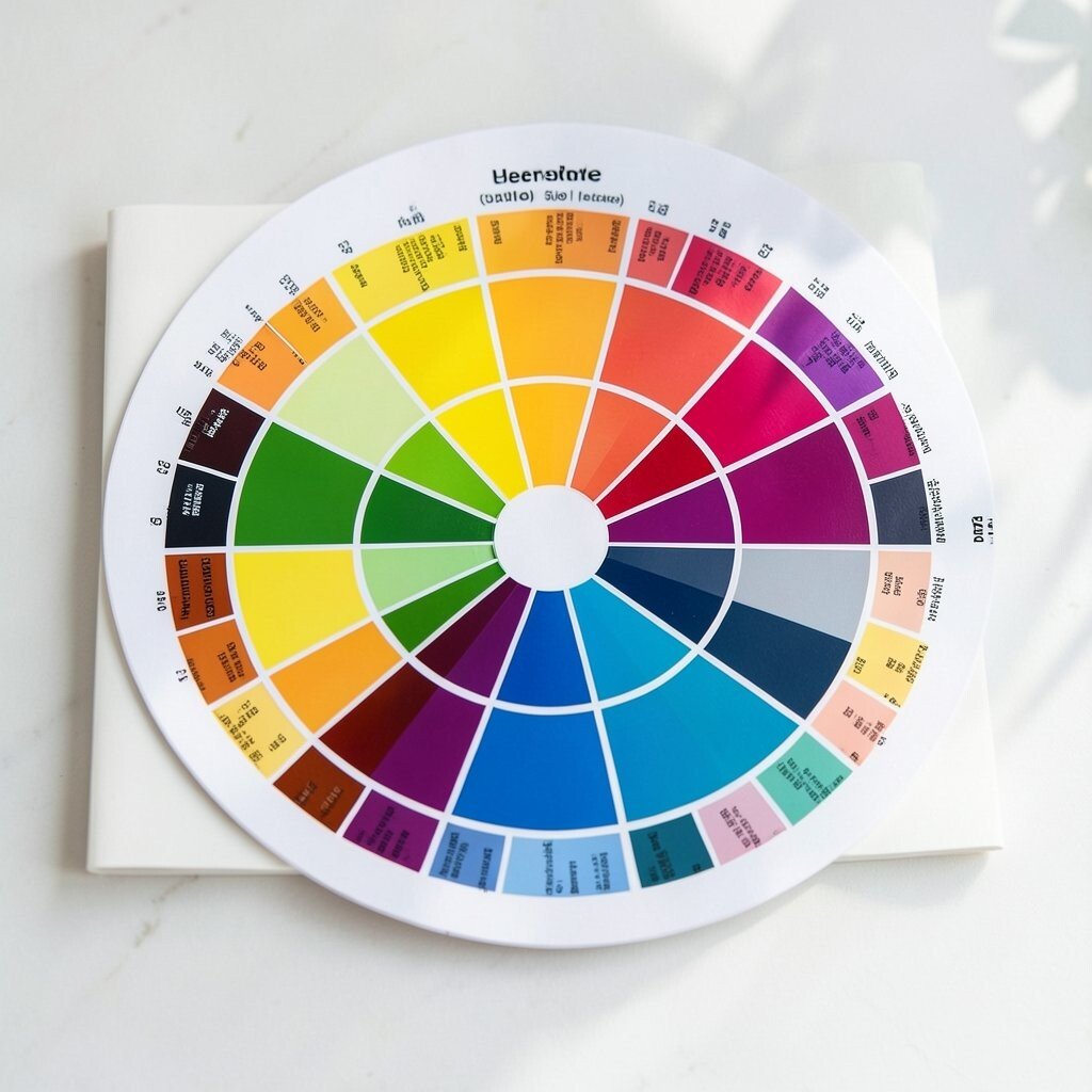
Use a Color Wheel, But Keep It Flexible A color wheel helps you choose related colors without guessing.
Complementary colors, for example, sit across from each other and can create strong energy.Analogous colors sit next to each other and feel smooth and calm.
Either way, you should adjust saturation and brightness so the palette fits your audience.Tip: If two colors fight, try muting one slightly.
Tiny changes can make the same pair feel friendly instead of loud.Personalize the wheel method by using colors you see in your favorite brands.
Study how their accents pop while backgrounds stay comfortable. -
8. Pick One Neutral That Does Real Work
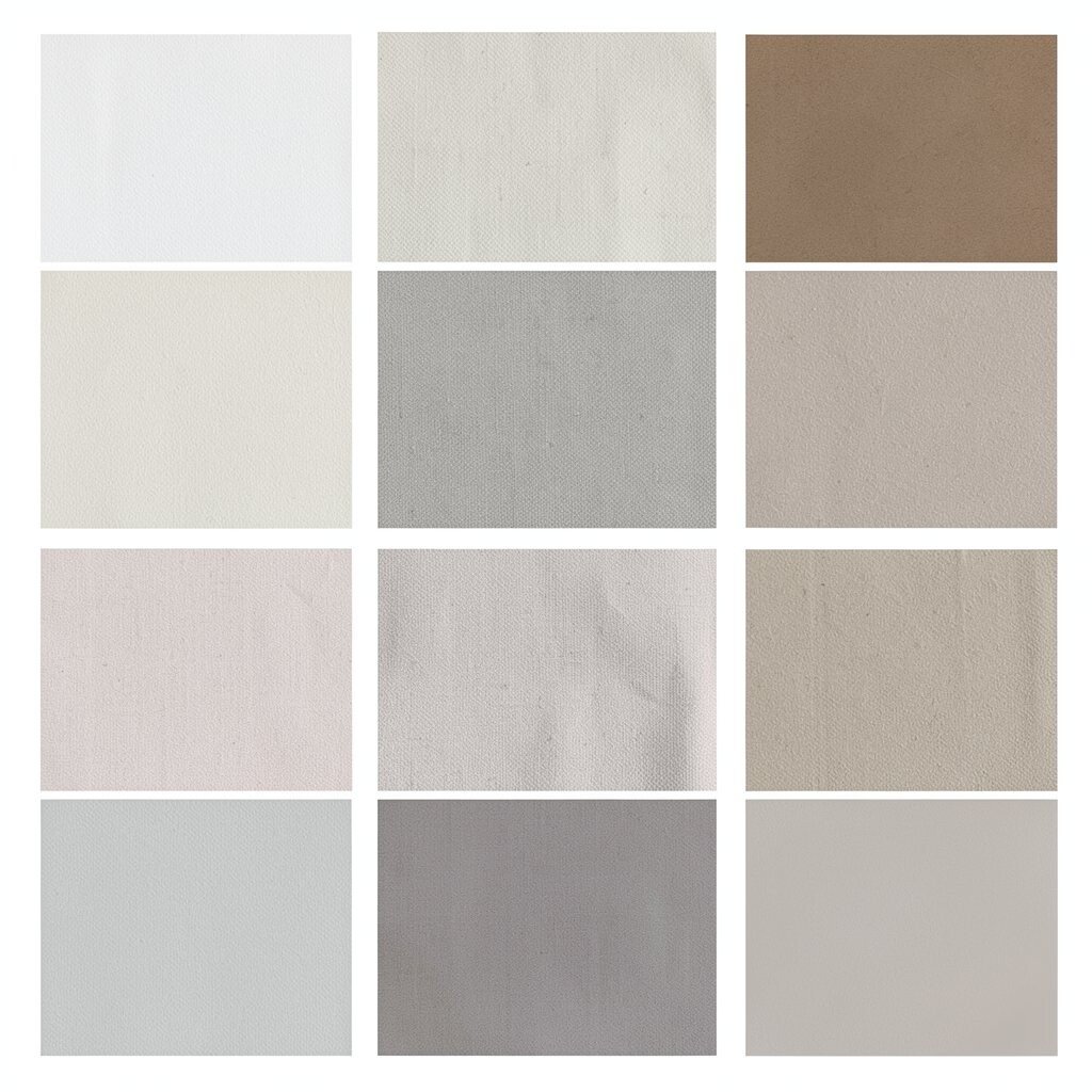
Pick One Neutral That Does Real Work Neutrals make your palette usable in real layouts.
Without them, your design may look pretty for a moment but feel messy in practice.Choose a neutral like off-white, light gray, warm beige, or deep charcoal.
Then use it for backgrounds, borders, and text areas that need calm. -
9. Limit Your Colors So Your Design Breathes
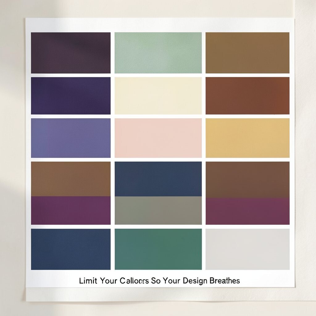
Limit Your Colors So Your Design Breathes It is tempting to pick many colors, but fewer can look more premium.
When your palette is tight, every color feels intentional.Decide what colors are for “structure” and what colors are for “attention.”
Structure colors keep the page organized.Attention colors should be rare, like a bright sticker on a clean notebook.
This also helps with cost, because you avoid extra assets and complex styling. -
10. Check Accessibility With Contrast Thinking
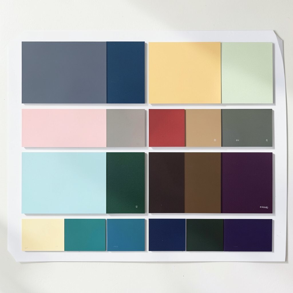
Check Accessibility With Contrast Thinking Beautiful colors are not enough if text is hard to read.
Use strong contrast for body text and important labels.For example, dark text on a light background usually reads clearly.
If you use light text on dark backgrounds, make the light shades bright enough to stand out.A helpful tip is to test your palette on a grayscale preview.
If the text still separates from the background, you are on the right track. -
11. Add Texture With Subtle Tints and Shades
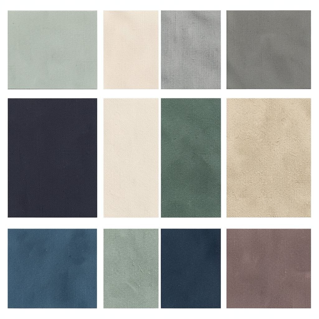
Add Texture With Subtle Tints and Shades You can create depth without adding new colors by using tints and shades.
Tints are lighter versions, and shades are darker versions of the same color family.Imagine a button that starts with a mid-tone, then gets a slightly darker edge for depth.
That small change makes the whole interface feel more touchable.You can also use gentle gradients, like a soft top-to-bottom fade.
This trend is popular right now because it looks modern while staying smooth.Personalize it by using your accent color in different strengths, not totally new hues.
Your palette will feel consistent and unique at the same time. -
12. Design a “Color Role” Map Before You Start
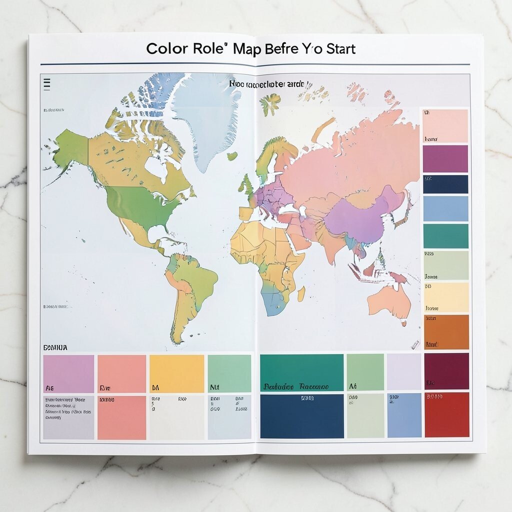
Design a “Color Role” Map Before You Start Make a quick list of where each color will go.
For example, background, headings, body text, links, borders, and buttons.When you know the role, choosing shades becomes easier and faster.
It also prevents the classic problem of “What color is this supposed to be?” -
13. Test the Palette in Real Layouts
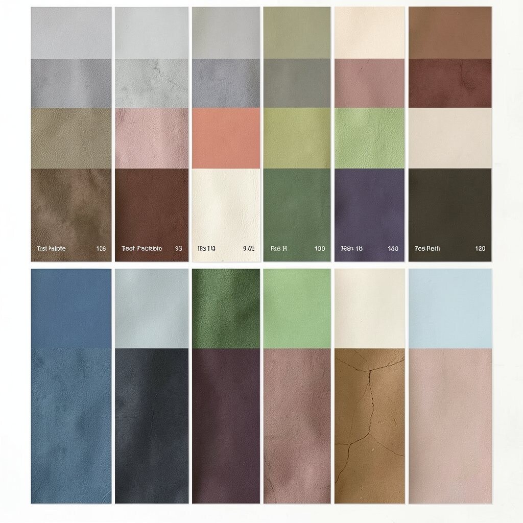
Test the Palette in Real Layouts A palette can look amazing in a color picker and still fail in a real mockup.
Test it on a header, a card, a form, and a button.Place the text and see if it feels calm and readable.
Add a few icons and make sure the accent color clearly signals action.If something looks off, fix the shade first, not the whole palette.
Small adjustments keep your design cost lower because you do not need to rebuild everything. -
14. Use Mood Boards to Keep Your Choices Consistent
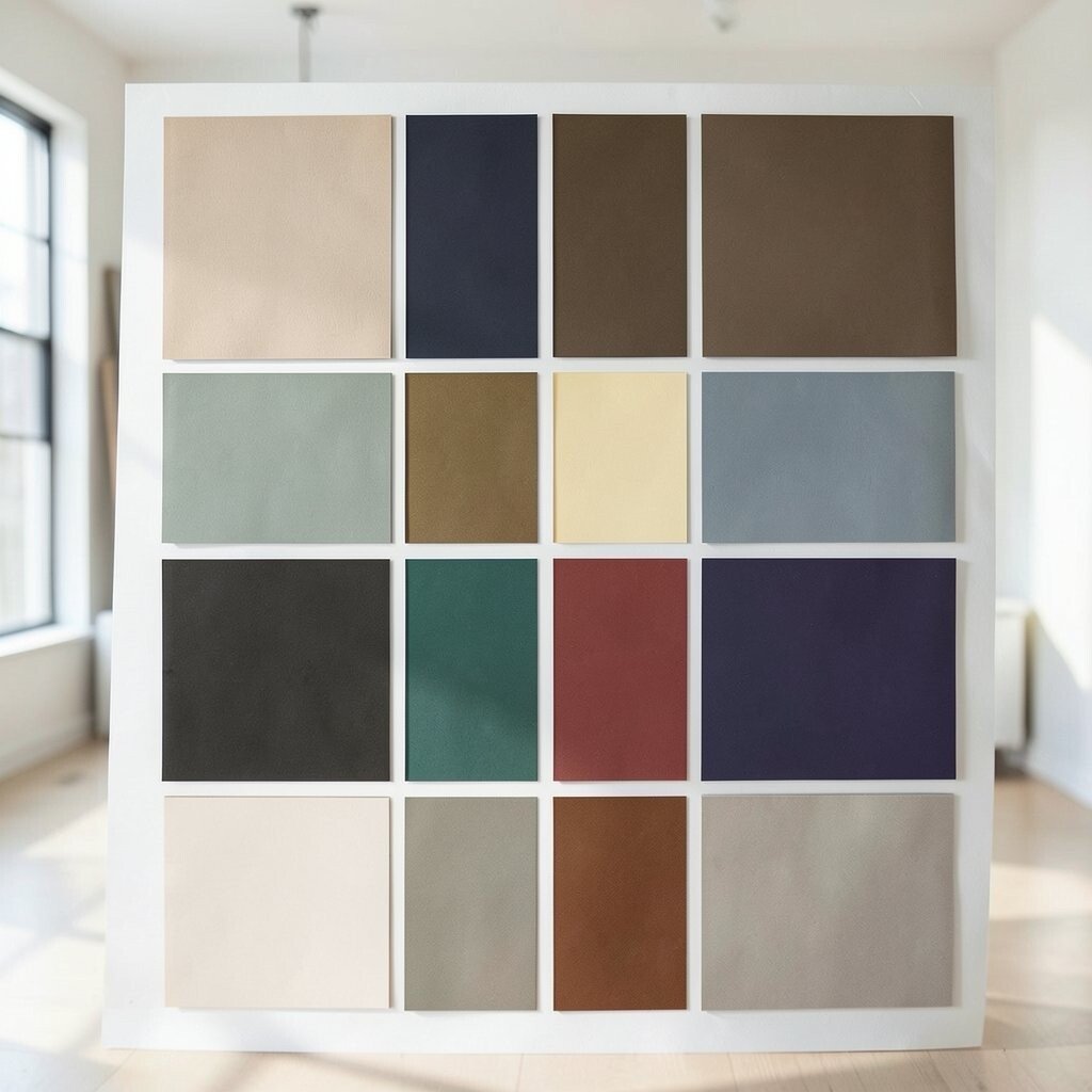
Use Mood Boards to Keep Your Choices Consistent A mood board is like a visual contract with your own taste.
Gather colors from your favorite images, patterns, and design screenshots.Then look for repeated themes, like “soft and creamy,” “bold and playful,” or “sleek and modern.”
These themes guide your choices when you feel stuck.For uniqueness, include a tiny surprise color that fits the story.
Maybe a gentle lavender with a sunny gold note, or a teal with a warm clay accent. -
15. Try Limited Palettes With One Bold Accent
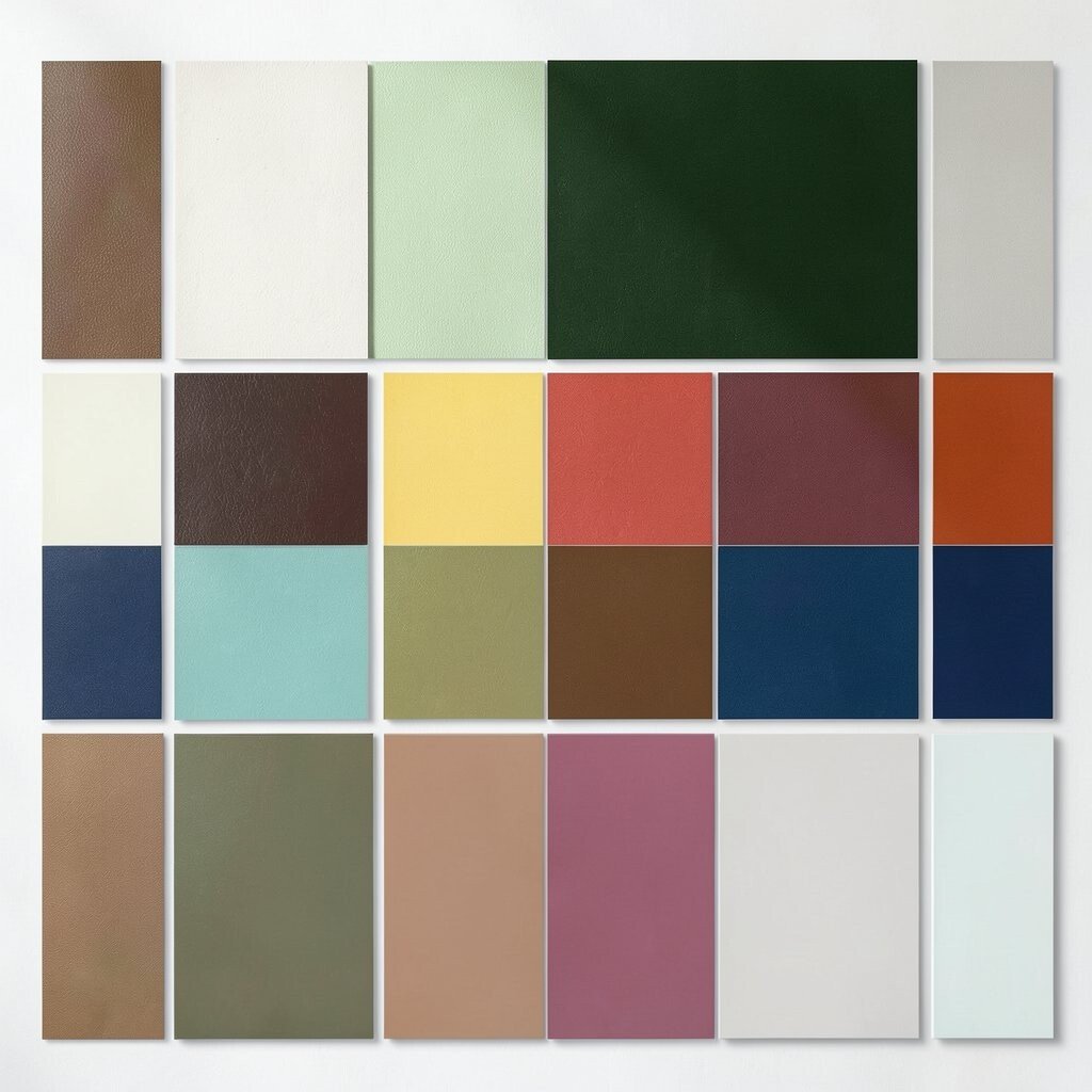
Try Limited Palettes With One Bold Accent A limited palette can feel extra stylish when you let one accent do the work.
Think of it like a ring of color around a simple outfit.Keep the rest of the design in neutrals and mid-tones, then use the accent for CTAs and key highlights.
This helps your eye move in the right order.Tip: If your accent is bright, use it sparingly and pair it with calming neutrals.
This style is popular in modern UI because it feels clean and focused. -
16. Personalize With Cultural and Brand Stories
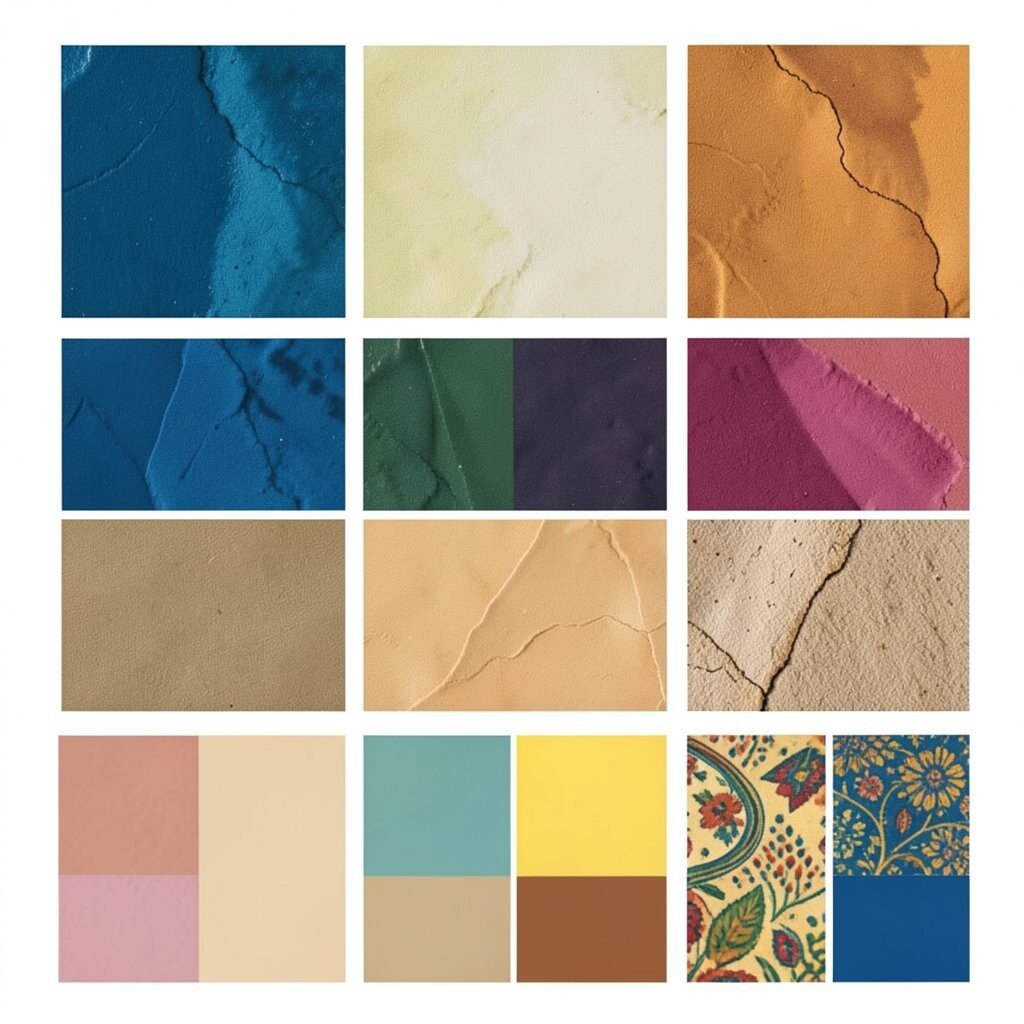
Personalize With Cultural and Brand Stories Colors can carry meaning, like trust, celebration, calm, or courage.
Use that meaning to match your audience and your brand voice.For personalization, connect colors to a story: local landmarks, family traditions, or the feeling of a place.
People love when design has a quiet reason behind it.It also supports uniqueness because your palette will not look like everyone else’s.
Cost stays low when your “source” is your own memories and notes. -
17. Watch Current Trends, Then Adjust for Your Style
Watch Current Trends, Then Adjust for Your Style Color trends can be fun, like bright neon touches, gentle pastels, and soft gradient backgrounds.
But trends should match your message, not overpower it.Try one trend element in a small way, such as a subtle gradient behind a hero section or a pastel accent on a card.
If it feels right, you can build on it slowly.A friendly tip: keep a stable neutral base so trend changes do not break your layout.
That way, you can refresh accents without rebuilding everything.For cost considerations, plan assets so you can reuse the same base components.
This makes updates faster later. -
18. Create Your Own Palette Toolkit for Next Time
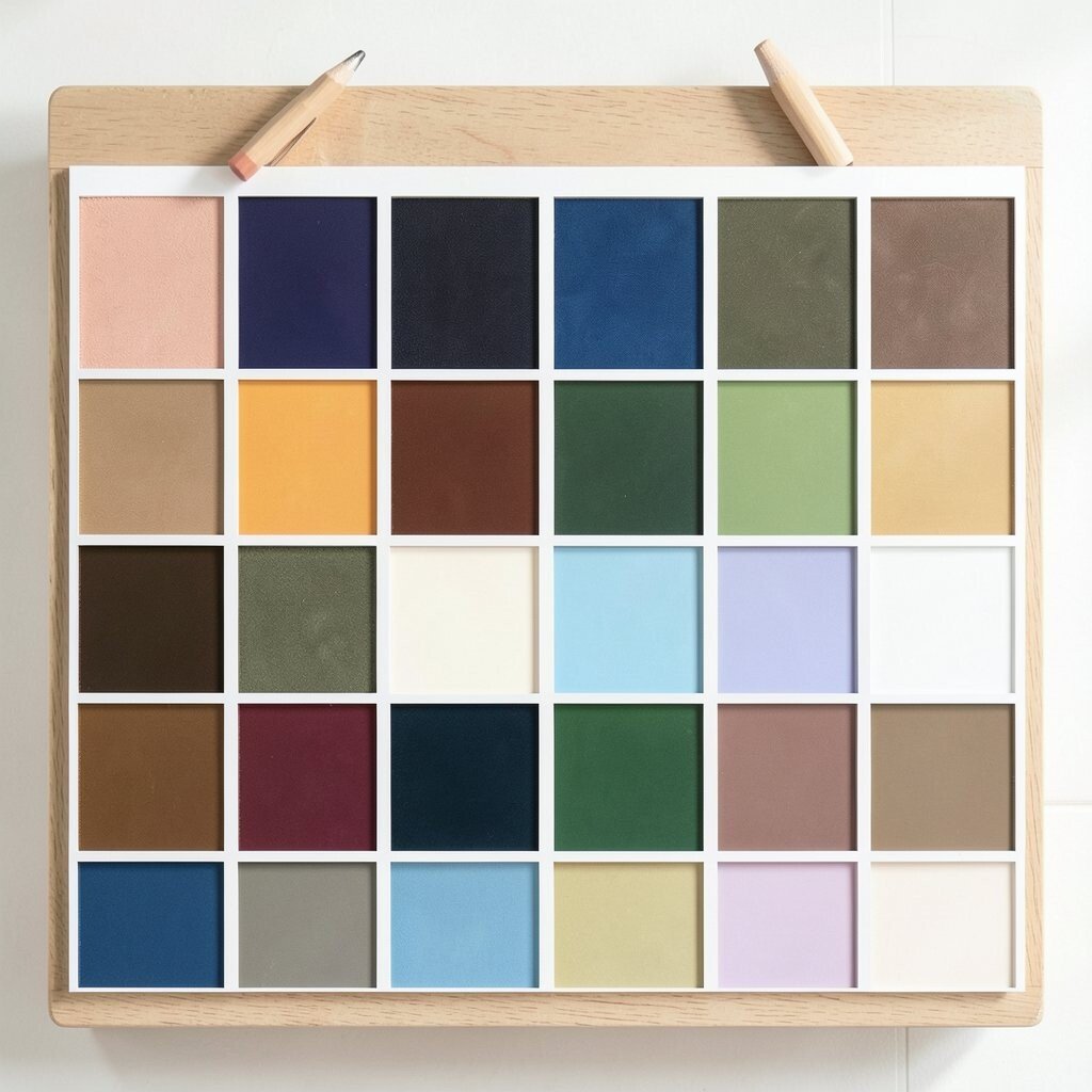
Create Your Own Palette Toolkit for Next Time When you make a palette you love, save it as a toolkit for future projects.
Store it with the roles: which color is the background, which one is the accent, and which one is for text.Make versions for different uses, like a lighter theme and a darker theme.
This helps you move quickly next time while keeping your style consistent.You can also keep notes like “this shade works best for buttons” or “this neutral feels warm.”
Personal touches make your toolkit smarter and more unique over time.