Small kitchens can still feel roomy and calm. The right color choices make everything look brighter and more organized.
-
Soft White Cabinets With Warm Undertones
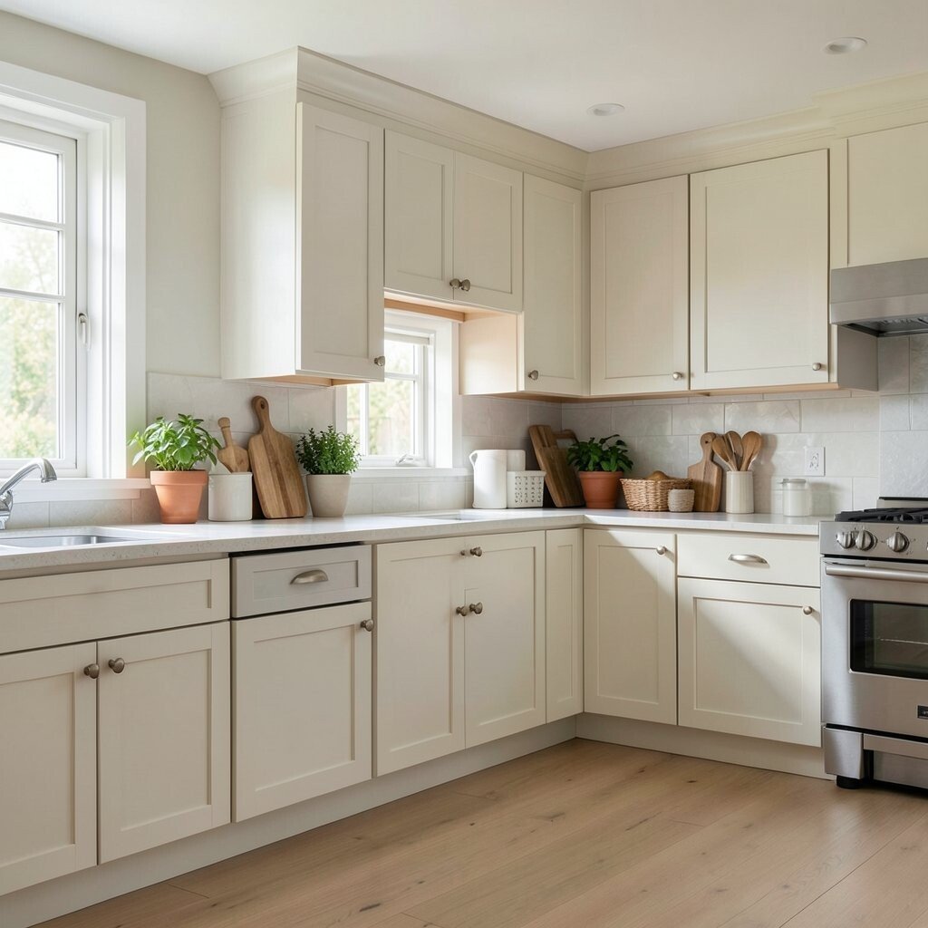
Soft White Cabinets With Warm Undertones Soft white cabinets make a kitchen feel airy right away. Choose a warm undertone so the space feels welcoming, not cold.
This color works great with most countertops and floors, so it helps you avoid big redesigns. The bright surface also bounces light around, which makes shadows feel softer. To personalize it, add cabinet hardware in matte black or brushed brass for a small but bold upgrade.
-
Creamy Off-White Walls for Gentle Depth

Creamy Off-White Walls for Gentle Depth Off-white walls add a cozy glow without taking over the room. They also create a “buffer” between cabinets, flooring, and backsplash tiles.
Use a matte or eggshell finish for an easy, forgiving look. If your kitchen gets lots of daylight, even slightly deeper creams can still feel light. Try matching the paint to the grout color in your backsplash so everything lines up visually.
For cost, a wall paint refresh is one of the most budget-friendly changes. If you rent, use a test patch first and confirm it looks good at night with your overhead lights. This idea is especially popular right now because warm neutrals stay timeless and modern.
-
Light Greige for a Clean, Modern Feel
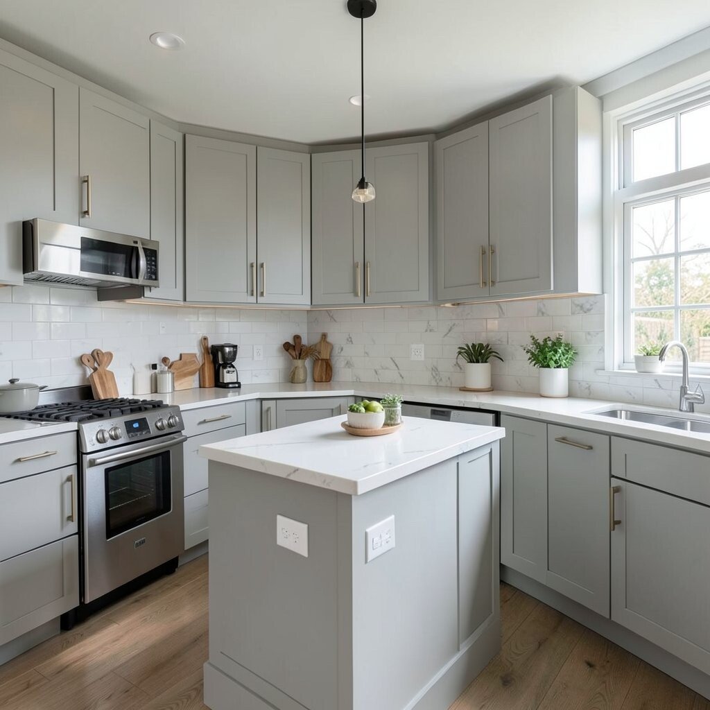
Light Greige for a Clean, Modern Feel Greige sits between gray and beige, giving your kitchen a smart, balanced look. It can make the room feel neat and uncluttered.
Pair light greige walls with white trim and a subtle backsplash for a smooth, airy flow. The color helps hide tiny marks better than bright white. If you want a personal touch, use a linen-toned curtain or a soft tan rug to warm things up.
This approach also helps with open shelving because items look intentional instead of messy. In terms of cost, paint is usually cheaper than replacing cabinetry. Many kitchens are leaning into “soft modern” palettes, and greige fits that trend well.
Tip: check the undertone in daylight, because some greiges lean more yellow or more pink. Once you like the sample, coat the walls in a high-quality primer for best coverage and easier cleaning.
-
Charcoal or Graphite Accents Without Making It Dark
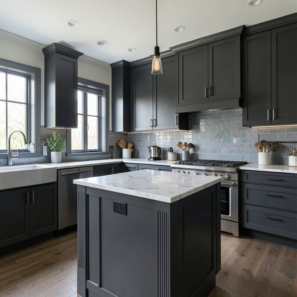
Charcoal or Graphite Accents Without Making It Dark Dark accents can actually help a small kitchen feel styled, not cramped. Use charcoal or graphite on just one feature, like a backsplash, island edge, or cabinet pulls.
This contrast makes everything else look brighter by comparison. Keep the main surfaces light so you still get that open feeling. For personalization, try a charcoal subway tile with a white grout for a crisp, modern look.
-
Pastel Blue for a Fresh, Airy Mood

Pastel Blue for a Fresh, Airy Mood A light pastel blue can make your kitchen feel calm and airy. It also looks extra cheerful when paired with white cabinets and warm wood details.
This color is great for maximizing space because it feels like sky and soft daylight. Add a simple tray in a matching blue shade to tie the look together. If you love organization, use blue-labeled canisters or matching storage bins to keep counters tidy.
Cost-wise, painting a single wall or adding blue tiles can be more affordable than a full cabinet repaint. A current trend is using gentle color pops instead of going fully bold. Try to keep the blue light so the room stays bright and open.
-
Greenery Tones: Sage for Calm and Clarity
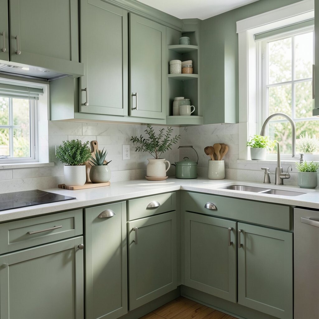
Greenery Tones: Sage for Calm and Clarity Sage green gives a kitchen a fresh vibe without feeling too loud. It can make the whole space look cleaner and more relaxing.
Use sage on walls or on lower cabinets, then keep uppers white to maintain brightness. Sage also pairs beautifully with natural stone countertops and light wood shelves. For personalization, add a small plant corner and choose planters in cream or clay tones.
-
Muted Terracotta for a Cozy, Spacious Warmth

Muted Terracotta for a Cozy, Spacious Warmth Muted terracotta adds warmth like a soft sunset, even in a small kitchen. The trick is using it in a way that doesn’t overpower.
Try terracotta in a backsplash, a few cabinet doors, or a patterned tile. This adds visual texture, which makes the space feel more interesting instead of plain. To personalize, bring in terracotta-toned dishware and textiles so the color feels intentional.
Budget note: backsplash updates can vary, so decide early whether you want paint-and-peel tiles, peel-and-stick accents, or full tile. Terracotta is showing up more in modern kitchens lately because it feels earthy and stylish. Choose softer, dusty terracotta shades to keep the light bouncing nicely.
-
Sunny Yellow in Small Doses
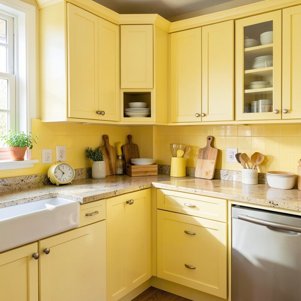
Sunny Yellow in Small Doses Yellow can make a kitchen feel brighter instantly. Even a small splash of sunny tone can bring energy to an otherwise neutral room.
Use it for accessories like canisters, bar stools, or a single accent wall. Balance yellow with white cabinetry and light gray or warm wood flooring to avoid a heavy look. A fun personalization idea is matching the yellow in the backsplash grout for a subtle, tidy harmony.
-
Soft Blush for a Light, Stylish Contrast

Soft Blush for a Light, Stylish Contrast Blush can look sweet and modern, especially with white kitchens. It creates a gentle contrast that helps the room feel more layered.
Paint lower cabinets blush or choose blush-look tiles for a backsplash with a delicate pattern. This keeps the color in the “lower field,” which can visually ground the room while still feeling open. For personalization, add warm metals like brass or rose-gold toned handles.
Cost matters, so consider repainting only one section or swapping hardware first if you’re on a tighter budget. Blush is also part of a wider trend toward soft, “lived-in” color palettes. Keep the shade pale so it reflects light instead of absorbing it.
-
Warm Wood Finishes and Color-Paired Paint

Warm Wood Finishes and Color-Paired Paint Light wood tones make kitchens feel natural and roomy. They also pair well with many colors, so it’s easy to get a custom look.
Choose light oak or birch-inspired finishes on open shelves and add paint colors like off-white or soft gray on the walls. This combo gives your eyes a clear path, which helps the room feel organized. Personalize by mixing a few wooden utensils in matching tones for a “styled” but practical look.
If you’re thinking cost, refinishing existing wood can be cheaper than replacing cabinetry. You can also use wood-look vinyl or laminate on shelves and accent surfaces. Right now, people love natural textures because they make small spaces feel calmer and more “homey.”
-
Ivory Cabinets With a Light Gray Backsplash
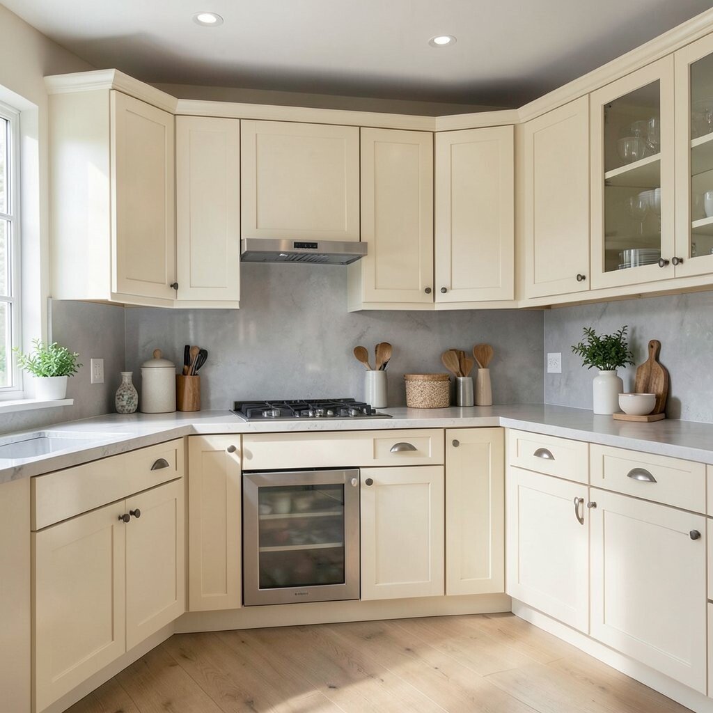
Ivory Cabinets With a Light Gray Backsplash Ivory cabinets look soft, clean, and bright without feeling stark. Add a light gray backsplash to create a gentle frame around your cooking area.
This pairing helps keep your counters and walls from blending into one flat space. A light gray backsplash can also hide minor splashes and stains better than ultra-white. For personalization, pick a backsplash pattern with small movement, like subtle veining or tiny chevrons.
Cost-wise, a backsplash update is often a smarter “space effect” than replacing floors. Trend-wise, light neutral mixes are everywhere because they feel modern and easy to style. Keep grout light to maintain the airy look and avoid heavy lines.
-
Monochrome Whites With Different Textures
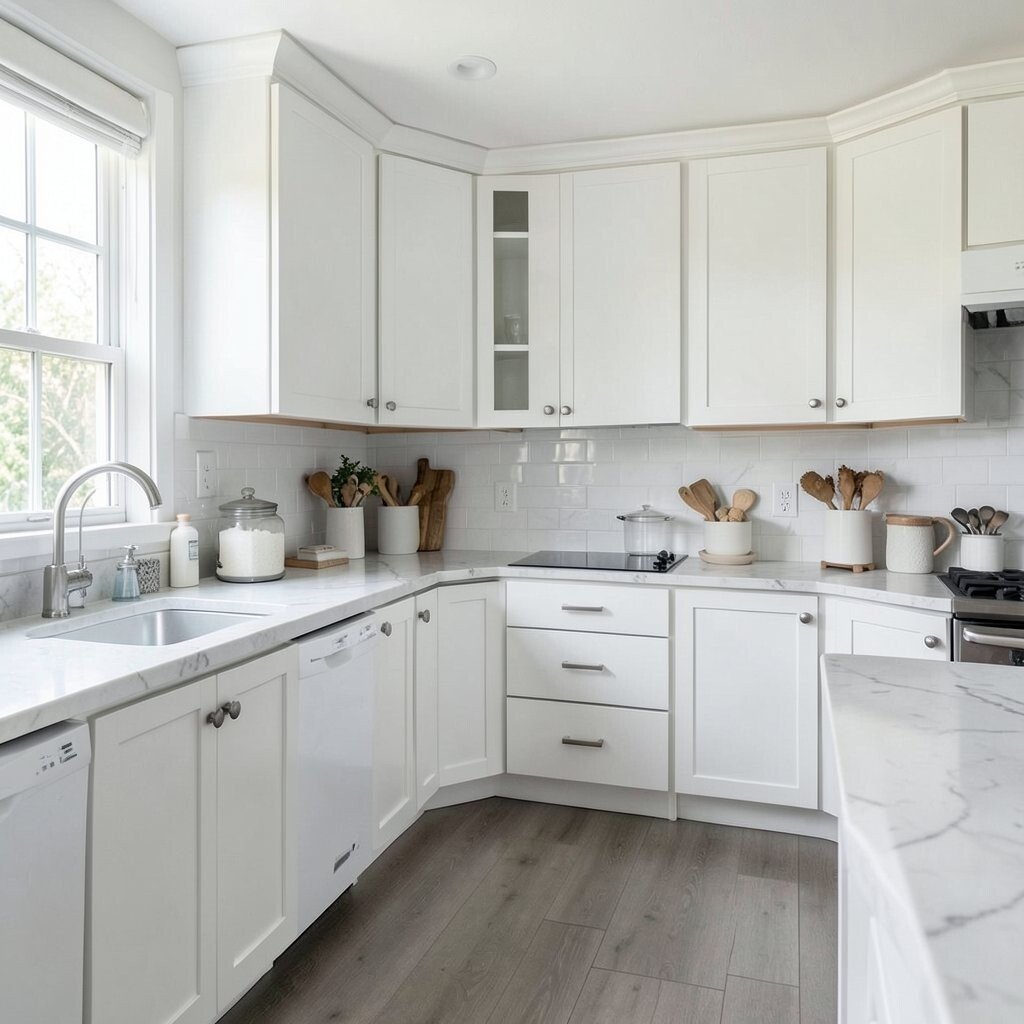
Monochrome Whites With Different Textures You can maximize space using one color family, then change textures. Monochrome white kitchens look extra open when every surface plays a different role.
Try matte white cabinets, a glossy white backsplash, and a countertop with soft gray veining. This keeps the visual interest high without adding extra colors that can clutter. Personalize by mixing finishes—like matte hardware with a satin faucet.
-
One Bold Color on the Island for Focus

One Bold Color on the Island for Focus A bold island color adds personality and creates a clear focal point. When the island stands out, the rest of the kitchen can stay light and calm.
Choose a shade like navy, deep green, or even a rich terracotta, then keep the surrounding cabinets white or cream. This makes the kitchen feel “designed” instead of cramped. Tip: if your kitchen has an open floor plan, match the island color to something nearby, like a rug or accent wall.
-
Soft Navy for a Surprisingly Spacious Look

Soft Navy for a Surprisingly Spacious Look Soft navy is a smart middle ground between dark and dramatic. It can make your kitchen feel elegant while still working in a small space.
Use navy on upper cabinets, an accent wall, or a herringbone backsplash. Pair it with warm white countertops so the navy doesn’t shrink the room. For personalization, choose lighter navy tiles with a subtle sheen so light reflects around the area.
Cost considerations: painting cabinets can be pricier than repainting walls, so decide what part you can afford first. If you can only do a small update, try navy accessories and hardware and see how you feel. Navy kitchens remain popular because they look timeless and they hide scuffs better than very light finishes.
-
Light Gray Walls With Crisp White Trim
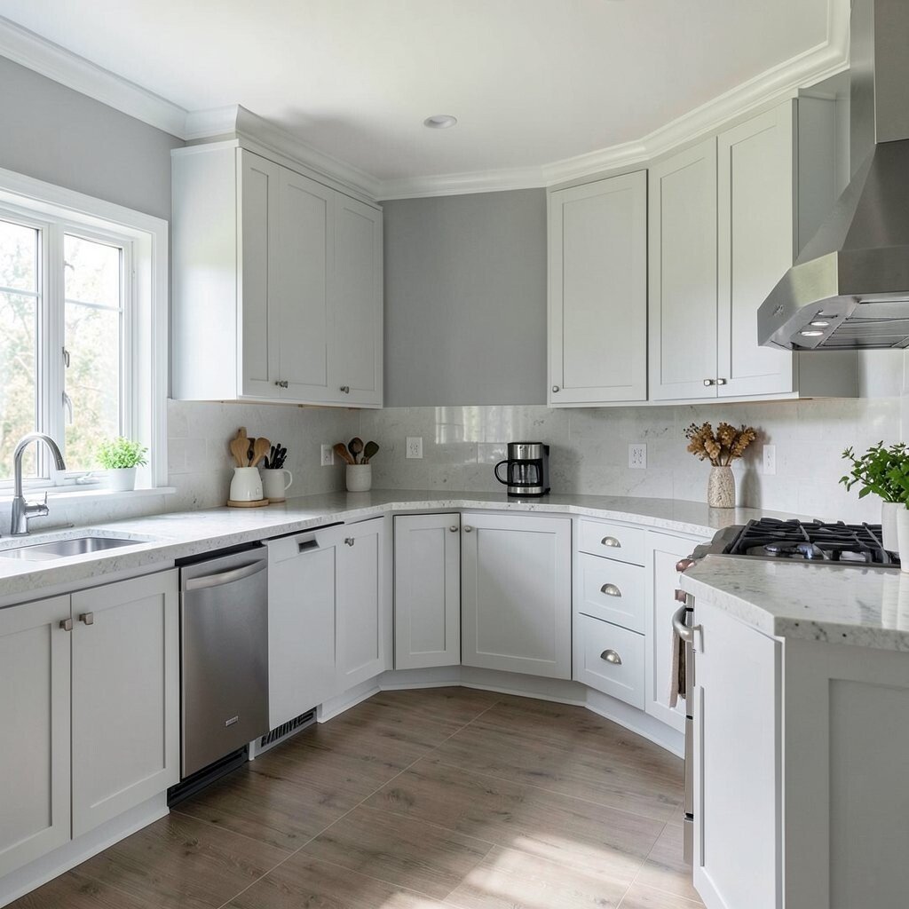
Light Gray Walls With Crisp White Trim Light gray walls give a modern feel while still staying neutral. Crisp white trim sharpens the edges and makes the room look cleaner.
This color combo works especially well when you want your cabinets to feel larger. Use a slightly warmer gray if your kitchen lacks natural light. Personalize with a backsplash that adds tiny color highlights, like soft taupe or pale cream.
For cost, paint is again the easiest win, and you can update trim with simple caulk and fresh coats. Current trend: people are choosing “soft structured” looks with tidy borders. Keep your lighting bright and consistent so the gray stays inviting.
-
Bright White Backsplash With Minimal Grout Lines

Bright White Backsplash With Minimal Grout Lines A bright white backsplash makes your kitchen feel fresh and open. When you keep grout lines minimal, the surface looks smoother and more spacious.
Choose larger tile sizes or use a design that reduces the number of lines. Smooth backsplashes also make cleaning easier, which helps keep counters looking clear. For personalization, add a thin strip of color, like a slim matte black border, only where it feels right.
Cost depends on tile choices, but you can often get a big visual effect without going ultra expensive. This is a common design preference right now because it fits both modern and classic kitchens. Pair it with light cabinet colors so the backsplash becomes a bright backdrop rather than a busy pattern.
-
Warm Beige Walls With White Upper Cabinets

Warm Beige Walls With White Upper Cabinets Beige walls add softness and make kitchens feel calm. When you pair beige with white upper cabinets, the room stays bright and airy.
Beige is also great for hiding tiny everyday wear and tear. Use a slightly richer beige near the floor and keep the trim white for crisp definition. Personalize by adding a patterned rug with beige and cream tones that ties everything together.
If you’re thinking budget, this is a simple paint plan that usually costs less than replacing major items. Beige continues to be popular because it works with many styles—farmhouse, modern, and even coastal. Tip: test swatches at different times of day so the undertones look right in morning and evening light.
-
Steel Blue Countertop-Look Accents
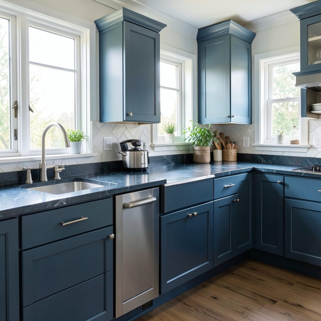
Steel Blue Countertop-Look Accents Steel blue accents bring a cool, clean feeling to your cooking space. Even if your cabinets stay neutral, blue details can make the kitchen look more “finished.”
Consider a backsplash with steel blue tones or a countertop-look contact paper in a marble-inspired style. This kind of visual texture helps the kitchen feel more layered and less empty. For personalization, choose blue mugs, a matching utensil crock, or a blue-tinted glass jar set.
-
Soft Charcoal on Lower Cabinets for Smarter Hiding
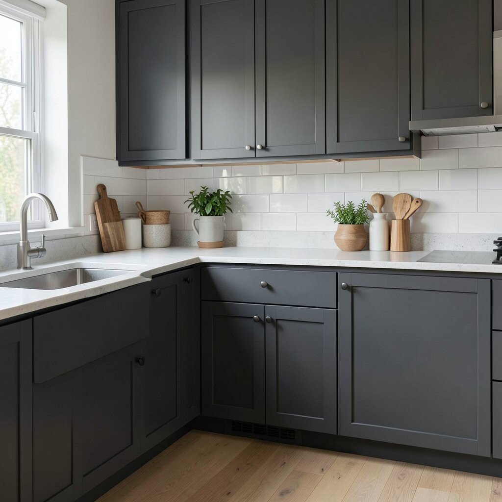
Soft Charcoal on Lower Cabinets for Smarter Hiding Lower cabinets take the most everyday action, so charcoal can be a smart choice. A soft charcoal tone hides marks better than lighter colors.
Keep upper cabinets white or light gray so the kitchen still feels open above. This split-color setup adds depth and helps the room look taller. Personalize by using charcoal cabinet doors with sleek, simple handles for a modern look that doesn’t feel bulky.
Cost-wise, repainting lowers may be cheaper than doing everything, especially if you’re keeping your uppers the same. Charcoal and darker lower cabinets are trending because they look stylish and practical. Tip: make sure your backsplash and countertops are light so the contrast stays crisp instead of heavy.
-
Terracotta or Clay Tones on Open Shelving

Terracotta or Clay Tones on Open Shelving Open shelving can feel cramped if everything looks the same. Clay-toned shelves or shelf accents add a warm background that makes items look arranged.
Use terracotta bins, matching jars, or coordinated baskets to keep the visual clutter low. This benefits your space by turning storage into part of the design. Personalize by labeling jars with handwritten-style labels in cream or dark brown ink.
Cost considerations: you can update open shelving with paint, removable liners, or budget-friendly shelf baskets. Current trend: people love “display and storage” moments, and warm shelf tones make them feel cozy. Choose lighter clay tones if you want extra brightness, especially in kitchens with fewer windows.
-
Cool White With Glossy Highlights for Extra Shine
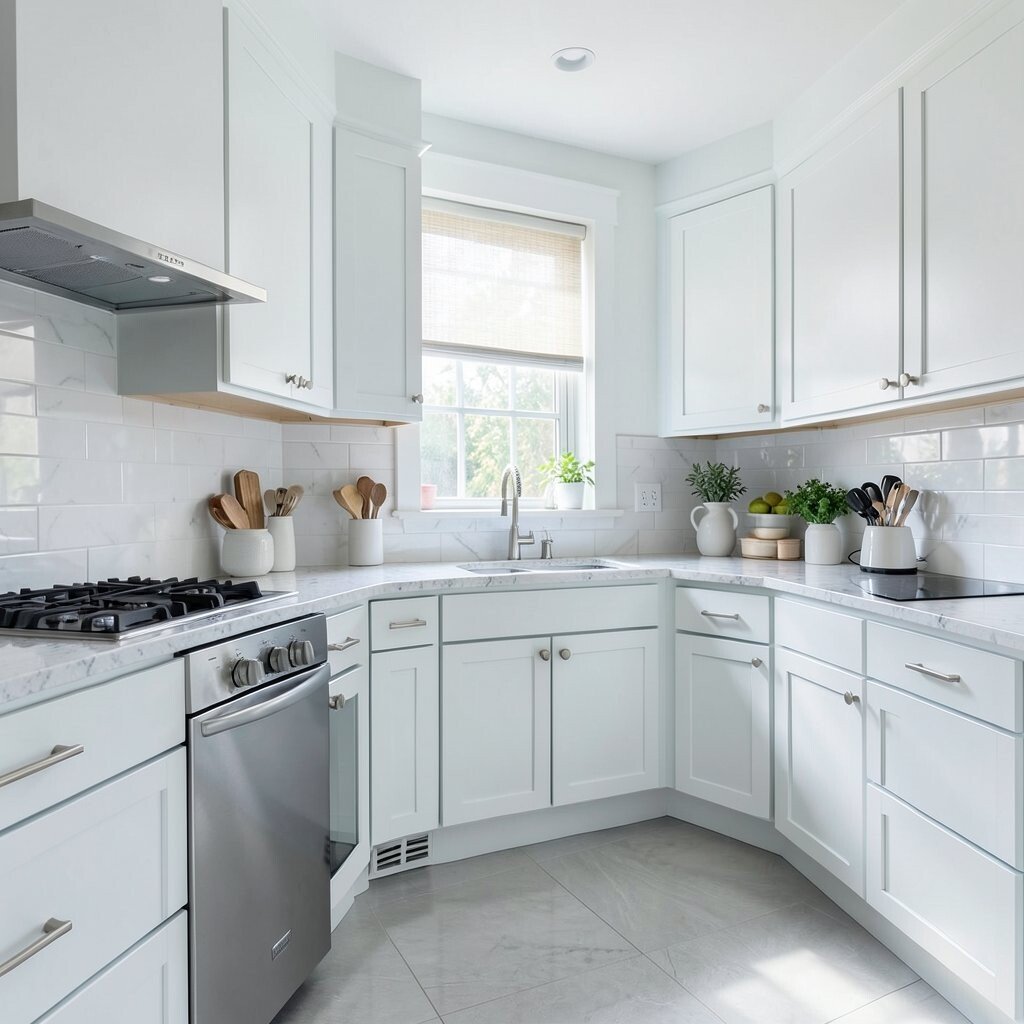
Cool White With Glossy Highlights for Extra Shine Glossy highlights can make light bounce farther through a small kitchen. Cool white surfaces feel crisp, clean, and bright when paired with the right lighting.
Use semi-gloss on trim, a glossy backsplash accent, or a reflective tile for a subtle shine. This helps the room look more open and less flat. For personalization, add a reflective chrome or brushed nickel faucet so the shine feels intentional.
Cost-wise, glossy accents can be less expensive than a full cabinet overhaul if you focus on small areas. Keep in mind that glossy finishes can show fingerprints more, so plan for easy wipe-down cleaning. This finish style remains popular because it looks modern and works well with minimalist kitchens.