When your artwork has depth, it feels like it’s talking to the viewer. Small choices, stacked carefully, can make a simple piece feel unforgettable.
Layered elements help your art hold attention, guide the eye, and show your personality. If you want people to pause, lean in, and look longer, this list is your helpful toolbox.
-
1. Start with a Strong Underpainting
Start with a Strong Underpainting Pick a base layer that sets the mood before you add details. A warm underpainting can make colors feel friendly, while cool tones can feel calm.
Try using thin paint, diluted ink, or even toned paper to build that first glow. Then let the texture show a little, so the top layers don’t feel flat. This saves you time later because your color choices will look better right away.
If you’re on a budget, use leftover paint or cheap craft acrylics. A simple wash is often enough to guide everything that comes next. For personalization, match the underpainting color to your subject, like golden tones for sunsets or grays for moonlit scenes.
-
2. Add a Clear Focal Anchor
Add a Clear Focal Anchor Choose one spot that should steal the show, like a face, a flower center, or a bright sign. Place it so your viewer’s eyes land there first.
Use contrast to make it pop: darker shadows nearby, lighter highlights around it, and sharper edges at the anchor point. This gives your art a purpose and keeps the viewer from getting lost. When people know where to look, they stay longer.
To keep it affordable, create the anchor with one bold color or one metallic pen line. Current trends often favor “spotlight” looks, where one area glows and the rest stays softer. Personalize it by using a meaningful color for your own story, even if it’s not the “real” color of the subject.
-
3. Layer Value for Depth
Layer Value for Depth Value means how light or dark something is, and it’s one of the biggest secrets to depth. When you layer values, your artwork looks like it has space.
Try a simple plan: light background, mid-tones for main shapes, and deep shadows for form. Add highlight touches last so they look bright instead of random.
If you only use one value range, everything can look like it’s sitting on the same plane. Layering helps your edges breathe and your forms feel real. It also improves readability from far away.
Use a limited palette of grays or browns to practice. Many artists use this kind of step-by-step value layering as a base before color goes on top. You can personalize by making your deepest shadow tone match the emotional theme of your piece.
-
4. Build a Textured Middle Layer
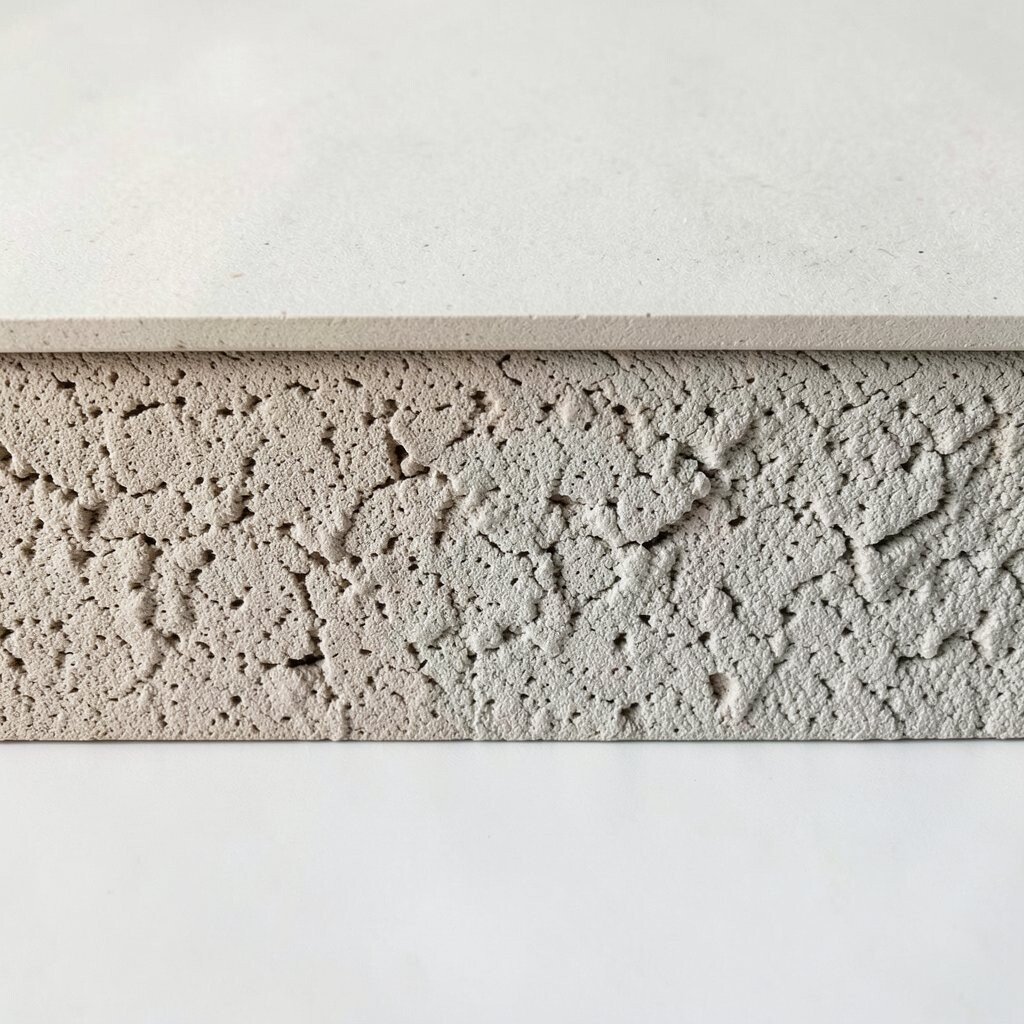
Build a Textured Middle Layer Texture can turn a smooth drawing into something you can almost feel. Add it in the middle areas where the eye moves, like clothing folds or tree bark.
Use sponges, palette knives, scraping tools, or even crumpled paper under paint. Let some texture stay visible, because hiding everything can make the art feel too perfect. The benefit is that your work looks more alive and more handmade.
If you want low cost, use household items like torn paper, old toothbrushes for splatter, or a kitchen sponge for patterns. A big current trend is mixing “clean” edges with “messy” texture, so it feels modern and energetic. Personalize by using patterns tied to your life, like stripes you love or dots that remind you of a place.
-
5. Add Atmospheric Haze for Distance
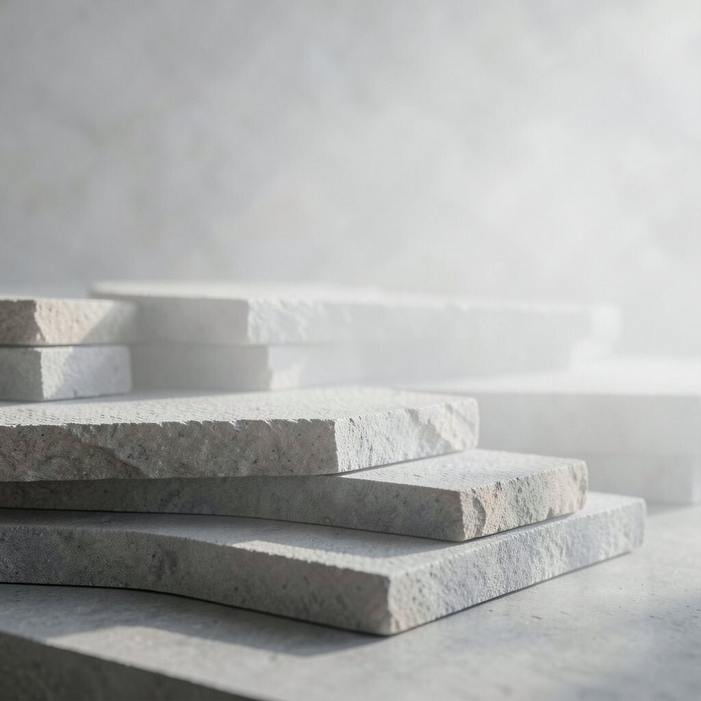
Add Atmospheric Haze for Distance Distance is not just about size; it’s also about softness and color change. Atmospheric haze makes far parts feel airy and near parts feel solid.
Lighten the far background, reduce contrast, and soften edges as things go farther away. This helps your scene feel like it extends beyond the paper. Viewers often feel “inside” the artwork when haze is done well.
For a budget option, use watery paint or a blending stump to glaze over distant areas. Many artists love this look because it feels cinematic. Personalize it by matching haze to the weather you imagine, like misty gray or warm dusty gold.
-
6. Use Mixed Media Edges
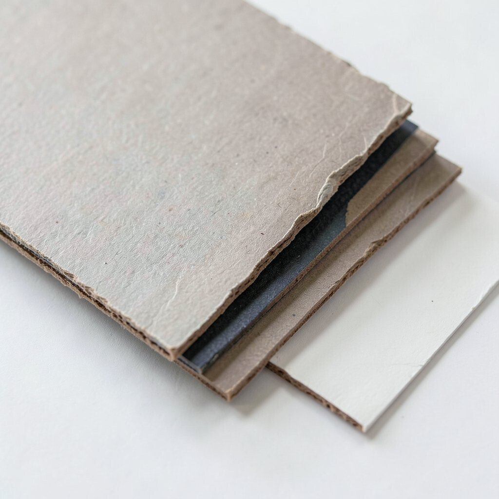
Use Mixed Media Edges Edges are like the artwork’s voice, telling people what’s important. Layering different materials can create edges that feel unique.
Combine paint with ink, or pencil with watercolor, and let the borders between them show. A slightly messy edge can feel natural, while a crisp edge can feel sharp and bold. This contrast becomes a guide for the eye.
Try a simple method: paint a shape, then outline part of it with a dark pen, leaving some areas unlined. It’s easy to do, and it adds personality instantly. If you want to save money, use a single ink pen plus whatever paint you already have.
Right now, many creators are enjoying “imperfect perfection” edges for a textured, modern feel. Personalize by making your outlined parts match your focal anchor, like tracing only the main character’s silhouette.
-
7. Layer Pattern Like a Story
Layer Pattern Like a Story Patterns can act like secret messages in your artwork. They can show rhythm, culture, or a mood without using many words.
Choose one repeating pattern, then build it slowly across layers. For example, you might add dots, then add stripes, then add a faint grid under everything. This makes the piece feel planned instead of random.
Patterns are great because they add uniqueness and keep the viewer searching. They also work well for both backgrounds and clothing, depending on your style. Start small, so it stays fun and doesn’t overtake the whole image.
To keep costs low, use stamps, stencils, or a drawn pattern from a pencil sketch. A current trend is mixing hand-drawn patterns with clean shapes, so try that contrast. Personalize the pattern with something meaningful, like shapes from a favorite place or symbols from your own memories.
-
8. Create a Color Glaze Sequence
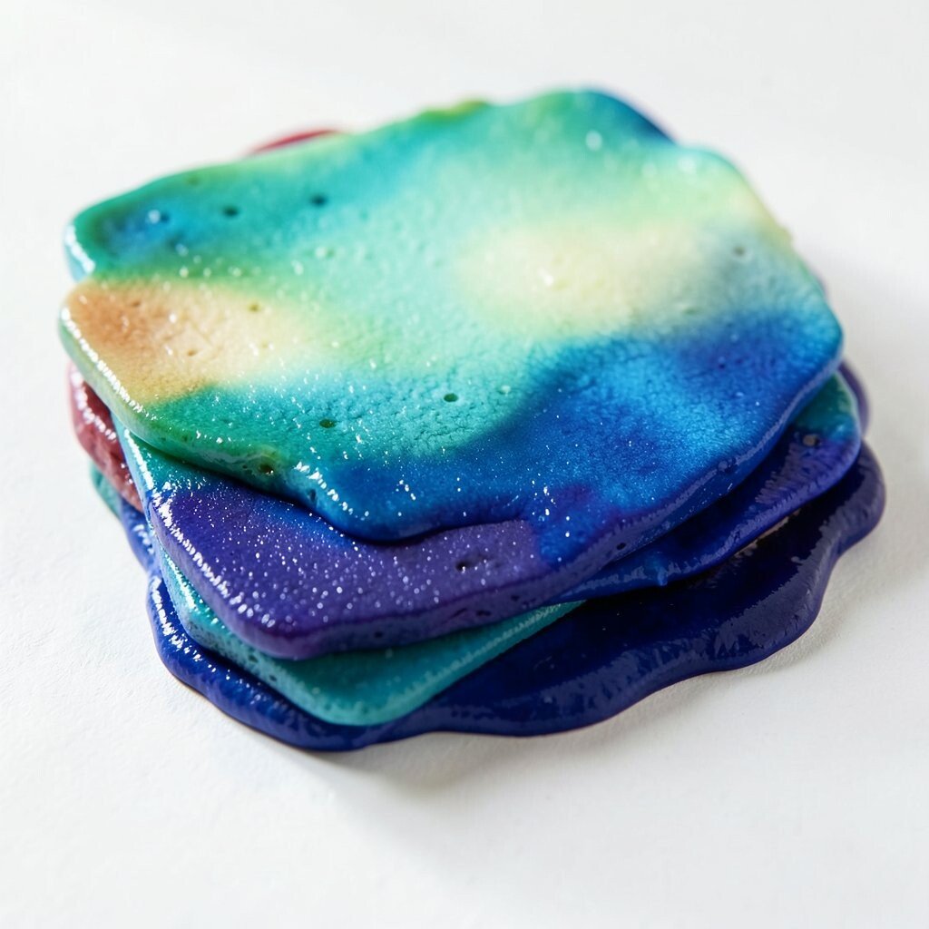
Create a Color Glaze Sequence Glazing means painting thin, transparent layers so colors build over time. This is a simple way to get rich color without using expensive pigments.
Start with a base color, then add one glaze at a time, letting each layer dry. You’ll get a layered look that feels smooth, shiny, and deep. Viewers notice it even if they can’t explain why.
If your colors look dull, glazes are a good fix because they shift tones gently. Use a medium or water to keep the glaze transparent, and test on scrap paper first. Personalize by choosing glazes that match your mood, like a soft teal veil for calm scenes or a rosy glow for warmth.
-
9. Add “Flash” Details That Surprise
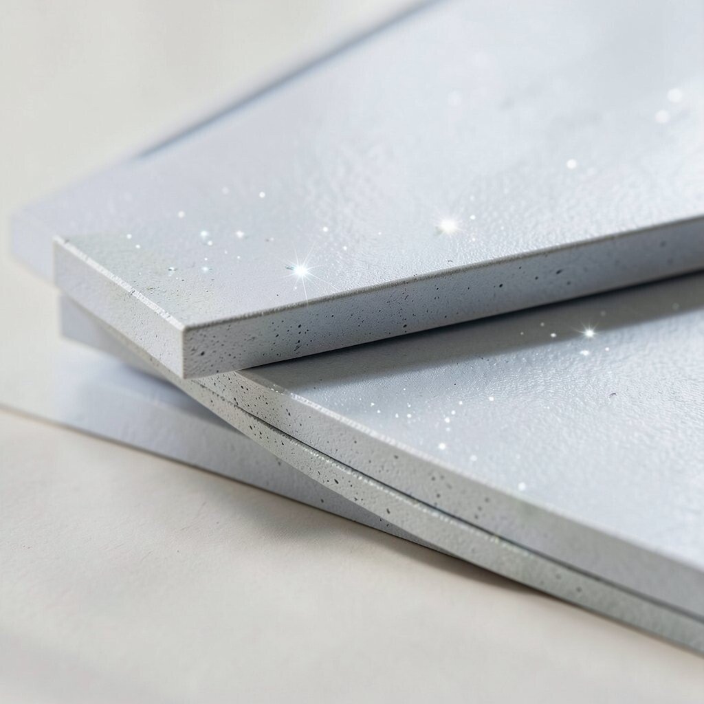
Add “Flash” Details That Surprise Flash details are small bits of something bright that pop at the right moment. Think of it like the artwork’s wink.
Place them near your focal anchor, like a tiny highlight, a small star shape, or a sudden color shift. These little hits help the viewer feel rewarded as they look. They also add uniqueness because they’re hard to copy perfectly.
Use a gel pen, a white paint pen, or even a carefully placed sticker dot. It can cost less than you think because you use tiny amounts. A popular trend is adding micro-accents for a “sparkle” effect, so this fits right in. Personalize the flash details with shapes that feel meaningful, like your initials hidden in a highlight.
-
10. Layer Lighting Effects
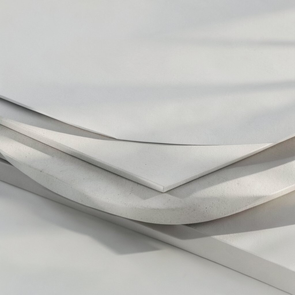
Layer Lighting Effects Lighting is how you make forms feel real and dramatic. You can use it to set time of day, mood, and energy.
Pick a light source and stay consistent, then build layers: base shadows, mid values, and highlight edges. Add a soft glow around the brightest areas to make the scene feel lit, not just colored. This improves depth and makes colors work together.
If you want an easy method, use a warm light color and a cooler shadow color. This is both beginner-friendly and visually strong. For cost, try using one or two light colors and mixing them on paper.
Current trends often use moody lighting with strong contrast, like dramatic interior scenes or neon-style highlights. Personalize by choosing lighting that matches your story, like golden morning light for hope or blue streetlight tones for mystery.
-
11. Build Depth with Overlapping Layers
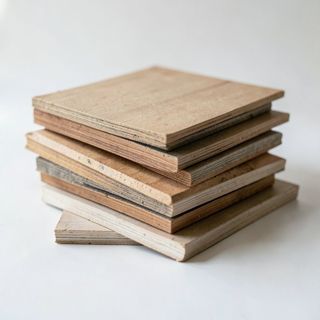
Build Depth with Overlapping Layers Overlapping is one of the oldest tricks, and it still works amazingly well. It tells the viewer which objects are closer.
Layer shapes so some edges go in front of others, and keep far items lighter and less detailed. Add more detail to what’s near, and simplify what’s far away. This makes your art feel organized and deep.
If you want to avoid getting stuck, draw the closest shapes first, then work backward. Overlapping gives you structure and stops your picture from looking like stickers stuck on a flat page. It’s also easy to adjust as you go.
Use cheap tracing paper to plan overlaps if you want help. Many artists use this method when working on posters and illustration, because it reads clearly. Personalize by deciding your “closest” layer based on what you want the viewer to care about most.
-
12. Add a Graphic Border or Frame Layer
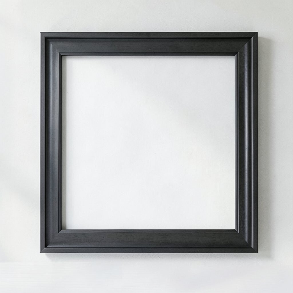
Add a Graphic Border or Frame Layer A frame can hold everything together, like a stage that keeps the spotlight focused. It also gives your piece a finished feel.
Try adding a subtle border line, patterned tape look, or a hand-drawn frame with imperfect corners. Keep it simple so it doesn’t compete with the focal anchor. When the frame matches your color palette, your work feels intentional.
You can make a budget frame with colored paper, washi tape, or even a single thick marker line. A current trend is using bold graphic borders for modern illustration and poster-style art. Personalize it by using a frame style inspired by your favorite album covers, books, or signs you see in your town.
-
13. Layer Typography or Handwritten Marks
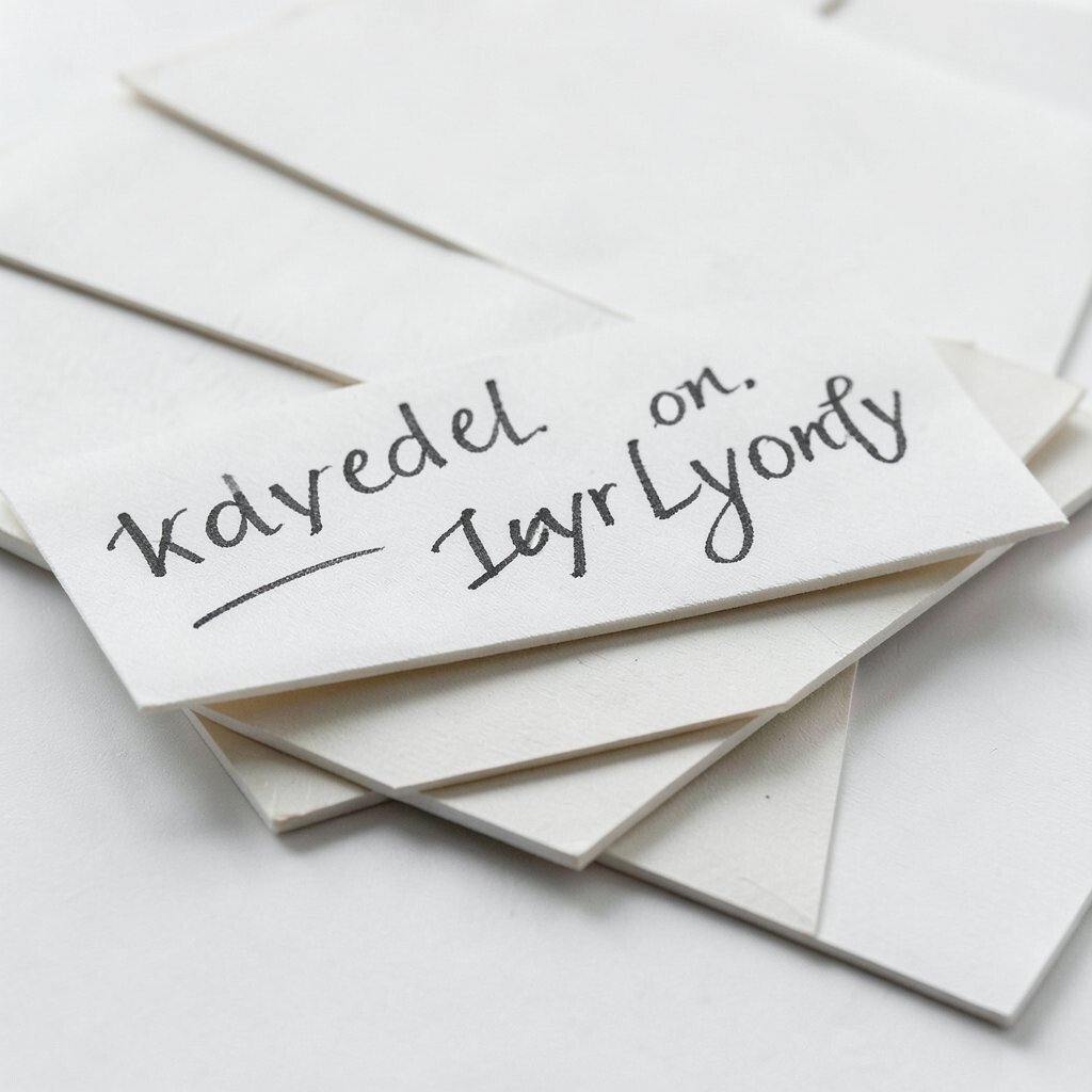
Layer Typography or Handwritten Marks Words and marks can add meaning, mood, and personality. You don’t need full sentences to make it feel connected.
Use handwriting, tiny labels, or short phrases like “warm” or “hush” as layered details. Place these near the edges or inside texture zones so they don’t steal the main focus. This gives your art a voice that feels personal.
If you’re worried about spelling, keep it minimal or use symbols instead. You can also hide a small date, a nickname, or a memory name. Cost is usually low because pens and pencils are affordable.
Typography trends are popular in mixed media because they blend visual art with story. Personalize by writing in your own style, even if it’s messy, because your handwriting is uniquely yours.
-
14. Use Oversized Soft Shapes as a Background
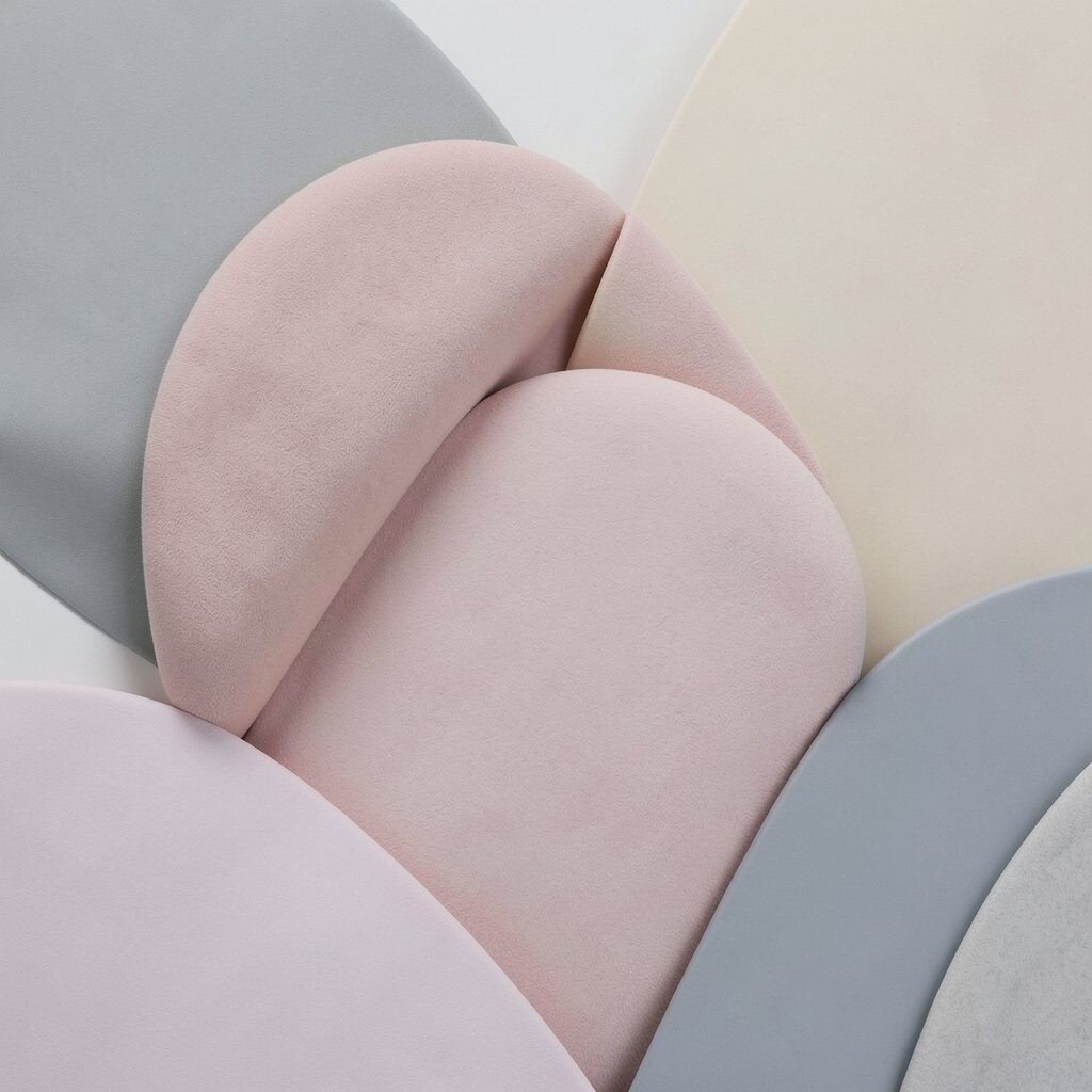
Use Oversized Soft Shapes as a Background Soft shapes behind your main subject can make everything feel more colorful. They also act like a background “soundtrack.”
Try painting big circles, blobs, or sweeping curves in low contrast colors. Then layer your main drawing on top with clearer lines. This trick helps the subject stand out while keeping the background interesting.
For budget, use a few colors you already own and mix them into gentle washes. This is also great for beginners because soft shapes forgive mistakes. A current trend is using dreamy gradients and abstract shapes in illustration.
Personalize by choosing shapes that match your theme, like swirling shapes for movement or blocky shapes for a steady, grounded mood.
-
15. Add Metallic or Gloss Accents
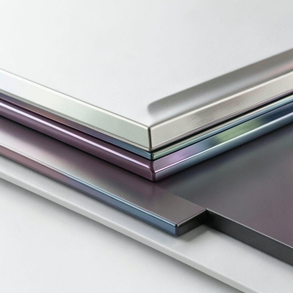
Add Metallic or Gloss Accents Metallic and gloss accents can make art feel special without covering the whole piece. They catch light and draw the eye like tiny beacons.
Use small areas for shine: a highlight on glass, a glint on leaves, or a strip on a sign. Gloss medium or clear gel can also add shine over painted areas. The benefit is instant “wow” with careful placement.
If you’re keeping costs down, you don’t need a full expensive set. Use one metallic pen, one small bottle of gel medium, or even a budget foil piece in a tiny area. Personalize by reflecting your theme—silver for icy calm, gold for warmth, or copper for a cozy sunset glow.
-
16. Include Hidden Layers with Faint Marks
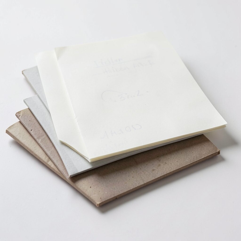
Include Hidden Layers with Faint Marks Hidden layers are like secret ingredients. They are faint enough not to distract, but they add complexity when you look longer.
Sketch lightly under your top layers, then glaze over them so the marks remain subtle. You can add faint texture lines, erased pencil shadows, or light wash trails. This makes the artwork feel layered even when it looks simple.
This technique helps uniqueness because every mistake and correction becomes part of the final look. It also makes the art feel more human. Even viewers who don’t know art techniques can feel that the piece took thought.
For cost, use pencil, charcoal, and diluted paint, since you don’t need expensive materials. Current trends lean toward “depth you can’t see all at once,” especially in contemporary illustration and portrait art. Personalize by using faint marks that relate to your life, like map lines, music notes, or doodles you love.
-
17. Layer with Collage Paper and Handmade Shapes
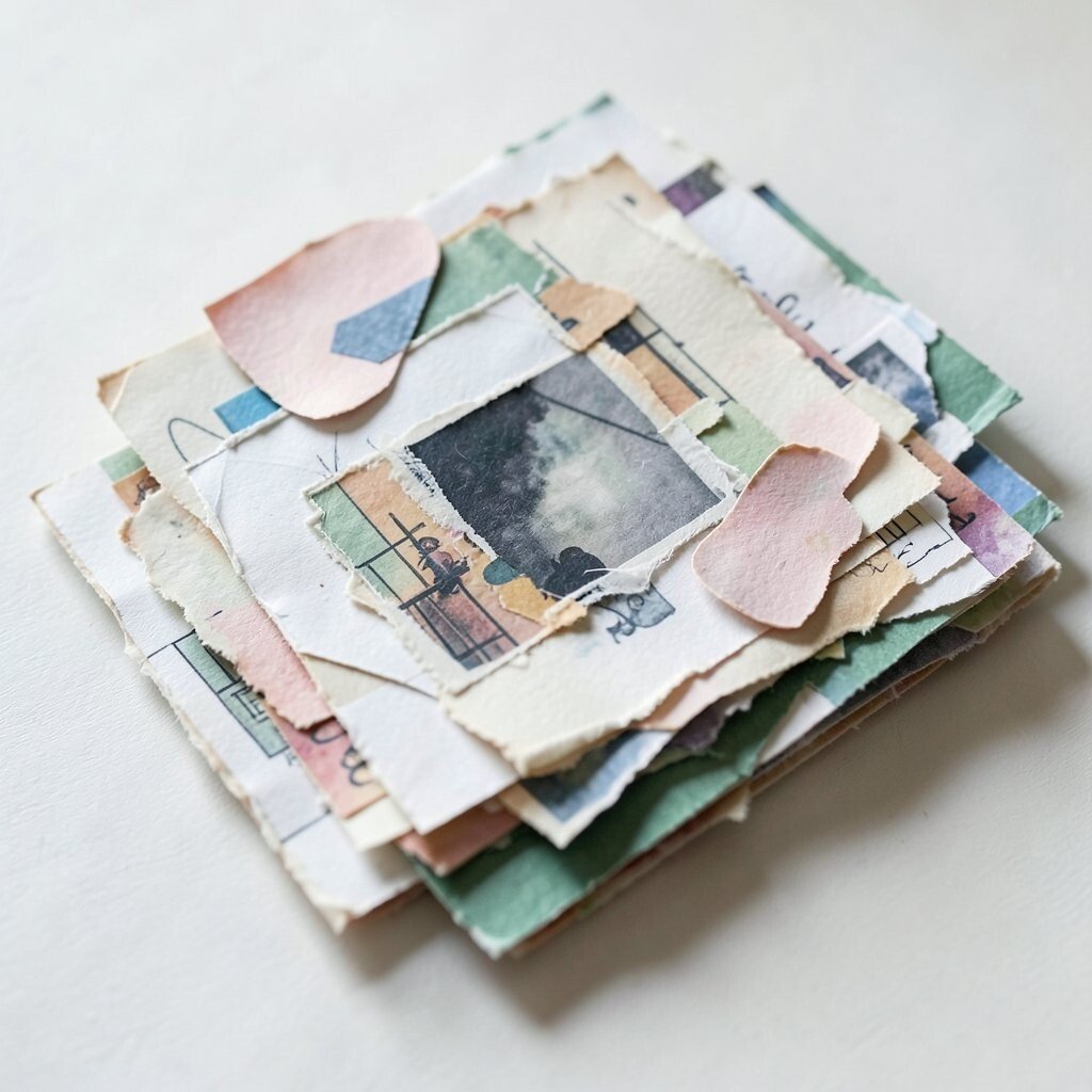
Layer with Collage Paper and Handmade Shapes Collage adds a physical layer that paint alone can’t always match. Pieces of paper bring color, grain, and tiny surprises.
Cut handmade shapes from magazines, wrapping paper, craft paper, or old drawings. Glue them down, then paint over parts to unify the look. This creates a rich surface with uniqueness built in.
Collage is also flexible for different budgets because you can use scraps. If you don’t want to buy new supplies, save paper from packages, receipts, or old notebooks. Personalize it by using papers that connect to your interests, like comic pages, fabric patterns, or tickets from events.
-
18. Finish with a Protective Coating and Final Unifier
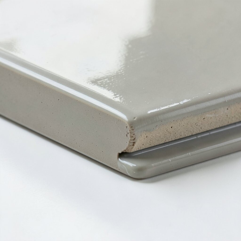
Finish with a Protective Coating and Final Unifier Finishing steps matter because they keep your layers working together. A final unifier can make the piece look more cohesive.
Use a fixative for dry media, or a protective varnish for paint. Then do a last pass to adjust contrast, add one or two highlights, and soften one area if it looks too harsh. This helps the viewer feel calm instead of confused.
Consider cost carefully, especially if you’re using multiple materials. Test coatings on a small scrap first, because some products can change color slightly. Current trends often show strong, clean finishes, so a light protective layer can help your art look polished.
Personalize the final look by choosing the shine level you like, like matte for a soft story feeling or gloss for energetic scenes. A good finish also helps your layers last longer, so your artwork keeps its “stand out” power.