Warm light, soft tones, and smooth flow make an open concept living room feel like home. When your colors work together, the whole space starts telling a calmer story.
1. Honeyed Beige + Caramel Brown + Cream White
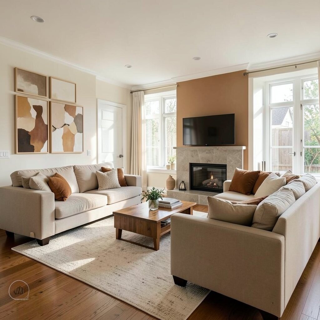
Imagine walls the color of warm bread crust, paired with creamy accents that brighten everything. The room looks cozy even when the day is gray.
Beige and caramel create an easy, welcoming base that blends with many styles. This palette helps large open rooms feel connected, not split into separate zones. If you want a classic look, choose one warm neutral for the walls and repeat it in curtains, rugs, and throw pillows.
Use a honeyed beige for the main walls and keep trim in cream white so edges stay crisp. Add caramel brown through wood tones, leather-like pillows, and a coffee table with visible grain. For a modern touch, include a small amount of matte brass in lamps or picture frames.
Great for: families, renters, and anyone who wants a low-stress refresh. Budget-wise, neutral paints cover the largest area, so start there if you need to spend smart. If you’re personalizing, pick a fabric pattern that includes your favorite caramel shade so it feels intentional, not random.
2. Terracotta + Warm Sand + Soft Sage
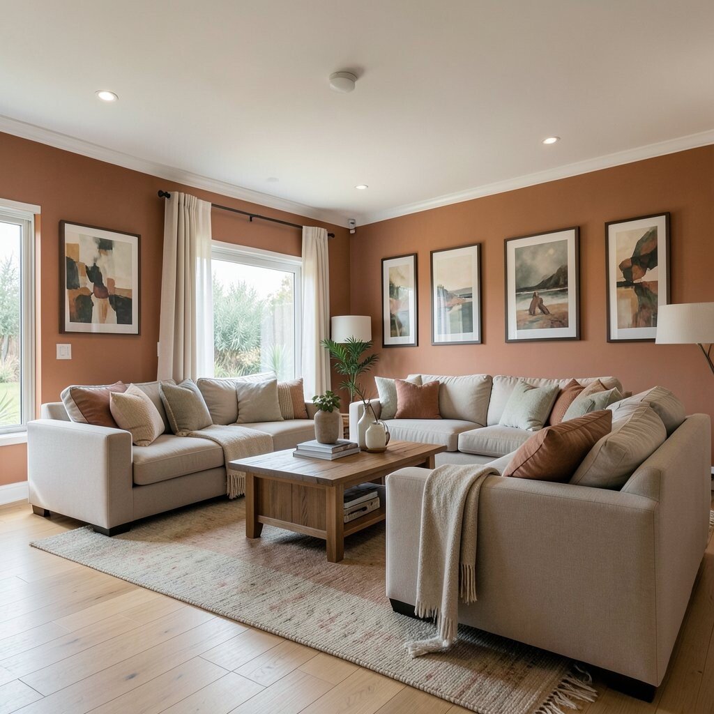
Terracotta brings a sunny, earthy warmth that feels grounded. Picture terracotta pillows, a warm sand rug, and a gentle sage wall accent that cools the room in a nice way.
This combo looks inviting and still feels fresh, especially in open layouts where spaces blend. It also helps highlight natural materials like rattan, oak, and woven baskets. Keep it balanced by letting terracotta be the star, while sand and sage do the supporting work.
Try painting one wall in soft sage and use terracotta in textiles like cushions and area rugs. Choose warm sand tones for larger pieces like a sectional or slipcovered chairs. Add a few greenery touches, like a small plant or vase leaves, to bring the palette alive.
Cost considerations: terracotta can be powerful, so you may only need one or two splashes to make the whole room feel styled. If you want to avoid painting, use peel-and-stick wall panels or swap in art prints with matching hues. Personalization idea: find a terracotta shade that matches your favorite mug or ceramic vase, then repeat that color across two or three places.
3. Spiced Clay + Butterscotch + Warm White

Spiced clay feels like a quiet sunset, rich and friendly at the same time. Pair it with butterscotch accents for a glow that looks good day and night.
This palette is great for open rooms because it creates a warm “bubble” around your furniture. It also makes lighting look nicer, especially if you use warm bulbs. The uniqueness here is how earthy clay can feel both bold and calm when you keep the rest creamy.
Start with warm white for walls and ceilings, then pick spiced clay for a feature wall or a large rug. Add butterscotch with curtains, lampshades, and a few decor objects. If you love cozy texture, choose a boucle or linen blend that catches light softly.
Tips: avoid using too many strong shades at once, or the room can feel busy. Instead, keep the biggest surfaces neutral and let the warm accents show up in smaller items. For trend alignment, this palette fits the current love for warm earth tones and natural textures.
4. Toasted Oat + Walnut + Amber Glass
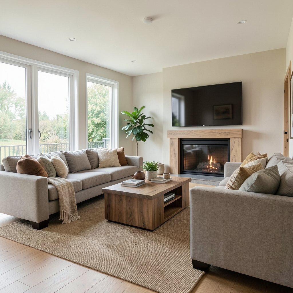
Toasted oat is gentle, like oatmeal with a golden spoon of honey. Walnut adds depth and richness, while amber glass adds a small sparkle that feels special.
This mix gives you that “soft luxury” look without needing a full makeover. It also supports open concept flow because walnut and amber look good next to natural stone and wood floors. Choose one main neutral and then let darker accents create contrast where you need it.
If you want easy upgrades, add walnut-toned frames, a media console, and a textured throw. Use amber glass through a lamp, a vase, or decorative bottles on a shelf. Cost-wise, lighting is a smart spend, because changing lamps can shift the whole mood fast.
5. Burnt Orange + Cream + Cocoa
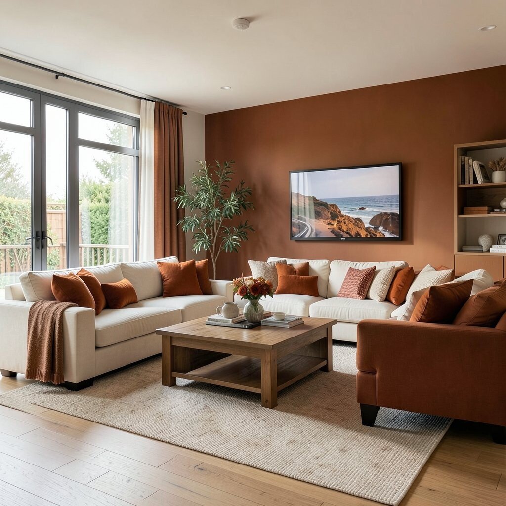
Burnt orange adds bold warmth, while cream keeps the room airy and bright. Cocoa tones ground everything, so the palette feels cozy instead of loud.
This is a great choice if your open room has lots of blank wall space. It creates warmth that feels welcoming when you walk in, and it also looks amazing in evening light. The uniqueness comes from pairing a lively orange with deep cocoa like a warm dessert color story.
Use cream for the walls and keep burnt orange for accents, such as cushions, artwork, and a statement rug. Add cocoa through wood, leather, or darker paint on the fireplace surround. For personalization, select one shade of burnt orange from a piece you already love, like a sweater or a favorite terracotta mug.
If you’re careful with the amount of orange, the room will feel balanced. A fresh coat of cream paint plus updated textiles can fit many budgets. For trend inspiration, warm “spice” tones are still popular, but they look best when you let cream and chocolate calm them down.
6. Buttermilk + Olive + Blackened Bronze
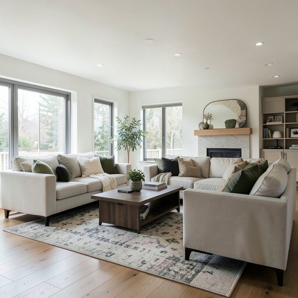
Buttermilk walls feel bright and friendly, like light passing through curtains. Olive accents bring natural calm, while blackened bronze adds a tasteful edge.
This palette works well in open concepts because it creates clear warmth without making the space feel heavy. Olive can also connect nicely to kitchen areas, especially when you have wood cabinets or natural stone. Use blackened bronze sparingly, like on hardware, lamp bases, or a mirror frame.
Try painting the main walls in buttermilk and using olive for an accent wall or large artwork background. Choose upholstery fabrics in neutral grays or warm creams so olive feels intentional. Add blackened bronze details for contrast, then repeat them in at least two places for a finished look.
Budget tip: swap hardware and lighting before you start big painting projects, if you want a fast impact. Personalization idea: if you love outdoor vibes, add woven textures, olive-themed prints, or a plant shelf with matching tones. This palette is unique because the olive feels soft, and the bronze keeps it stylish rather than rustic.
7. Warm Gray-Beige + Saffron + Soft Linen
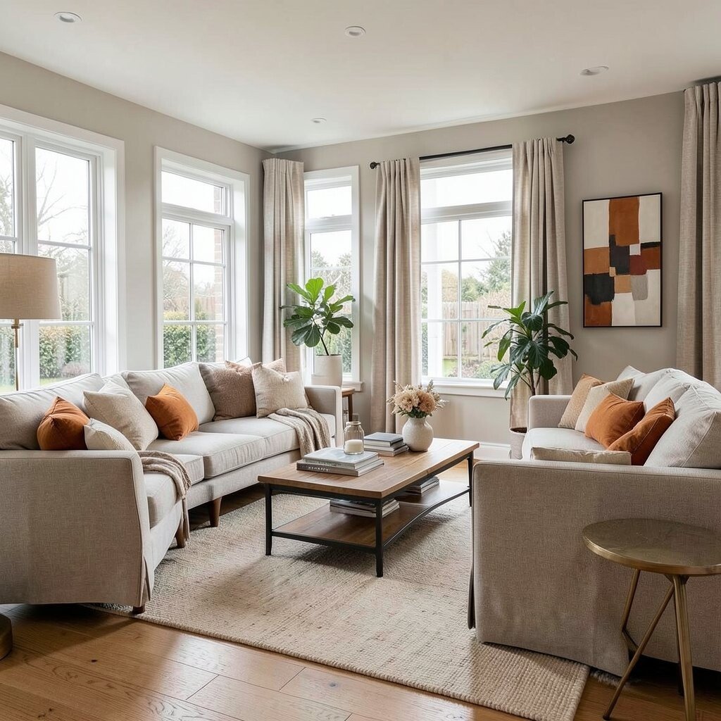
Warm gray-beige can look calm and modern, but it still feels friendly. Add saffron touches for a sunny pop, and keep everything else in soft linen tones.
This combo is a smart fit when you want a neutral that doesn’t feel cold. It also helps separate zones in an open plan without using harsh lines. The saffron lifts the mood, especially in rooms with limited natural light.
Use warm gray-beige for walls or larger furniture, then add saffron via throw pillows, a patterned rug, or curtains. Keep soft linen for bedding-like textures, like drapes and sofa throws. To personalize, pick a saffron shade that matches your favorite artwork colors, then pull those hues into one or two accessories.
Cost considerations: updating textiles like curtains and rugs is usually easier than replacing large pieces. If you’re painting, choose a warm undertone in your gray-beige so it reads cozy. Current trend note: warm neutrals with small bold accents are popular right now, especially in open living areas.
8. Coral Blush + Oat Cream + Terracotta Dots
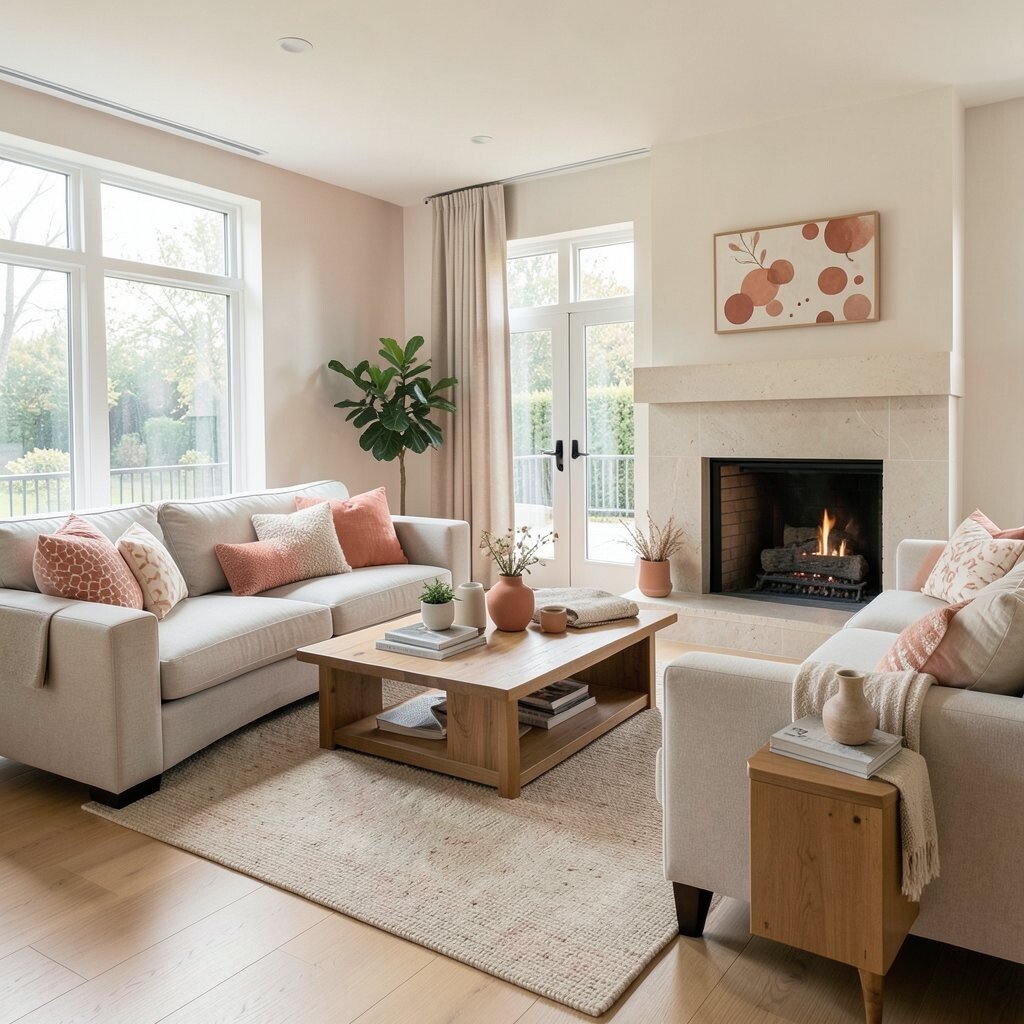
Coral blush feels playful and warm, like a soft sunrise on the walls. Oat cream keeps it gentle, while terracotta dots add a handcrafted vibe.
This palette is great for open concept rooms because it creates a friendly flow from living area to nearby dining or kitchen. It also looks lovely with light wood floors and white cabinetry. The uniqueness comes from mixing blush tones with earthy speckles, like a pottery-inspired pattern.
Choose coral blush for accent walls or large decor like a statement painting. Use oat cream for sofa cushions, rug base colors, and larger textiles. Add terracotta dots through patterned throw pillows, ceramics, or a small wall art set.
Tips: keep coral in the “mid-range,” not super neon, so it stays cozy. Personalization idea: collect small terracotta pieces from places you love, then display them together. Budget-wise, textiles and decor are flexible upgrades, so you can build the look piece by piece.
9. Peachy Nude + Caramelized Wood + Creamy Taupe
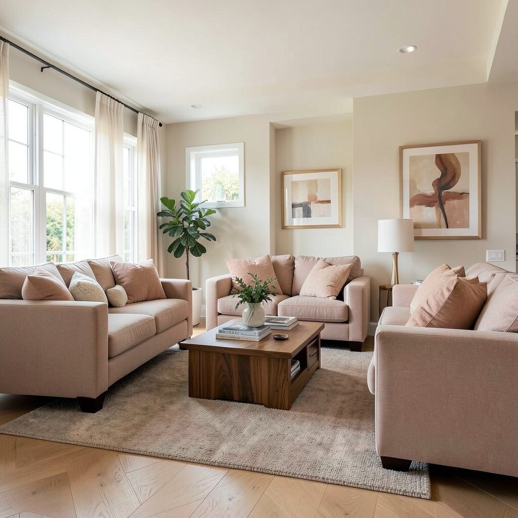
Peachy nude gives warmth without going too bright. Caramelized wood adds richness, and creamy taupe keeps the whole room soft and grown-up.
This palette works like a gentle hug in open spaces, because the tones stay close together. It’s also a helpful choice if you want your room to feel calm but still stylish. When paired with natural wood, it makes everyday items look more polished.
Start with peachy nude on walls, then keep major furniture fabrics in creamy taupe or oatmeal shades. Add caramelized wood through coffee tables, bookshelves, and picture frames. For a finishing touch, choose art prints that feature warm skin tones or sunset gradients.
Cost considerations: if you can’t paint, choose peel-and-stick wallpaper in peachy nude or switch to large-area rugs in creamy taupe. Personalization idea: use family photos in frames that match the caramel wood tone, so the room feels personal and cohesive. This palette is unique because it stays warm and soothing while still adding color warmth you can feel.
10. Warm White + Sage Cream + Light Oak
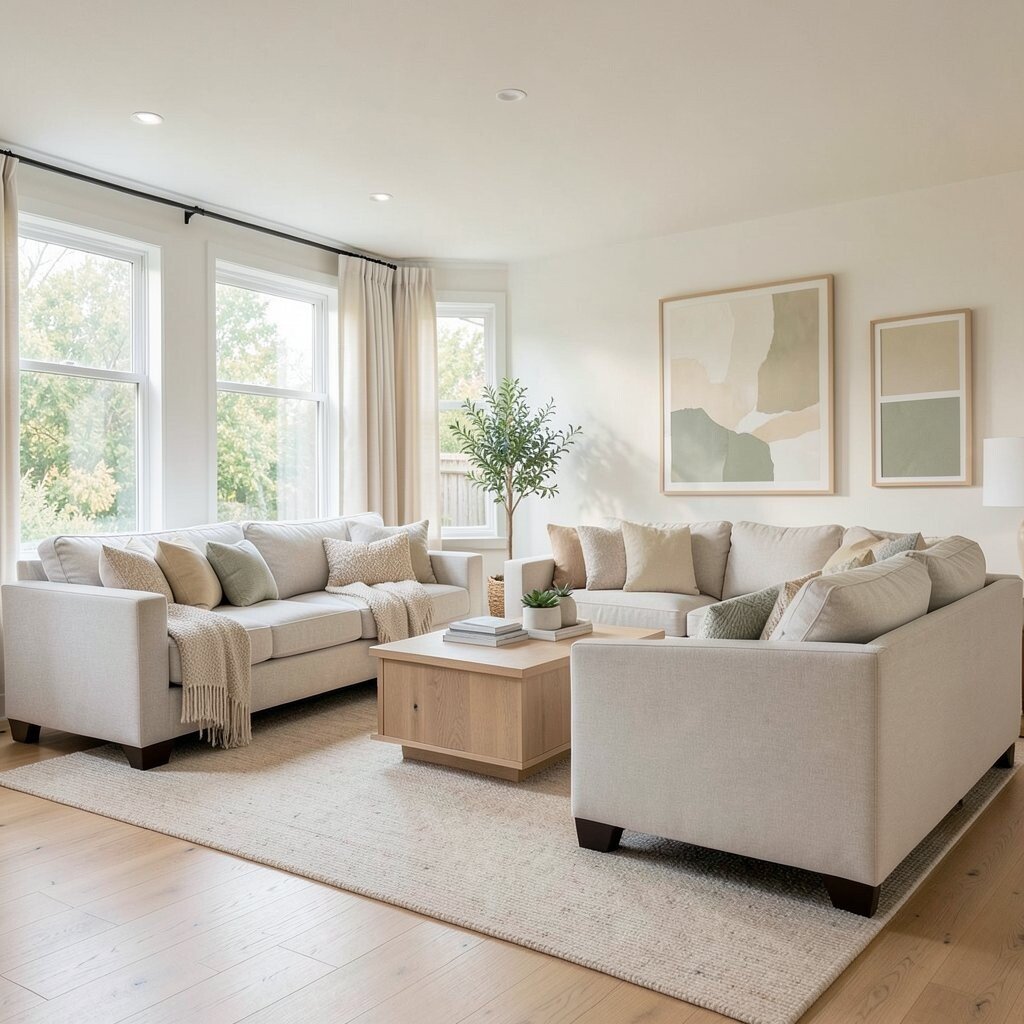
Warm white creates a clean, glowing background that makes the room feel open and airy. Sage cream adds a soft earthy layer, and light oak keeps everything natural and bright.
This palette is perfect if you want warmth without bold color. It also helps your layout feel seamless, which matters in open concept living rooms. When light oak is on the furniture or floor, the whole space reads warm and fresh.
Tips: keep your sage cream in smaller areas first, like curtains, a throw blanket, or the back of open shelving. Use warm white on walls and ceilings so everything stays light. Add light oak through your media unit, coffee table, or shelving for a consistent look.
Budget-wise, this approach can be very practical because warm white paint and natural wood tones are timeless. If you want personalization, add texture through a chunky knit rug or woven baskets. Current trend note: soft greens and light neutrals are still popular because they feel modern and calm.
11. Mushroom Tan + Rust + Antique Gold
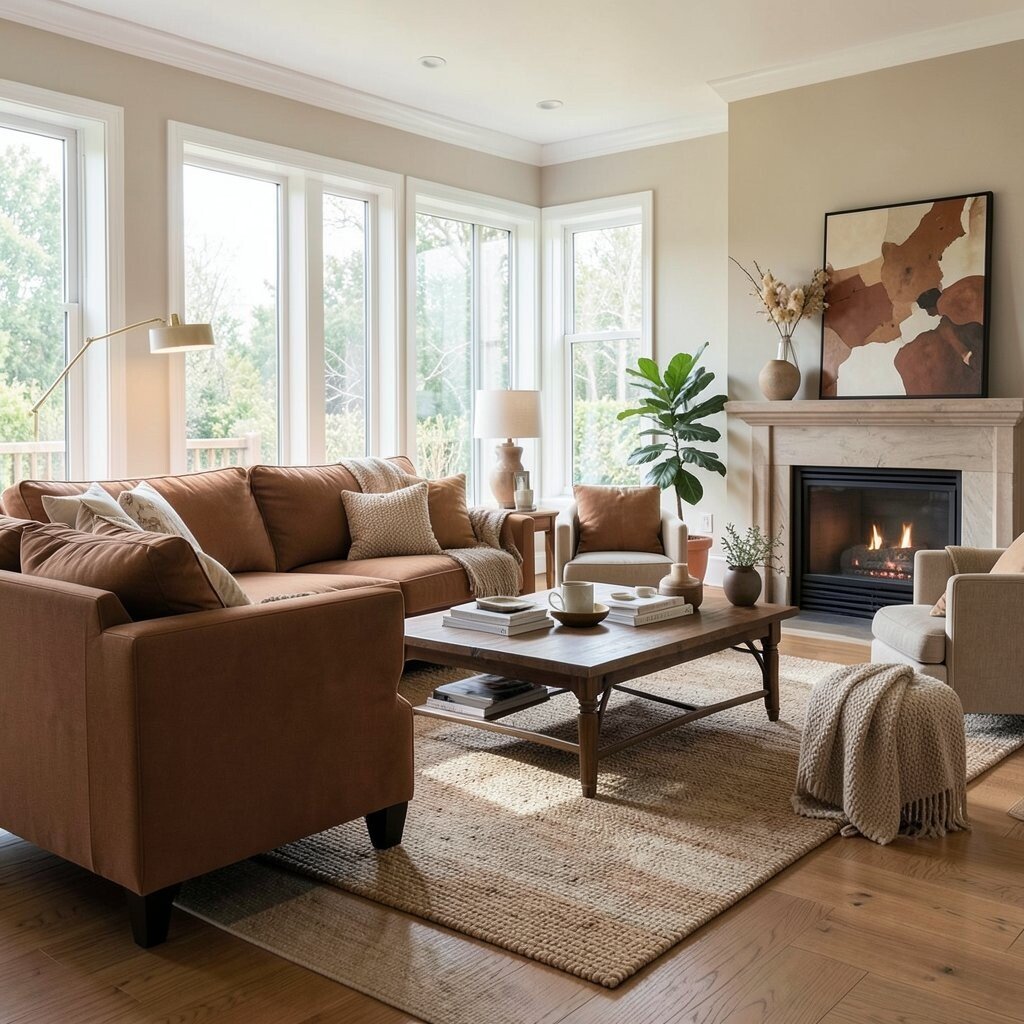
Mushroom tan feels earthy and cozy, like a warm café interior. Rust adds personality, and antique gold brings a refined glow.
This palette stands out because it blends grounded browns with a richer rust highlight. In open concept rooms, it helps create a “collected” look where different zones feel styled together. Antique gold details also catch light, so the room feels warm even when the sky is gray.
Use mushroom tan for walls and larger furniture pieces, then add rust through pillows, a statement chair, or a patterned rug. Bring in antique gold with mirrors, lamp bases, and picture frame accents. To personalize, choose one rust tone that matches a piece of art or a ceramic object you already own.
Cost considerations: lighting and hardware are great places to spend a little more, because they last for years. If you want to avoid painting, use a rust patterned rug and keep walls neutral. This palette also works well with current styling trends that favor warm metallic touches and layered textures.
12. Chocolate Brown + Cream + Toasted Honey

Chocolate brown creates drama and comfort, especially when paired with creamy walls. Toasted honey adds a warm highlight that keeps the look from feeling too dark.
This palette is ideal for open concept rooms with lots of sunlight, because chocolate can look rich and inviting. It also gives you clear visual contrast, which helps define seating areas. The uniqueness is in how honey-colored accents soften the boldness of chocolate.
Try painting walls in cream and using chocolate for a fireplace surround, large media unit, or oversized rug. Add toasted honey with throw pillows, warm-toned art, and lighting that has a golden bulb. Keep the rest of your decor in simple shapes so the palette feels elegant.
Tips: balance the deep brown with lots of light textiles, like oatmeal curtains or a soft cream throw. Budget-wise, a large rug and a few key pieces can carry this palette even if you don’t repaint. Personalization idea: choose honey tones from your own collection—think amber glass, caramel ceramics, or warm wood baskets—and repeat them in multiple places.
13. Warm Sandstone + Terracotta Rose + Soft Black
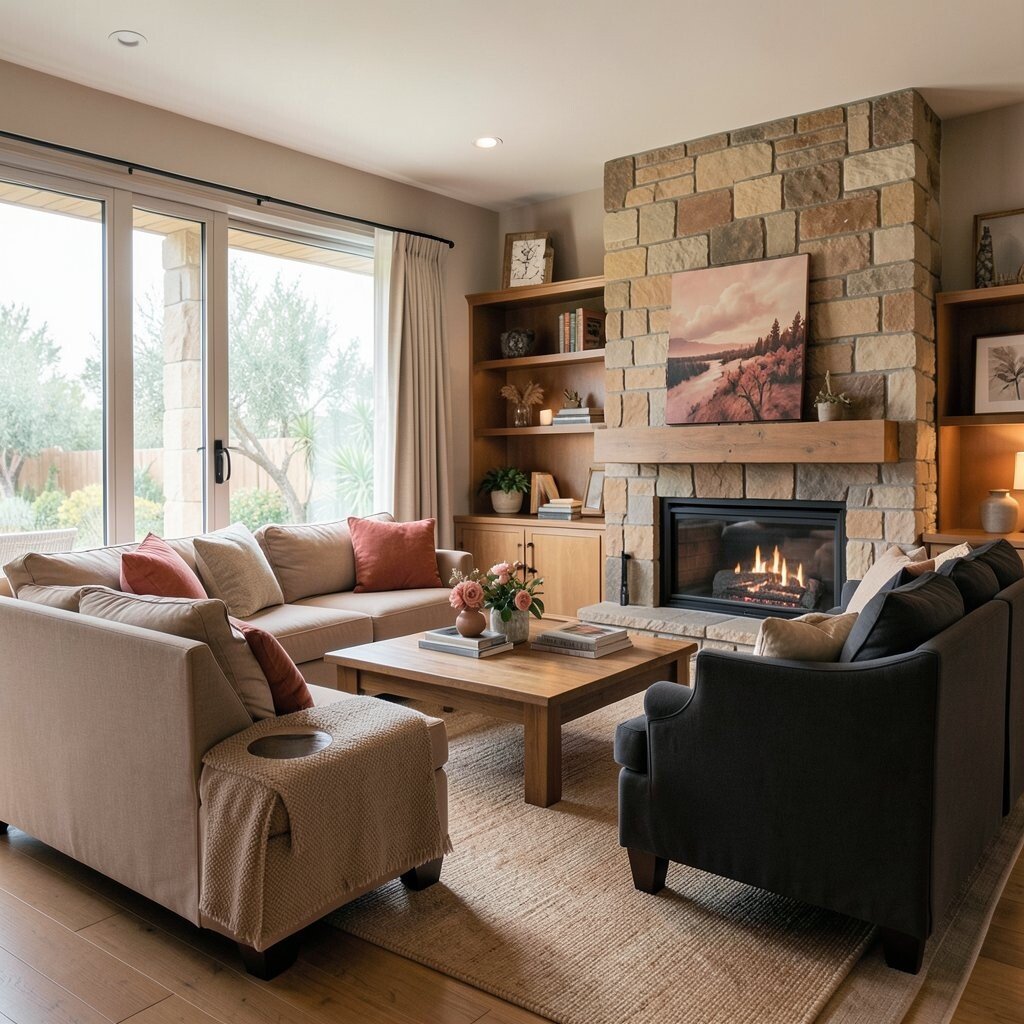
Warm sandstone looks like sun-baked stone, calm and inviting. Terracotta rose adds romance and warmth, while soft black brings modern structure.
This palette feels custom because it mixes old-world color warmth with clean contrast. In open concept rooms, soft black helps define lines, like shelving edges or a media console, without making the space feel harsh. The rose element makes the room feel lively and a little artistic.
Use warm sandstone on walls, then add terracotta rose in upholstery accents, curtains, or artwork. Bring in soft black through slim frames, lamp bases, or a textured black vase. For personalization, pick one terracotta rose pattern—like stripes or terracotta floral—and repeat the pattern in small ways across the room.
Cost considerations: if painting feels too big, use a large rug and updated wall art to lock in the sandstone look. Current trend note: warm earth palettes with a touch of darker contrast are showing up often in modern open living spaces. To keep it cohesive, repeat your sandstone and rose tones in at least three categories, like textiles, decor, and lighting.