Roman shades can make a room feel instantly softer and brighter. The right fabric and color can turn everyday light into a flattering glow.
1. Linen-Look Warm Whites
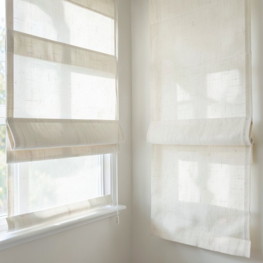
Warm white linen-look Roman shades give walls a gentle lift. They catch daylight and bounce it around without looking harsh.
Choose a shade a bit warmer than your trim so the whole room feels cohesive. For a practical touch, opt for a light-filtering fabric so mornings stay bright. Pair them with simple hardware in brushed nickel or antique brass to keep the look clean.
2. Soft Greige for Effortless Light
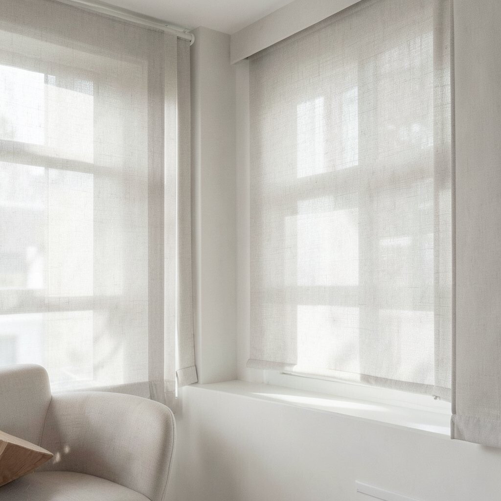
Greige Roman shades sit between beige and gray, so they look calm in almost any space. They brighten your room while still hiding everyday smudges better than pure white.
Try a medium-light tone if your room feels dim, especially near north-facing windows. If you like contrast, match the fabric undertone to your sofa or rug so everything feels intentional.
To personalize, add a subtle texture weave that shows in daylight but stays quiet at night. Budget-friendly options often use blended fibers, which can look surprisingly high-end. When measuring, keep the shade width slightly wider than the window so the folds stack neatly.
3. Sunny Golden Honey Tones
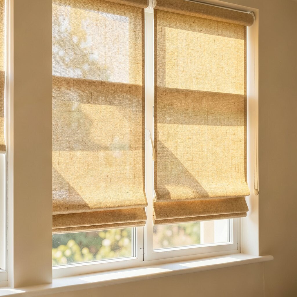
Golden honey Roman shades bring a cheerful, sun-kissed feel even on cloudy days. The warm color makes skin tones look better and furniture feel more inviting.
Go for light-filtering fabric if you want brightness without glare. A shade in a honey or marigold range works especially well in dining areas, kitchens, and home offices.
If you’re worried about it feeling too bold, choose a lighter honey that reads more “soft glow” than “statement.” Pair with natural wood, cream walls, and simple textiles for an easy, uplifting style.
Cost-wise, look for sales on standard sizes first, then customize only the length if needed. For a modern twist, pick a slightly deeper honey and add clean, minimal valance styling.
4. Classic Pinstripe for Bright Structure
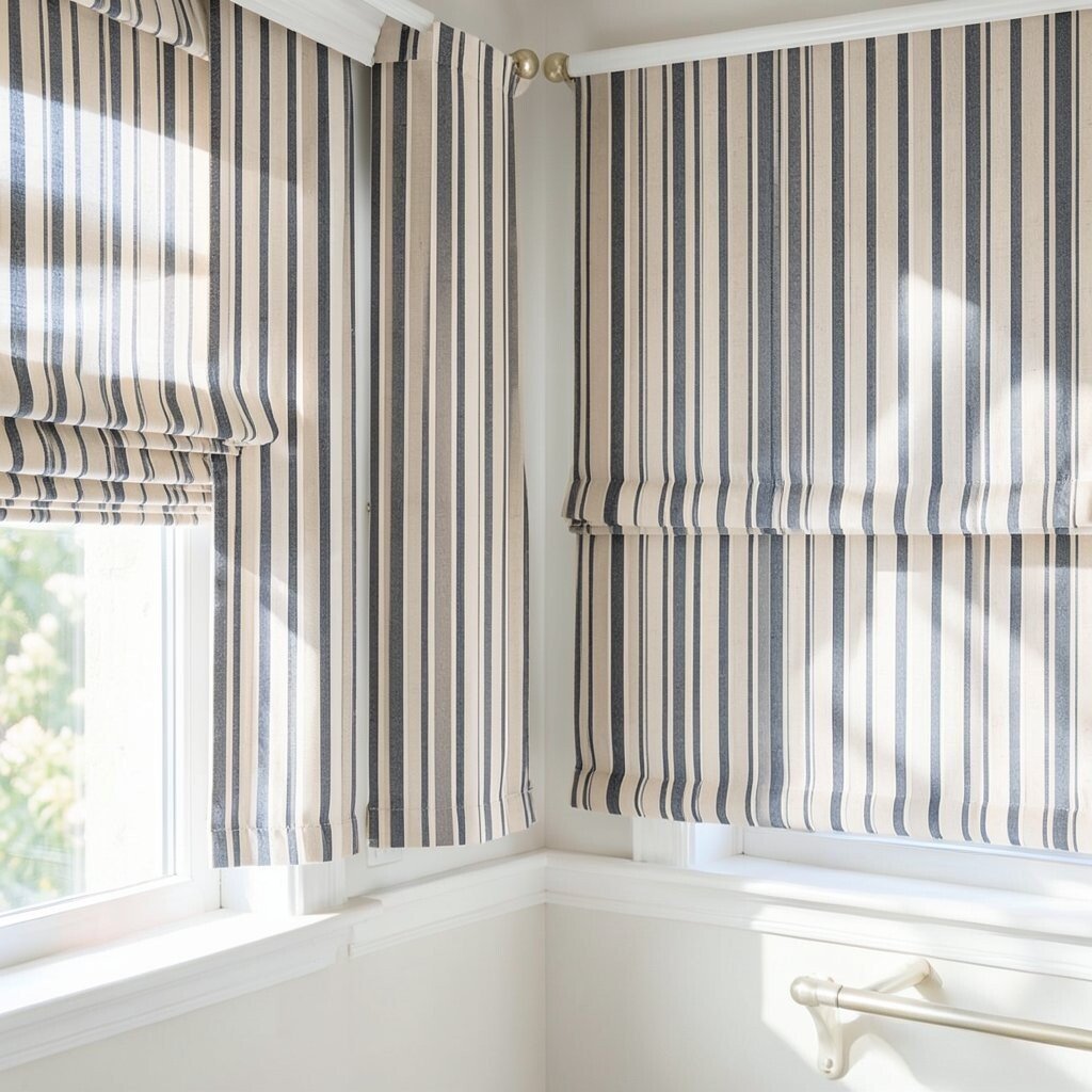
Pinstripe Roman shades add order to a room and can make windows feel taller. When the stripes are light and thin, they keep the space bright instead of busy.
Choose stripes that match your wall color family, then use a slightly darker stripe for depth. This works well in living rooms and hallways where you want visual rhythm without heavy color.
5. Blush Rose for a Gentle, Airy Mood
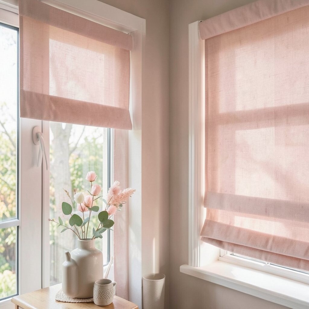
Blush rose Roman shades soften the light and create a cozy, airy mood. They look fresh with white trim and feel romantic without becoming overly themed.
Pick a pale blush for maximum brightness, especially if the room gets limited sun. If your furniture is neutral, blush can add warmth without taking over.
For personalization, match cushion covers or throw pillows to the blush undertone. You can also choose a fabric with a slight sheen for a subtle glow when the shade is raised. If cost matters, consider motor-free lift options and focus your budget on fabric quality.
6. Charcoal-Edge Color Blocking
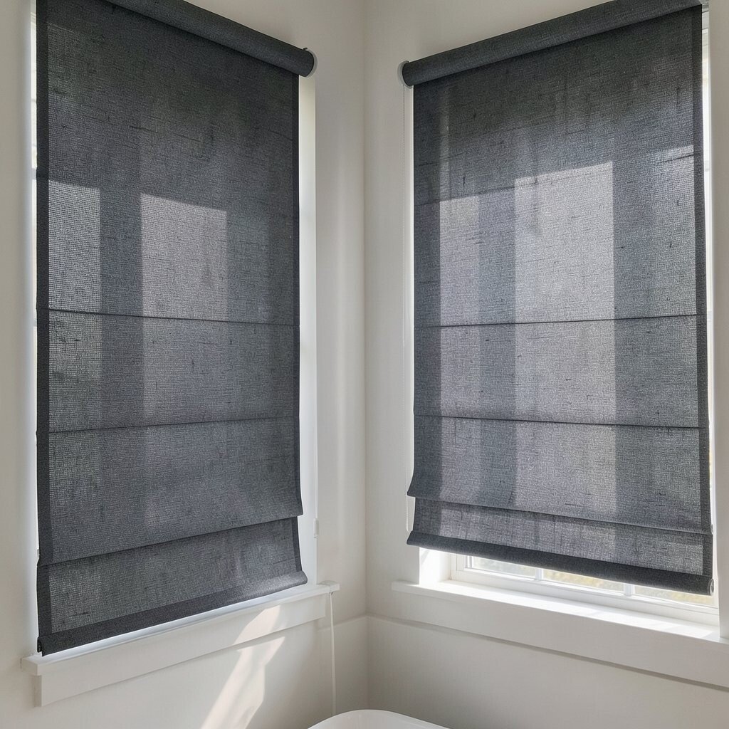
Color-block Roman shades use contrast to frame your window and brighten the rest of the room. A light base with a charcoal edge creates a crisp look that still feels modern and airy.
This style helps windows look more finished, even if you have plain walls. When light hits the lighter panel, it gives the room a balanced brightness.
To keep it from feeling too graphic, choose a thin border rather than a wide band. Consider coordinating the dark edge with picture frames or a lamp base for a tidy, designed feel.
7. Textured Woven Patterns in Off-White
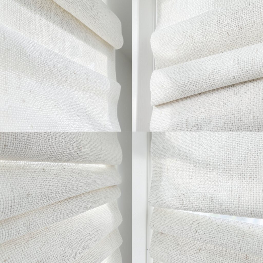
Textured woven Roman shades bring dimension without needing bold color. Off-white tones brighten the room while the weave creates visual interest in every angle.
Look for patterns like subtle boucle, basketweave, or micro-rattan styling. These add a “high design” look, especially in bedrooms and reading nooks.
For practical tips, choose a fabric that resists crushing so the folds stay crisp after days of use. If you want easy care, look for stain-resistant finishes or machine-washable liners. Budget-wise, textured fabrics can cost more, but they often last longer visually because the texture hides small imperfections.
8. Coastal White with Light Blue Undertones
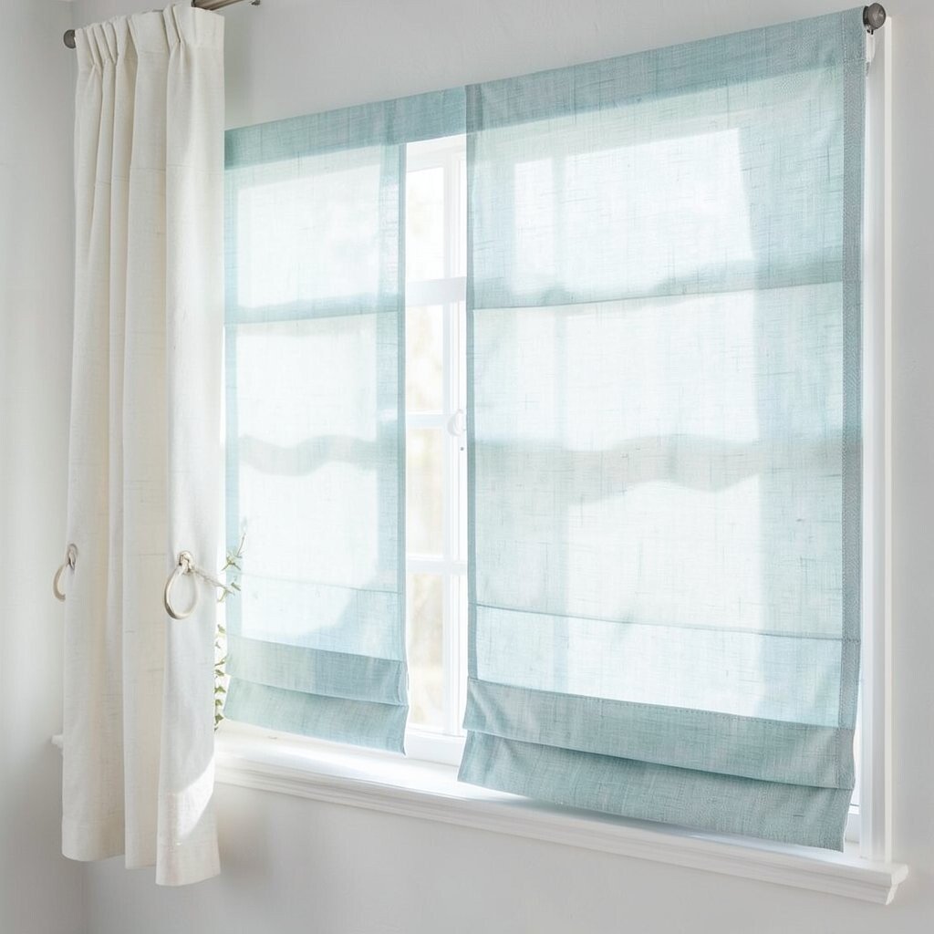
Coastal-inspired Roman shades make spaces feel breezy and clean. White fabric with light blue undertones adds brightness while hinting at calm ocean colors.
These shades look great in bathrooms, kitchens, and bright living rooms. They pair beautifully with white cabinetry, woven baskets, and light wood floors.
To personalize, choose a shade with a subtle wave texture or gentle ombré effect. If you want a more grown-up coast, go for dusty powder blue instead of bright sky blue. Measure carefully and consider inside-mount installation for a sleek, finished look that maximizes light.
Cost considerations are easier when you stick to a light-filtering option, since darker blackout fabrics can be pricier. You’ll also enjoy that the room stays bright during the day while you maintain privacy.
9. Light Olive for Warm Natural Vibes
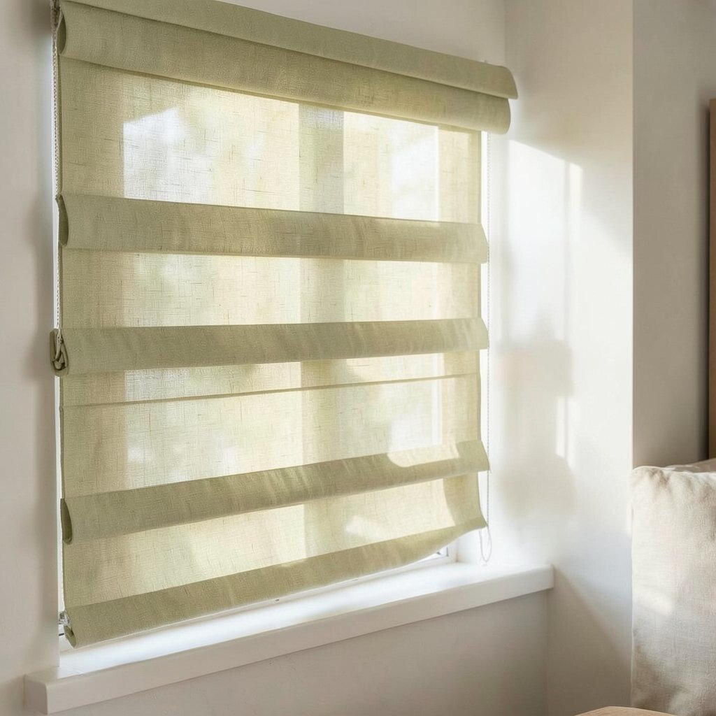
Light olive Roman shades add warmth like greenery in a sunny window. They brighten your room by bringing in an earthy color that feels calm and fresh.
Try olive shades with a yellow or warm undertone for a brighter, more optimistic look. This color works well with beige walls, tan leather, and natural stone.
10. Checkered Micro-Print for Playful Contrast
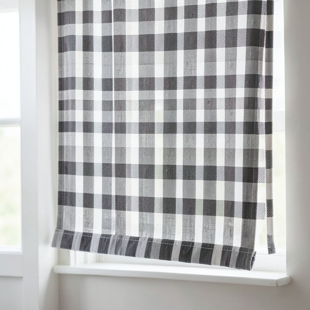
A micro-check Roman shade adds a fun pattern that doesn’t overwhelm the room. When the colors are light, the check pattern makes your window feel lively and bright.
Choose a check in white and a muted warm tone like sand or soft wheat. This gives contrast without making the room feel busy.
For practical styling, pair patterned shades with solid curtains or simple textiles so the room stays balanced. If you love a trend look, consider coordinating the check tone with a throw blanket or rug for a pulled-together feel. When planning your budget, remember that custom patterns can cost more, so look for standard sizes if possible.
11. Sheer-Backed Roman Shades for Soft Daylight
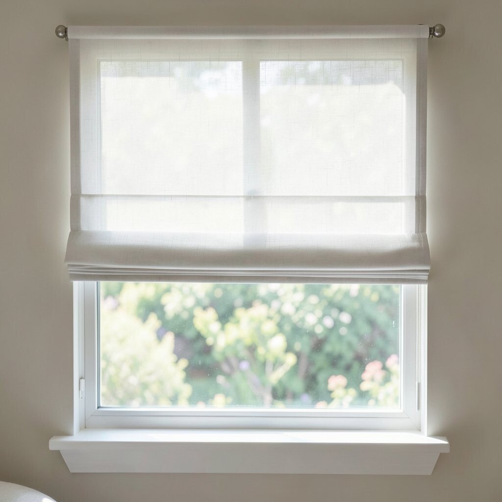
Roman shades with a sheer backing let light travel while still offering privacy. The result is a bright, glowing window that feels gentle throughout the day.
This style is great if you want brightness without looking at glare. It works well in bedrooms where you want softer morning light while keeping things private.
To make it unique, pick a fabric that has a slight color tint, like warm cream or pale gray. Add a lining that improves insulation if your room runs hot or cold.
Cost considerations vary based on lining and fabric weight, but sheer-back designs can be worth it because they change the whole feel of the room. For best results, mount the shade high and wide to let light in around the edges.
12. Crisp White with Simple Roman Trim
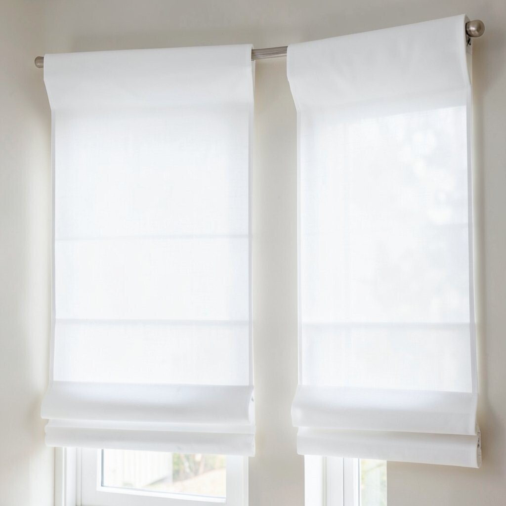
Nothing brightens a room like crisp white Roman shades. When they include clean trim details, the window looks tailored and modern.
Choose a fabric that holds its shape so the folds look neat as the shade rises and lowers. This is a smart pick for kitchens and small spaces where you want a bright, tidy look.
13. Morning-Glow Oatmeal with Subtle Speckle
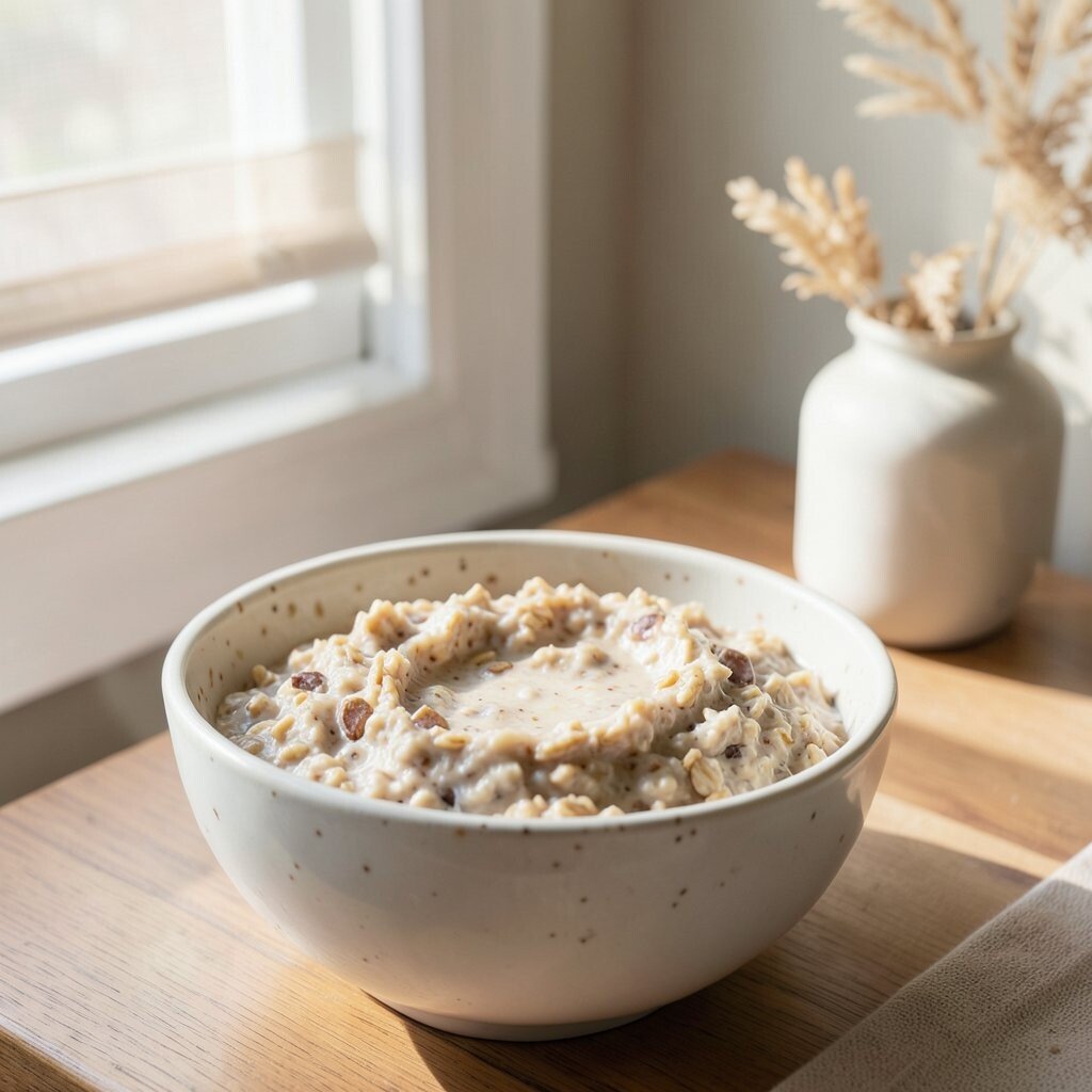
Oatmeal Roman shades create a warm glow that feels like soft sunlight. A subtle speckle pattern adds depth so the fabric doesn’t look flat.
This shade color works beautifully with wood furniture, cream walls, and warm metals. It also hides dust and minor marks better than bright white, which is handy in busy homes.
For personalization, match the speckle tone to your rug fibers or accent pillows. Consider a light-filtering fabric if you want daytime brightness without turning the room into a shadowy space.
When thinking about cost, speckled and blended fabrics can be a smart middle ground between plain and premium designer styles. If you’re ordering online, double-check the fabric direction and pattern alignment notes before finalizing.
14. Sage Green for Calm, Bright Comfort
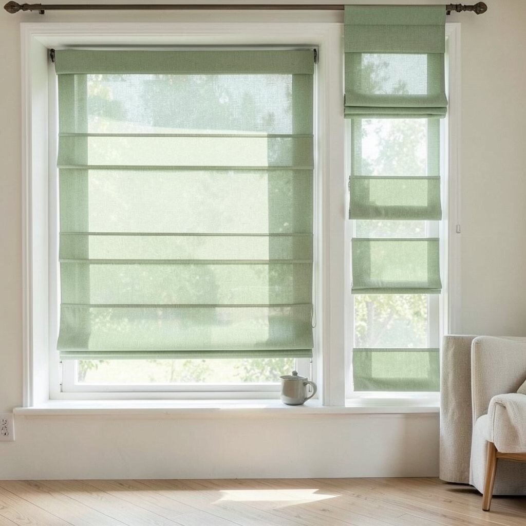
Sage green Roman shades bring a calming freshness that brightens the space. The gentle green tone feels balanced, not overpowering, which helps rooms stay airy.
Pair sage with warm whites, light beige walls, and natural textures like rattan or jute. This look is especially appealing in bedrooms and nurseries because it feels soothing.
15. Blackout-Plus Light Layer for Office Clarity
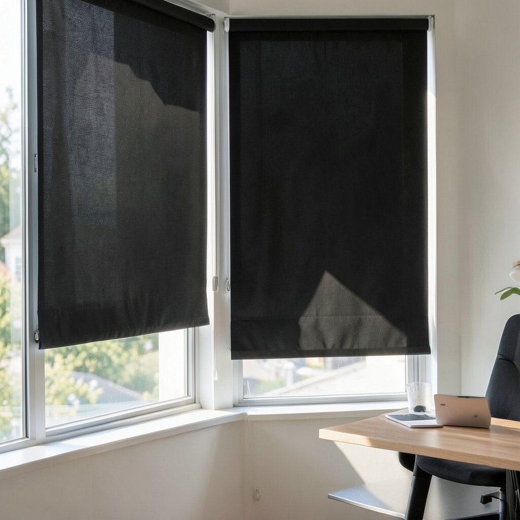
If your home office needs both brightness and focus, try a layered Roman shade approach. A light top layer softens daylight, while a blackout layer controls glare when screen time matters.
This makes workspaces feel more comfortable during sunny afternoons. You still get a bright look most of the day, but you’re prepared for glare and late meetings.
To personalize, choose a light neutral color for the visible layer, like ivory or pale sand. Consider motorized lift if you want convenience, but use budget wisely by limiting custom widths. Measure your window carefully so the layers align smoothly without gaps.
16. Terracotta Rust for Cozy Daylight
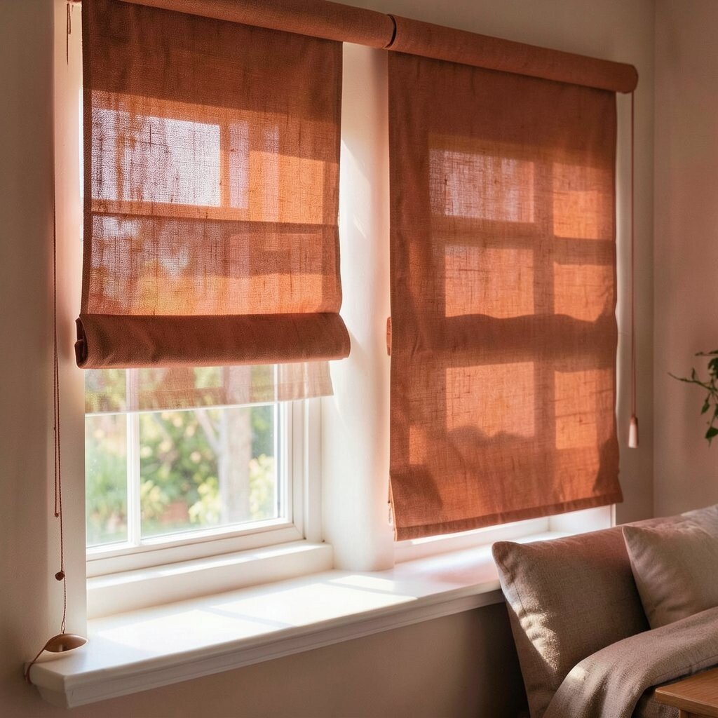
Terracotta Roman shades add warmth that feels both earthy and uplifting. The color brightens your room by creating a lively contrast with whites and creams.
Use terracotta in living rooms, dining spaces, and entryways where you want welcoming energy. Pair with warm wood, woven decor, and muted patterned rugs for a cohesive style.
For practical tips, consider a semi-opaque fabric that filters light but doesn’t make the room dim. If you love the look but fear it might fade, choose colorfast fabrics and follow care instructions closely.
Cost can be higher for richer terracotta dyes, so watch for fabric samples and return policies. If you’re saving money, start with a smaller window or use the shade on the brightest wall first to get the biggest impact.
17. Elegant Gray with Soft Light Specks
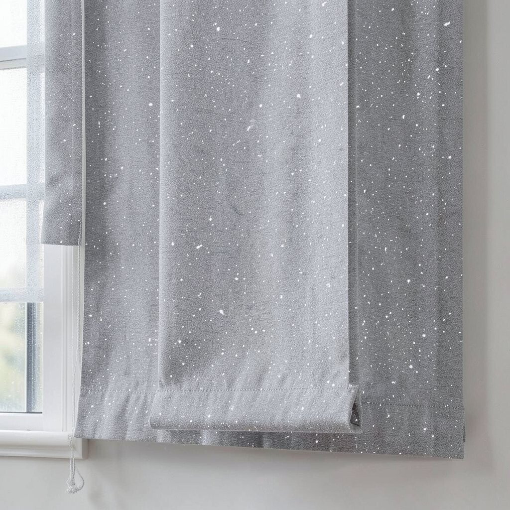
Gray Roman shades can brighten a room when they’re light and infused with subtle specks. The speckle adds texture so the window looks interesting even when closed.
Pick a light gray with warm undertones to avoid a cold, dim mood. This works well in modern rooms with white walls, steel hardware, and light gray upholstery.
To personalize, select a fabric that has a barely-there pattern, like micro-embroidery or tiny flecks. Those details make the shade feel custom without needing loud colors.
18. Bright Blue Geometric Lines
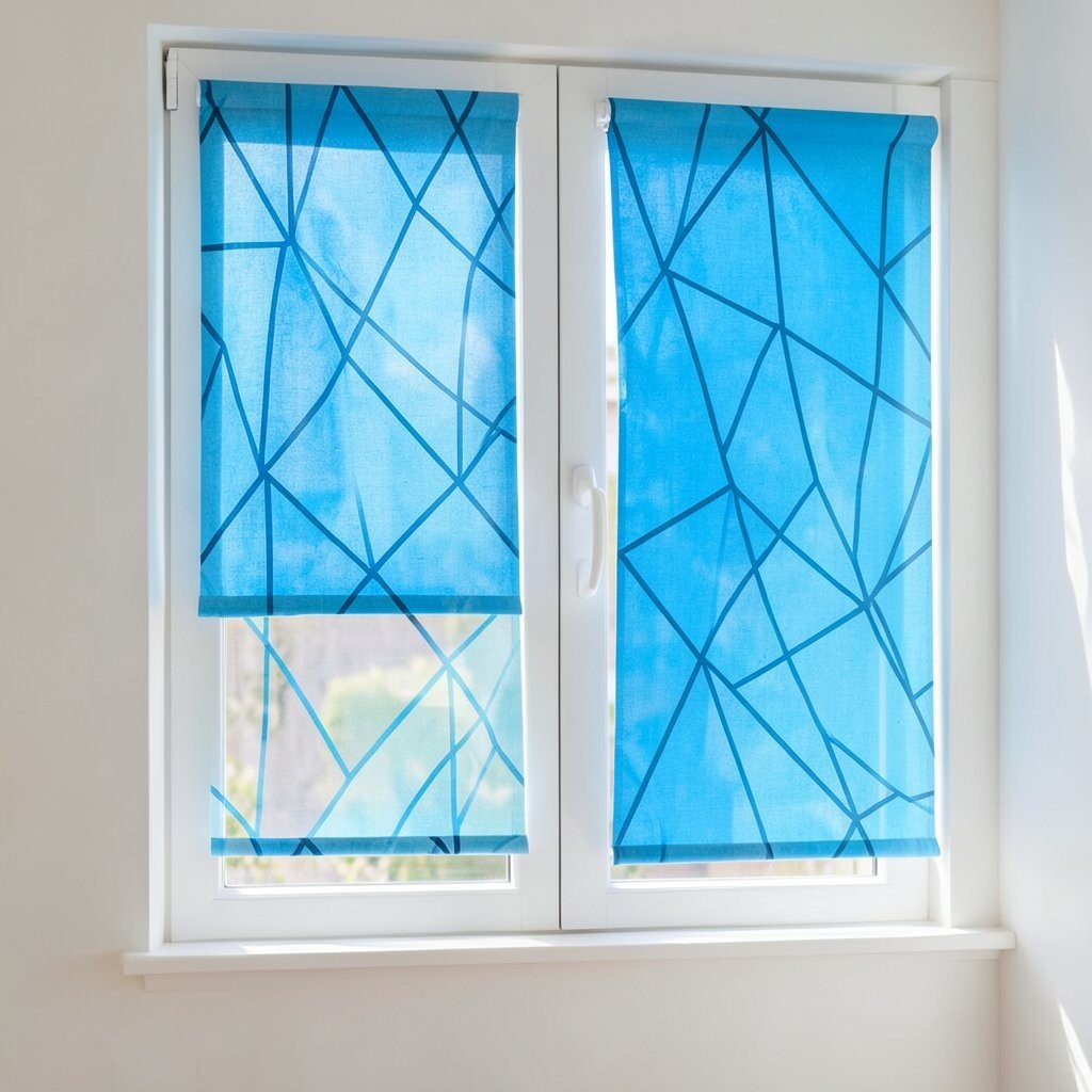
Blue geometric Roman shades can energize a space while still keeping it bright. Choose airy shapes and thin lines so the look feels light, not heavy.
This style adds personality to kitchens, kids’ rooms, and creative studios. Keep other decor simple so the geometry stands out in a friendly way.
When choosing fabric, consider how much sunlight your room gets so the blue doesn’t overpower. If you want a softer feel, go for powder blue or chambray tones that read calm in daylight. Cost-wise, geometric prints are sometimes more expensive, but they can replace the need for extra wall art.
19. Monochrome Cream with Embossed Texture
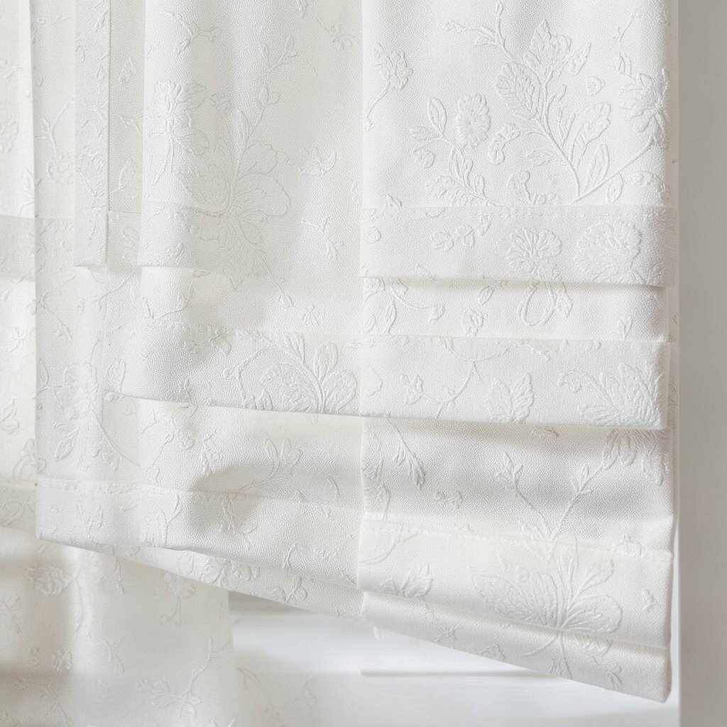
Monochrome cream Roman shades look luxurious when the fabric has an embossed texture. Even in a bright room, the raised pattern adds depth and interest.
This is a great option if you love bright spaces but want a subtle, elevated look. Embossed textures also make the shade feel richer than a flat weave.
For practical tips, test fabric swatches against your wall lighting. Daylight can make cream look slightly different, so you’ll want to see it in the room at different times.
Consider a lined option for better light control and insulation. If your budget is limited, choose the embossed fabric for the main shade and keep trims minimal.
20. Multi-Color Ombre for a “Window Glow” Effect
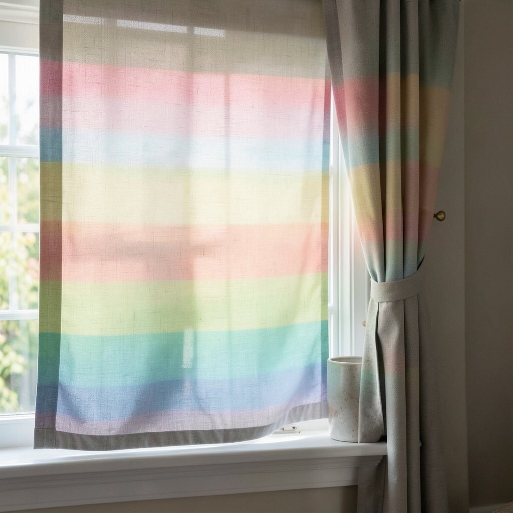
Ombre Roman shades create a smooth color story that feels like a glow moving across the window. When you choose light-to-warm gradients, the room looks brighter and more dynamic.
Pick ombre tones that match your palette, such as cream to peach or ivory to soft honey. This approach adds creativity without adding clutter.
21. Custom Photo-Style Panels with Neutral Base
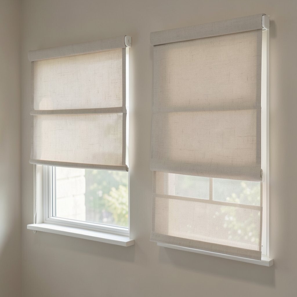
For a truly unique look, consider Roman shade designs that mimic a photo panel but keep a neutral foundation. The base color keeps things bright, while the design element adds character.
This works especially well in entryways, dining nooks, and creative rooms where you want a focal point. Choose imagery that includes light tones, like botanical sketches or airy landscapes, so the window still feels open.
Personalization can also mean adjusting the fabric sheen, the height of the design, and the fold style. If you’re budgeting, ask about the minimum custom fees and compare them to standard fabric upgrades. Always check how the image aligns when the shade is raised, since folds can change what you see.