
Sunset colors have a quiet superpower: they make rooms feel warmer and more alive. When the light hits just right, even plain corners start to glow.
-
1. Peachy-Orange Accent Wall
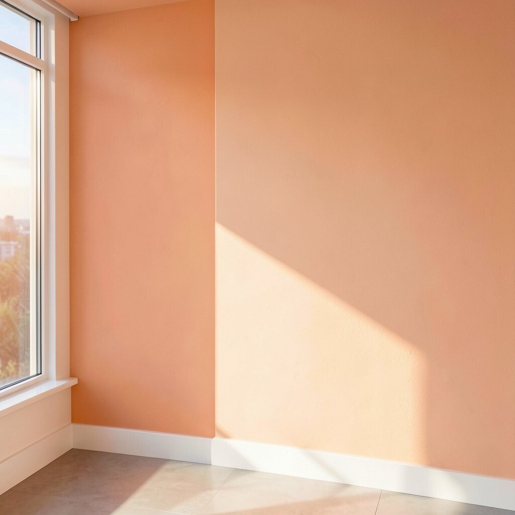
Peachy-Orange Accent Wall An accent wall in peachy-orange can look like golden hour right inside your home. It gives nearby furniture a softer glow and makes the whole space feel friendlier.
Choose a tone that matches your lighting, so it doesn’t turn too bold in the evening. Pair it with creamy whites and light wood for balance. To personalize, add a simple line of framed art or a small shelf to echo the warm mood.
Budget-wise, paint is one of the cheapest upgrades with the biggest impact. If you’re renting, use peel-and-stick wallpaper in a similar peach shade. This idea is trending because warm “sunset neutrals” are replacing harsh cool grays in many homes.
-
2. Warm Terracotta Curtains
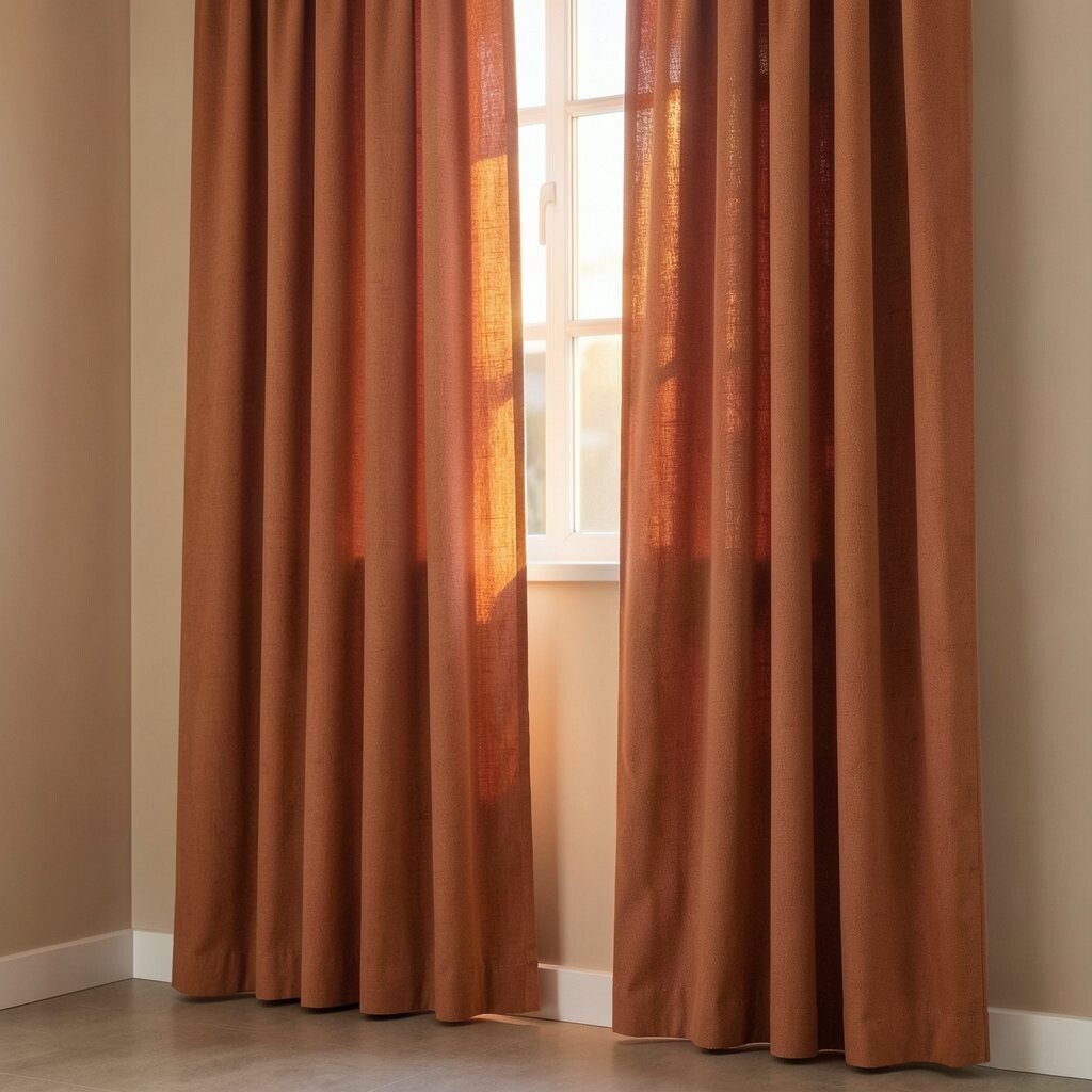
Warm Terracotta Curtains Terracotta curtains bring instant warmth to windows and soften harsh light. They look lovely in daylight and even nicer at night when lamps are on.
Go for a semi-sheer version if you want glow without blocking too much light. For extra style, choose a textured fabric like linen-look so the color feels rich. Consider adding matching throw pillows in a lighter clay or sand tone.
If you want a cost-friendly move, swap only one set of curtains first. Current trends show more earthy warmth coming from terracotta, rust, and clay, especially in living rooms and bedrooms. Measure your window width carefully so the curtains look full, not skimpy.
-
3. Sunset Gradient Rug
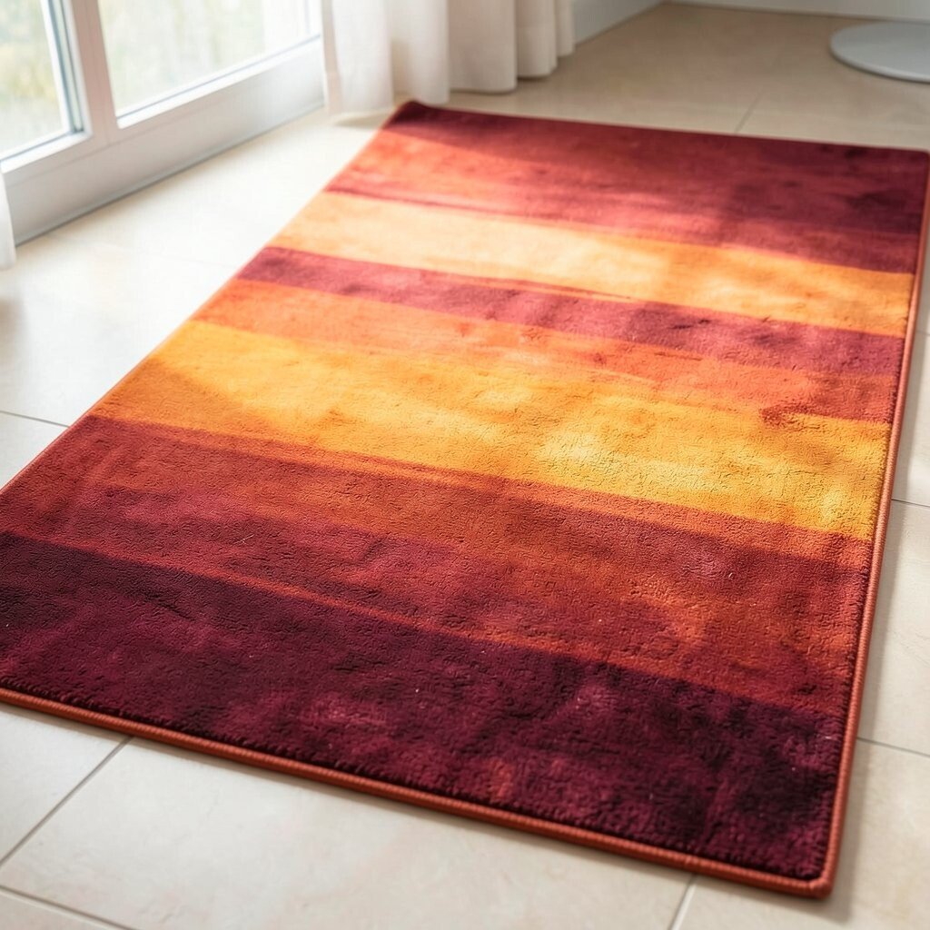
Sunset Gradient Rug A rug with a gentle sunset gradient can make your floor feel like a horizon. Think warm coral shifting into golden yellow, then fading into soft sand.
This visual trick adds movement, so your room feels more dynamic even when nothing else changes. It also helps define spaces, like a reading nook or dining area, especially in open plans. Pick a rug size that clearly fits under your main seating so the colors look intentional.
For personalization, match one rug color to your wall art or a cabinet knob finish. If you’re watching the budget, choose a smaller runner first and build from there later. Gradient rugs are popular now because they look modern, but they still feel cozy and inviting.
-
4. Apricot and Vanilla Wall Trim
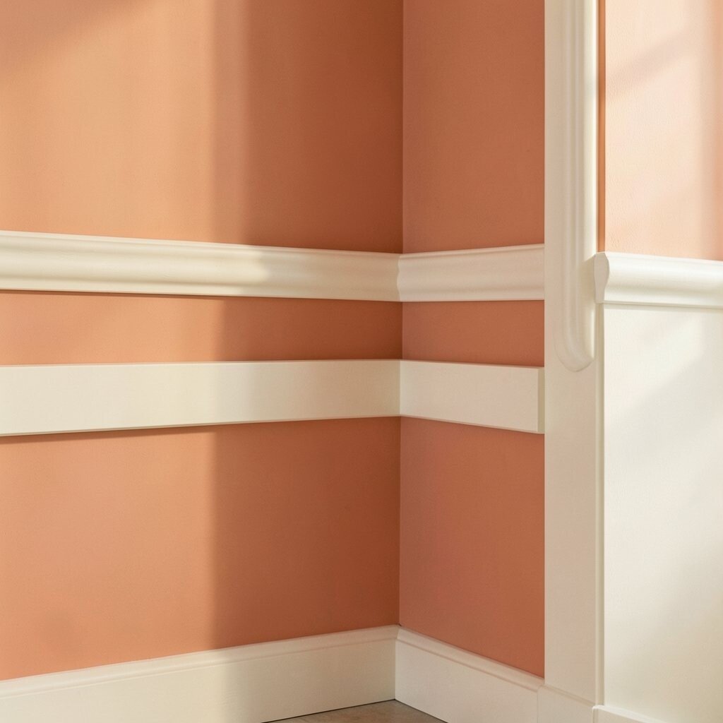
Apricot and Vanilla Wall Trim Paint your wall trim or baseboards with apricot and keep the main walls in vanilla. The result is a warm, polished look that feels bright without feeling loud.
Use the apricot only as a frame, like a gentle border around your room. This makes ceilings feel higher and corners look cleaner. Add a few touches of the same color in small ways, like a picture frame or a vase.
If you’re concerned about cost, trim paint is a focused project that can be done room by room. It’s also a good move for renters because you can remove or touch up the color later. Warm trim is trending as a way to add interest without repainting an entire room.
-
5. Golden Hour Pendant Lighting
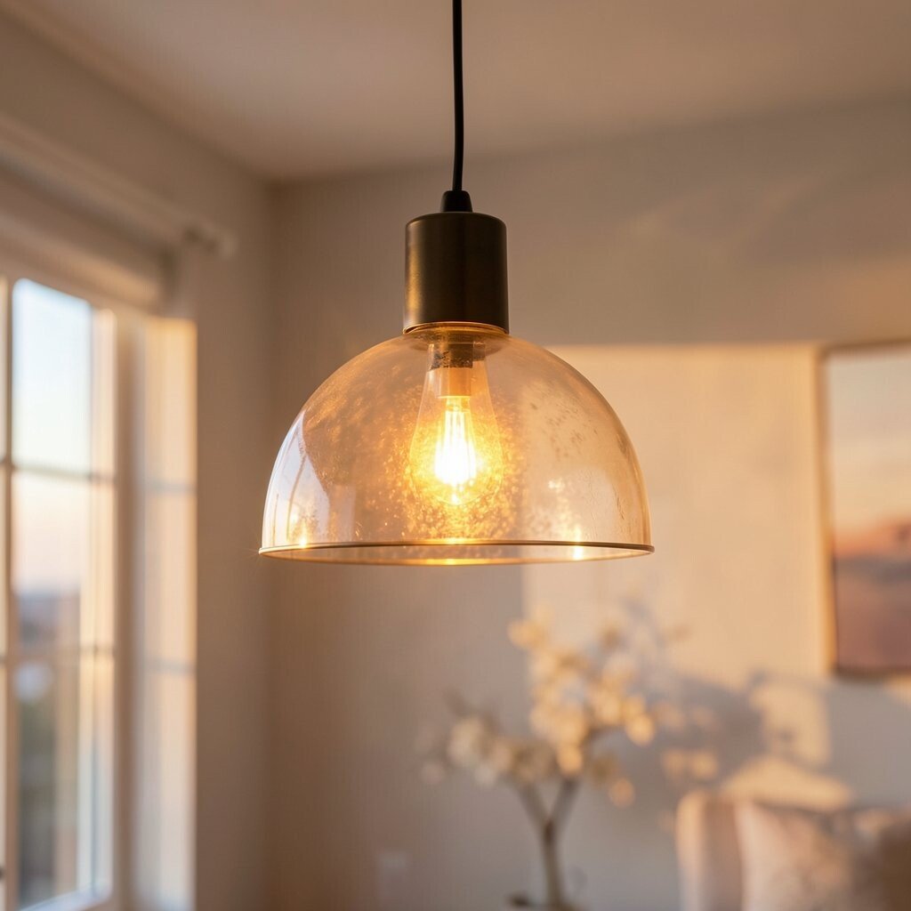
Golden Hour Pendant Lighting Warm metallic pendant lights can give your space a sunrise-to-sunset glow. Look for finishes like brushed brass, antique gold, or honey bronze.
Lighting is a fast way to brighten because it changes how all your colors appear. Use bulbs that look warm, not icy, so the light flatters skin and fabrics. To personalize, choose a shape that fits your room—rounded shades for softness, or angled shades for a sharper look.
Current trends lean toward warm lighting because it makes kitchens and dining rooms feel inviting. If you want to keep costs down, replace only the fixture and keep the same ceiling wiring setup. Make sure the new light scale fits the room size so it looks “right,” not too small.
-
6. Coral-Red Throw Blanket
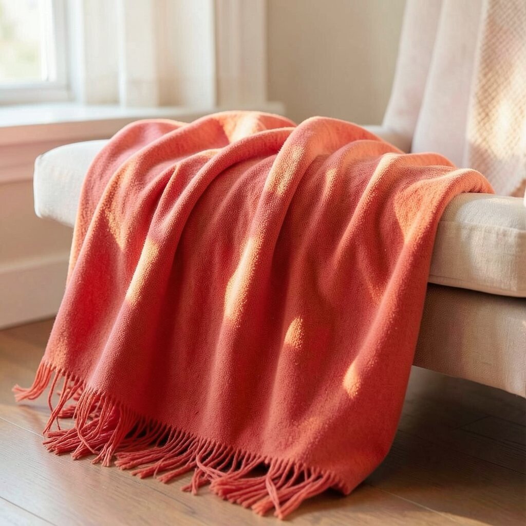
Coral-Red Throw Blanket A coral-red throw blanket can instantly add warmth to sofas, beds, and reading chairs. When draped casually, it looks like the color was always meant to be there.
This kind of color pop boosts your mood and helps neutral rooms feel more cheerful. It also adds texture, especially if the fabric is chunky knit or soft woven. Try folding it over the arm of a chair so the color catches attention every time you walk by.
For personalization, match coral with one accent color like olive green or warm navy. If you’re on a budget, shop for a blanket at end-of-season sales or in your preferred pattern style. Coral accents are trending again because they feel playful but still grown-up.
-
7. Cinnamon Brown Accent Chair
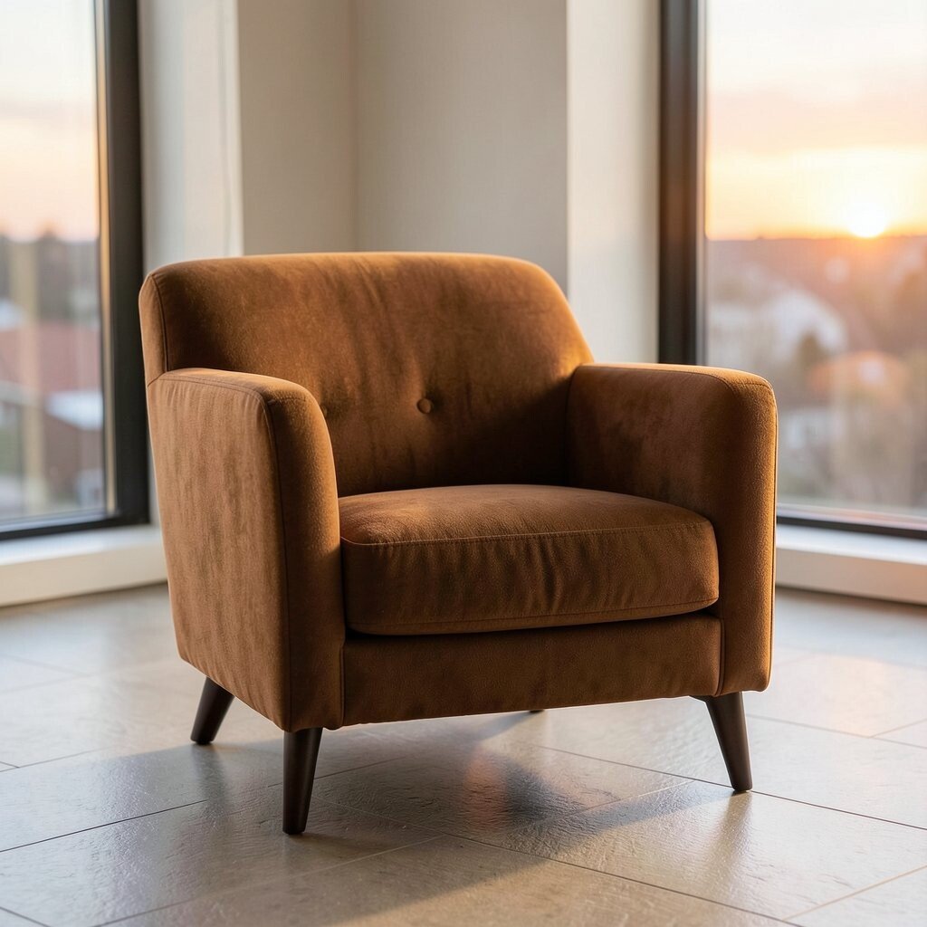
Cinnamon Brown Accent Chair A cinnamon brown accent chair brings grounded warmth without making the room feel heavy. It looks especially good with light walls and bright textiles.
Choose a chair with a comfortable shape—slightly curved arms or a rounded back feel extra inviting. The benefit is that it gives you a “main character” piece that ties the palette together. For personalization, add a cushion in peach or a patterned pillow that includes gold tones.
If the chair is a bigger purchase, look for durable fabric that handles daily life. You can also keep costs lower by recovering a thrifted chair or shopping for a pre-owned piece. This warm-brown look is currently popular in living rooms because it blends classic cozy with modern color.
-
8. Sunbeam Yellow Bookshelf Styling
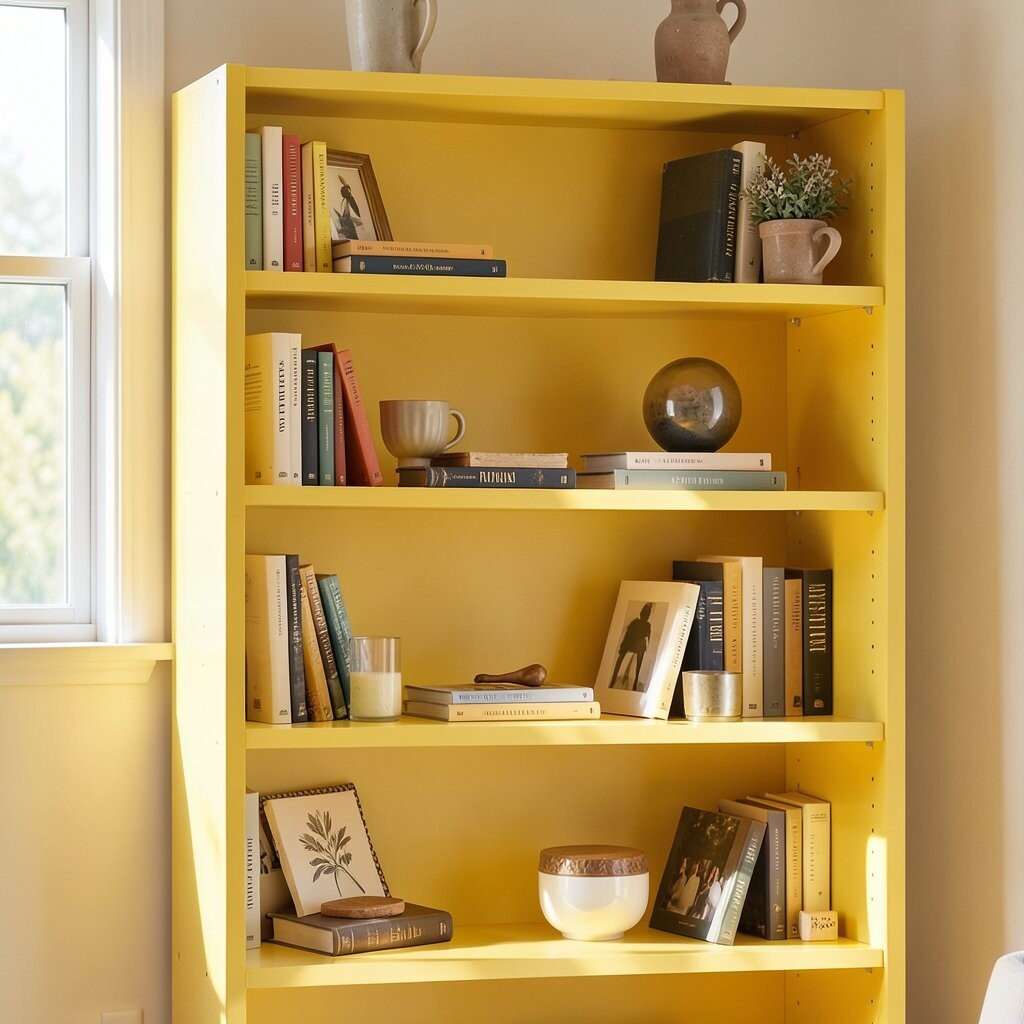
Sunbeam Yellow Bookshelf Styling If your bookshelf feels bland, a sunbeam yellow styling moment can fix that fast. Add a small set of books with warm spines and place them so color blocks show.
Yellow also makes the room feel brighter because it reflects light in a friendly way. Mix in a few ceramic pieces like small vases or bowls in cream and terracotta. To personalize, rotate decor by season—summer accents can be more yellow and spring accents can be softer peach.
For cost considerations, try using budget frames and painting only one small tray in yellow. Trends show that “styled shelves” are staying popular, especially when colors look like they belong together. A little effort here can make your whole room feel curated.
-
9. Sunset-Inspired Wall Art Set
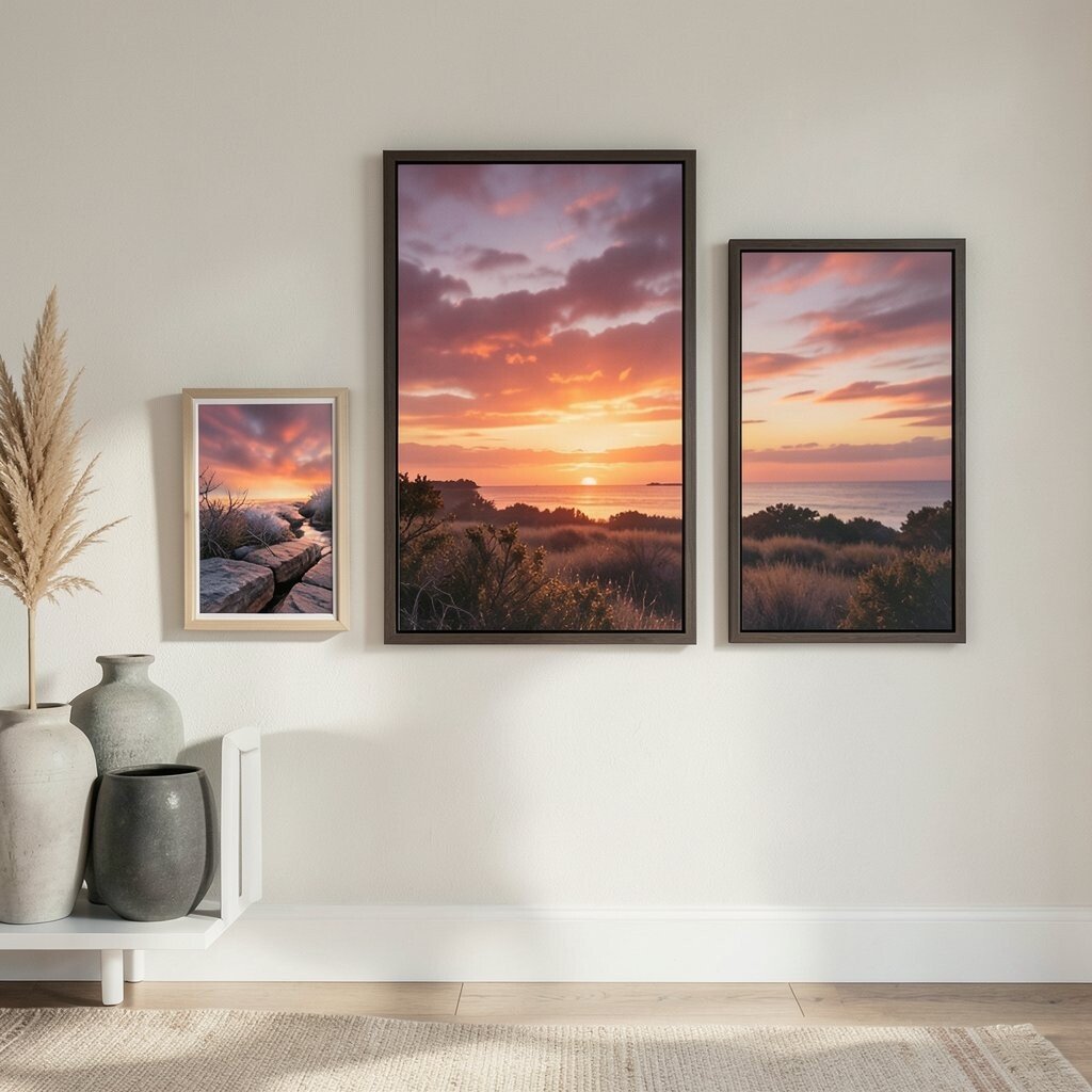
Sunset-Inspired Wall Art Set Wall art in sunset colors can turn a blank wall into a mood board you live with. Think prints that blend coral, peach, and golden yellow like a sky at dusk.
This benefits your space by adding warmth at eye level, where your eyes spend time. Choose frames in light wood or warm metal to keep things glowing. For personalization, pick art that matches your favorite style—minimal line art, abstract swirls, or photo collages with warm tones.
If you want budget-friendly options, mix one pricier statement piece with a few affordable prints. You can also print your own designs if you have a scanner or photo archive. Sunset art is trending because it brings the “outside sky” vibe indoors.
-
10. Sea-Salt Blue With Warm Orange
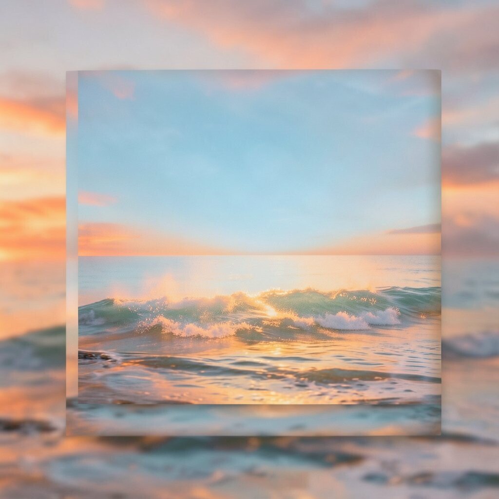
Sea-Salt Blue With Warm Orange Sea-salt blue with warm orange is a powerful combo that feels fresh, not flat. The cool blue makes orange look brighter, like a sunrise popping against the sky.
Use blue in areas like cabinets, a rug border, or accent pillows. Then bring in orange through small details like candles, art, or a chair throw. To personalize, decide how bold you want orange: subtle in small accents, or strong with one bigger piece.
Cost-wise, start with textiles because they’re easy to swap later. If you want to paint, do a smaller section like a hallway wall or a half-height board. This contrast style is popular now because it looks modern and it’s still cozy.
-
11. Warm Peach Bedding Refresh
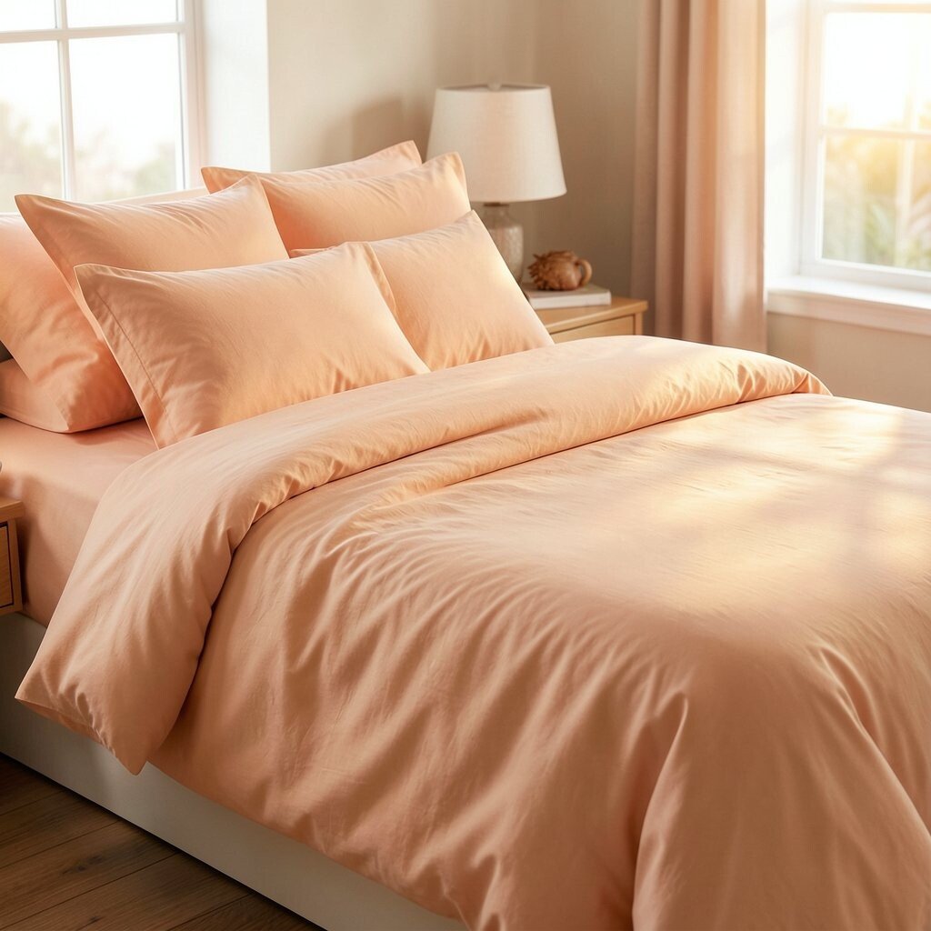
Warm Peach Bedding Refresh Peach bedding can make your bedroom feel like a soft glow every morning. It’s relaxing, but it still feels bright enough to wake you up.
Pick a duvet cover in peach, then add neutral layers in cream or beige for balance. This helps the room feel calm while the color stays warm. For personalization, choose patterns you love—subtle stripes feel gentle, while bolder patterns feel playful.
If cost is a concern, buy pillowcases first and build the set over time. Bedding trends are leaning toward warm, “sunset calm” palettes that feel soothing instead of loud. Also, try layering with different textures so the color looks rich, not plain.
-
12. Rosy Pink Vase Cluster
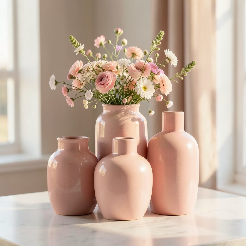
Rosy Pink Vase Cluster A cluster of rosy pink vases can look like a mini sunset sitting on your table. Use two or three pieces in different sizes so the display feels styled, not scattered.
These vases add a focal point and make your surfaces more interesting. Add flowers in warm colors, like orange marigolds or peach roses, for a matching effect. To personalize, swap flowers with greenery or dried stems when you want a low-cost refresh.
Cost considerations are simple here: you can use thrifted glass jars painted softly with spray paint. Trends favor small decor clusters because they look curated and easy to change. Keep the cluster near a light source so it catches the glow.
-
13. Copper and Cream Kitchen Details
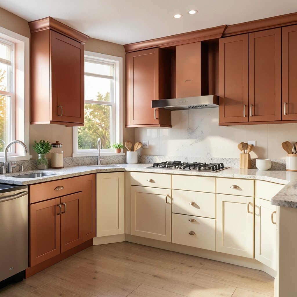
Copper and Cream Kitchen Details Copper and cream details can brighten a kitchen without repainting everything. Think copper-toned hardware, a warm backsplash tile, or cream bar stools.
The benefit is that metal accents reflect light and make surfaces look cleaner and warmer. Choose one main copper element and keep the rest in cream to avoid visual clutter. For personalization, match copper to a few small accessories like a utensil holder or a kettle finish.
If you’re budget-aware, upgrade cabinet pulls first; they’re usually cheaper than major remodels. Current trends show that warm metals like copper and brass are back because they look cozy and rich. Just remember to balance the shine with matte surfaces so it doesn’t feel too bright.
-
14. Sunset Color Block on a Door or Nook
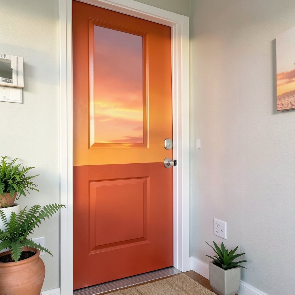
Sunset Color Block on a Door or Nook A color block on a door or built-in nook can turn a small space into a style highlight. Try a stacked look: sand on top, peach in the middle, warm orange at the base.
This benefits your space by creating a “destination” area you want to look at. It also helps break up plain walls in a way that feels fun. To personalize, choose a layout that matches your home—vertical blocks for tall spaces, and horizontal blocks for wider walls.
Cost considerations are friendly because a nook or door takes less paint than whole rooms. Use painter’s tape carefully for clean edges and test colors on a small sample patch first. Color blocking is trending again because it feels bold, yet still warm and welcoming.
-
15. Sunset-Tone Accent Wallpaper Strips
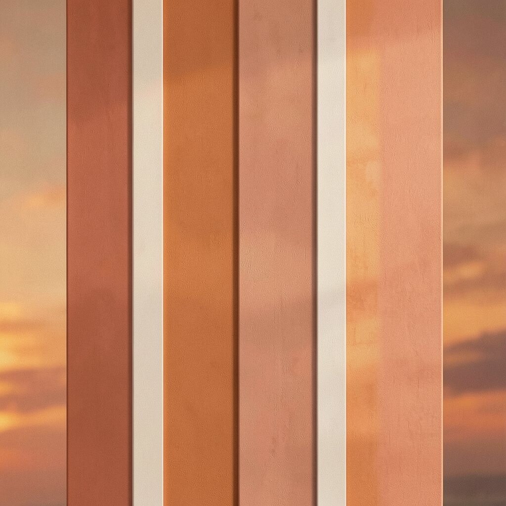
Sunset-Tone Accent Wallpaper Strips Wallpaper strips in sunset tones can make your room feel lively without covering every wall. Look for small sections behind a headboard, in a hallway, or inside a closet nook.
These strips bring texture and color while keeping the rest of the room calmer. Choose a pattern that includes warm peach, golden yellow, or gentle coral so the palette stays consistent. For personalization, match the strip colors to your rug or curtains so everything looks like it belongs.
If you’re watching your budget, choose peel-and-stick options for lower cost and easy updates. Current trends show “small statement wallpaper” instead of large full-wall coverage. Measure carefully and plan where your seams will fall so the design looks smooth.
-
16. Terracotta Tile-Style Floors With Rugs
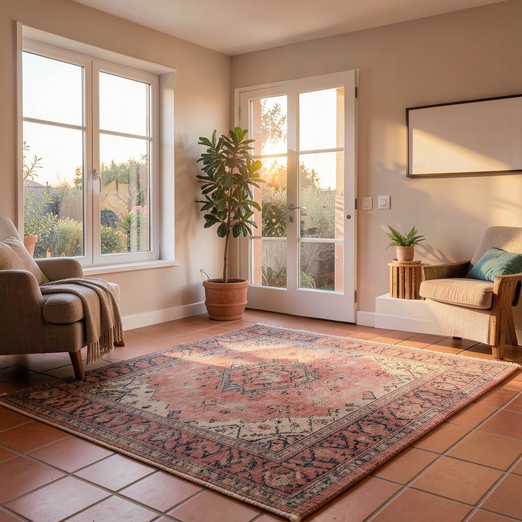
Terracotta Tile-Style Floors With Rugs If you can’t change your floors, you can still get the terracotta vibe with rugs. A tile-pattern rug in warm clay colors can mimic that sunny look.
This benefits your space by adding warmth underfoot and making the room feel grounded. Pair it with light furniture legs and warm white walls for a balanced look. To personalize, choose a pattern scale—small tile squares for subtle charm, or bigger blocks for stronger impact.
Cost considerations depend on rug size, but there are many affordable options that look expensive. Also, layer a neutral runner on top if you want extra brightness. Tile-style patterns are trending because they look timeless but still feel fresh in modern homes.
-
17. Sunset Lampshade Covers
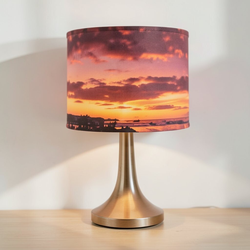
Sunset Lampshade Covers Covering lampshades with sunset fabric is a creative way to brighten a room fast. When the light turns on, the color feels like a warm glow behind glass.
The benefit is that it changes your lighting vibe without needing new wiring or fixtures. Use light fabric so the light passes through and the room feels airy. For personalization, pick a fabric pattern that matches your personality—tiny florals, smooth solids, or gentle stripes.
If you want a budget win, search for lampshade covers, fabric remnant kits, or basic shade replacements on sale. Trends are leaning into “textile lighting” because it makes decor feel softer and more custom. Test your fabric choice by shining a flashlight through it before committing.
-
18. Olive Green + Sunset Orange Accents

Olive Green + Sunset Orange Accents Olive green plus sunset orange is a classic nature-inspired combo. It looks like leaves meeting a glowing sky, so it feels calm and energetic at the same time.
This color pairing benefits your space by creating strong contrast without harshness. Use olive in plants, picture frames, or curtains, then bring orange in cushions, art, or small decor. To personalize, decide which color should lead—olive for a grounded feel, or orange for a louder, brighter mood.
Cost considerations are easy because you can start with plants and textiles. Current trends show more earthy greens because they help warm colors feel balanced. Just keep the tones in the same “family” so orange doesn’t clash with olive undertones.
-
19. Warm White With Peach Washover Paint
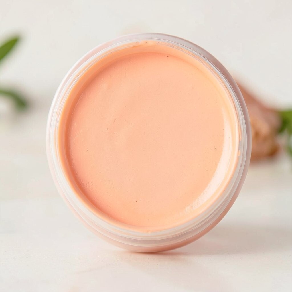
Warm White With Peach Washover Paint Instead of a full orange wall, try a warm white paint with a peach washover. This gives the room a gentle blush tone that still feels bright.
The benefit is that your space stays airy while getting the warmth of sunset colors. It also makes walls look soft and smooth, like light spread across sand. For personalization, test two strengths—one subtle, one slightly stronger—so you can choose what feels best in your lighting.
Cost considerations are good because you only need paint and a simple brush or roller technique. This approach is trending because many people want color without making the room feel too bold. It’s also a great option if you love warm hues but prefer calm spaces.
-
20. Sunset Candle Tray Styling
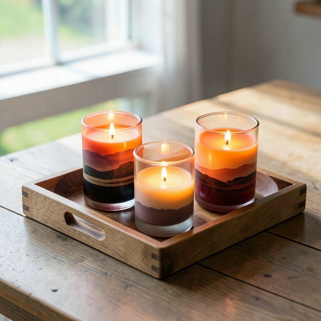
Sunset Candle Tray Styling A sunset candle tray is a small upgrade that can brighten your living room every day. Use a tray in warm wood or light metal and arrange candles in peach, amber, and cream.
The benefit is mood lighting that makes the room feel welcoming right away. Add a matching candle holder or a small bowl with dried citrus slices for extra warmth. To personalize, choose scents you love—orange spice or vanilla bean can make the color feel even more real.
Cost considerations are flexible since you can start with one tray and a couple of candles. Look for seasonal sales for better prices and try mixing one new item with thrifted pieces. This trend is popular because it feels quick, cozy, and easy to change for holidays.
-
21. Sunset-Inspired Accent Through Textured Paint
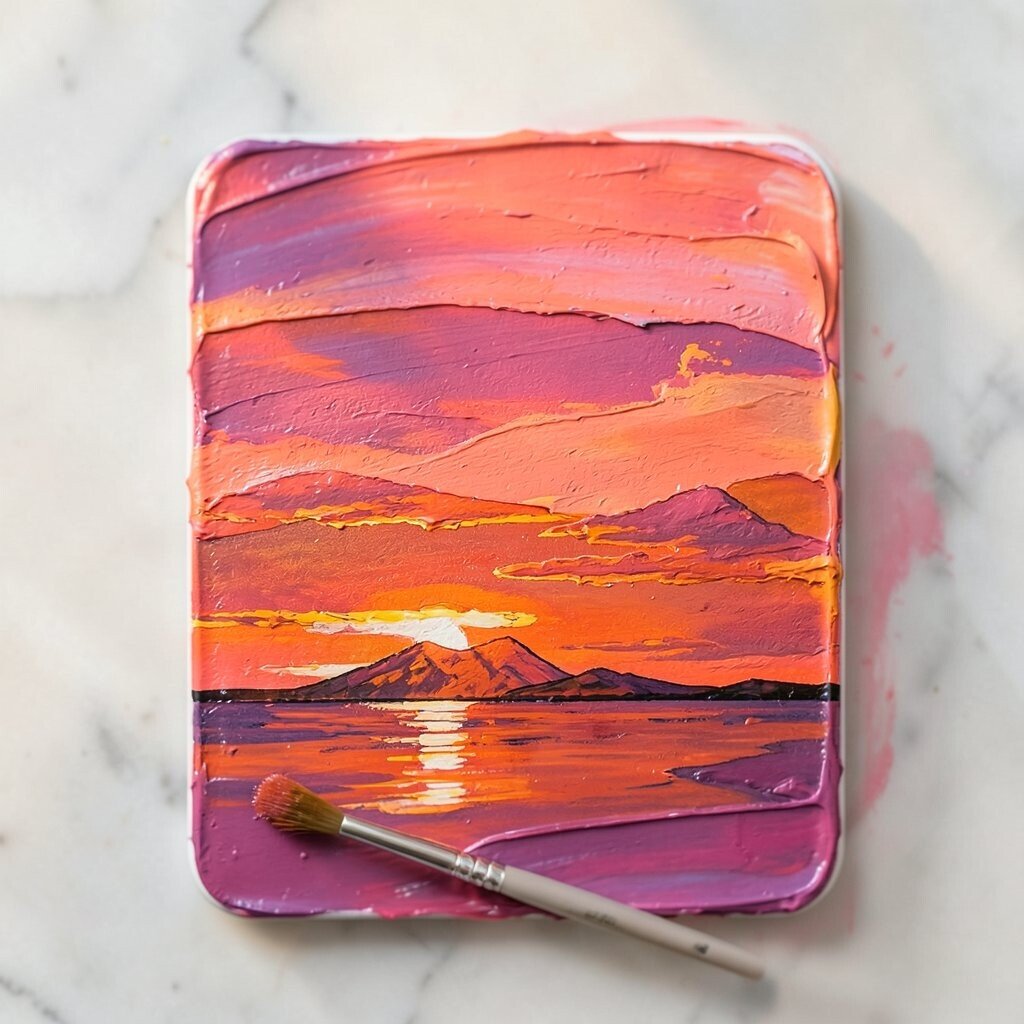
Sunset-Inspired Accent Through Textured Paint Textured paint in warm tones can make a wall look like it’s glowing. Try a soft plaster finish in sand and peach so the light catches the bumps and shadows.
This benefits your space by adding depth, which makes even simple furniture look more stylish. Textures also hide small wall imperfections, so the room feels smoother overall. For personalization, keep the texture subtle in large areas and stronger near features like a fireplace or shelf.
Cost considerations vary because textured finishes can be pricier than standard paint, but you can limit the project to one wall section. Current trends show more people choosing tactile surfaces because they feel warm and modern at the same time. If you’re unsure, test a small sample patch first so you can see how the texture looks in daylight.