
Color can turn a plain room into a place that feels alive.
Your next “happy” space is closer than you think.
-
1. Sunshine Citrus (Marigold + Tangerine + Cream)
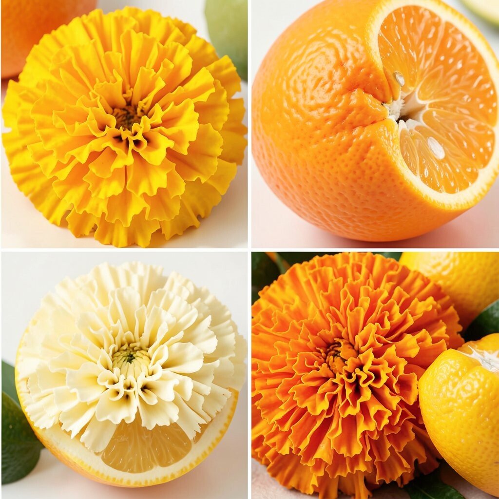
Sunshine Citrus (Marigold + Tangerine + Cream) Picture warm marigold walls paired with tangerine accents, like morning light in a kitchen. A soft cream sofa or rug keeps everything cozy instead of too loud.
This palette feels cheerful and helps rooms look bigger. It also makes everyday items, like bowls and throw pillows, look more fun. Try using the brighter color only on one or two surfaces, so your eyes don’t get tired.
For a quick update, swap in citrus artwork and curtains with small orange notes. If you’re on a budget, look for peel-and-stick tiles in bright spots, like a backsplash area or a shelf backing.
Personalize it with patterns: chevrons for energy, stripes for calm, or tiny polka dots for playful charm. This look is trending in kitchens and sunrooms because it photographs beautifully and feels welcoming.
-
2. Ocean Pop (Turquoise + Coral + White)
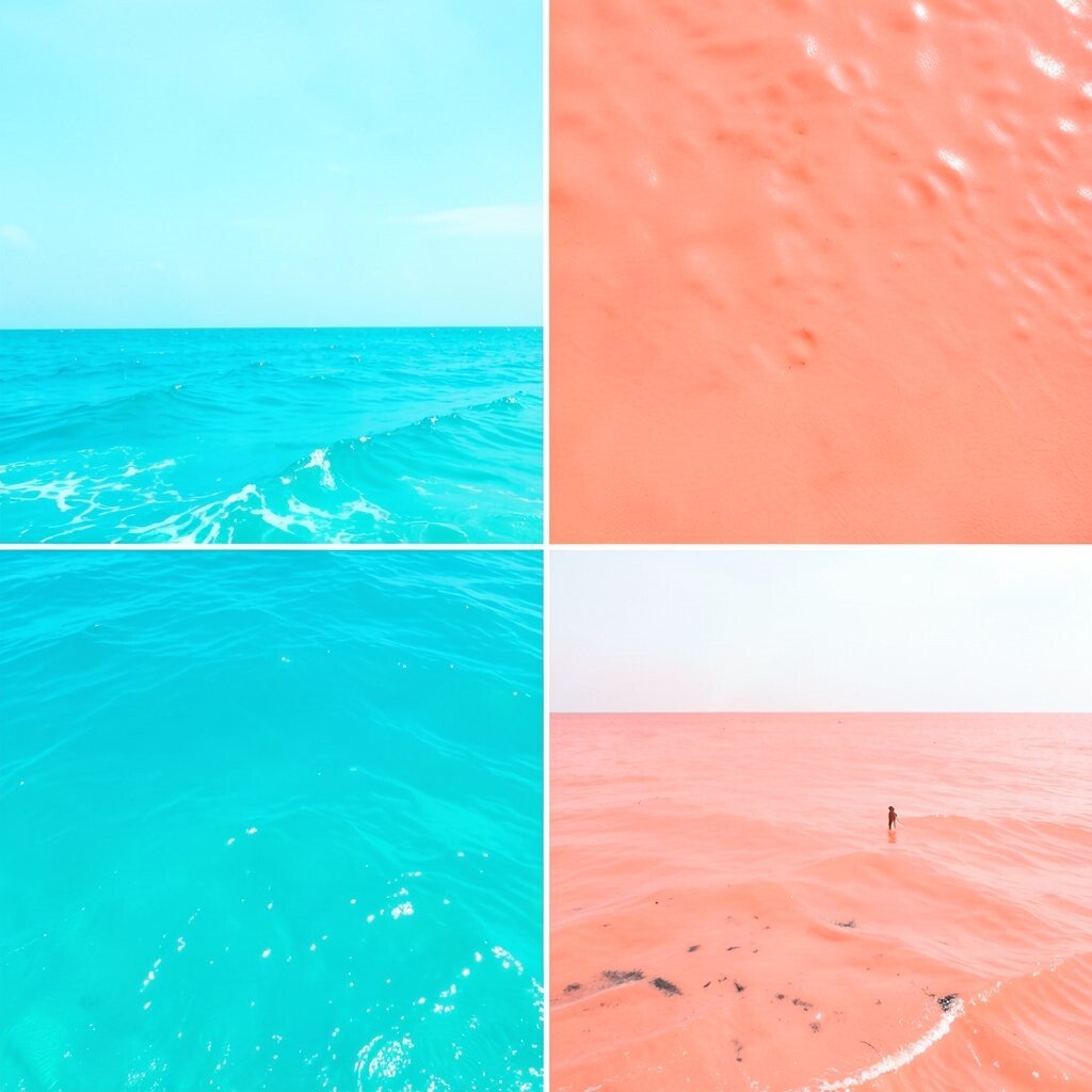
Ocean Pop (Turquoise + Coral + White) Think of turquoise waves with coral highlights, like a beach day captured inside your home. White trim or white furniture makes the colors snap into focus.
This combo brings a “fresh start” feeling and pairs well with casual, modern decor. It can also make dull corners feel brighter right away.
Use turquoise for the largest item, like a wall or big rug, then add coral through pillows, vases, or lampshades. Choose white pieces that keep the space airy, especially if your room is small.
If you want a lower-cost plan, pick one coral accent set and build around it with neutral basics. Trending styles often mix sea colors with natural textures like rattan, jute, and light wood.
-
3. Berry Garden (Plum + Magenta + Soft Sage)
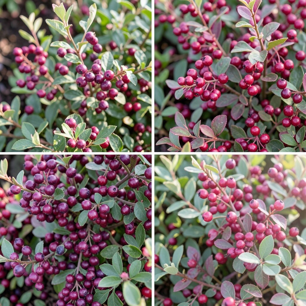
Berry Garden (Plum + Magenta + Soft Sage) Imagine plum and magenta flowers with a soft sage breeze in the background. The result looks lush, artistic, and a little fancy without feeling serious.
This palette adds depth because the cool sage balances the bold berry tones. It’s also great for creating a calm mood, even when the colors are vibrant.
Start with plum in larger pieces, like curtains or a feature wall, then layer magenta in smaller items. Add sage in leaves, plants, or a gentle painted detail to keep the room from feeling too heavy.
Personalize by matching your berry shades to your favorite lipstick or nail polish colors. If you’re careful with the balance, you can get a high-end look with simple budget swaps like cushions and frames.
-
4. Neon Candy (Hot Pink + Electric Blue + Charcoal)
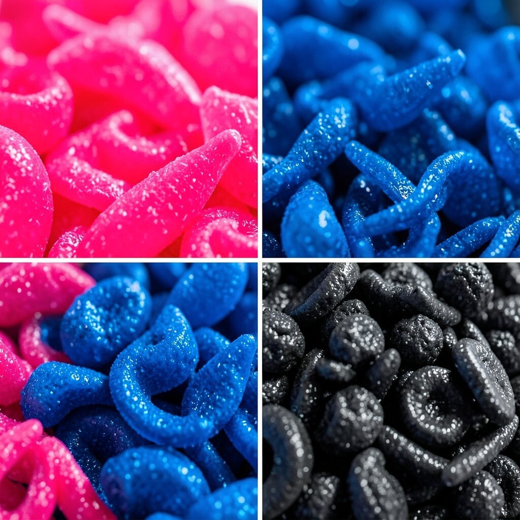
Neon Candy (Hot Pink + Electric Blue + Charcoal) Picture hot pink and electric blue popping like candy on a bright board. Charcoal grounds the brightness, so the room still feels styled and not chaotic.
This palette is perfect for creative spaces, like a home office or gaming nook. It also helps you make statement pieces without needing lots of furniture changes.
Use charcoal for the main “anchor,” such as a black or dark gray rug. Then place hot pink and electric blue in art, lighting, and a few small decor objects for punchy contrast.
To keep costs down, choose one or two bold items you love, like a statement chair or a neon-inspired poster set. Current trends lean toward playful color with darker neutrals, which makes this palette feel modern and bold.
-
5. Warm Earth Fire (Terracotta + Rust + Creamy Beige)
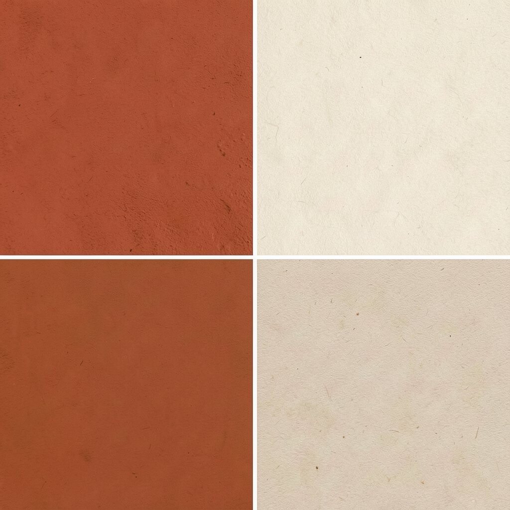
Warm Earth Fire (Terracotta + Rust + Creamy Beige) Think terracotta terrines, rust brick tones, and creamy beige that feels like warm bread. This palette looks cozy and energetic at the same time.
It’s a great option if you want vibrance without the “electric” feel. The warm hues also make lighting look flattering, which is a big bonus for evenings.
Try terracotta on accent walls or cabinets, then use rust in artwork and textiles. Finish with creamy beige on larger items like sofas, curtains, or rugs.
Personalize by adding patterns inspired by tiles, pottery, or woven baskets. For a cost-friendly upgrade, swap throw blankets and choose lamp shades with warm textures. This palette is showing up often in trending “Mediterranean-modern” spaces.
-
6. Forest Mint (Emerald + Mint + Light Wood)

Forest Mint (Emerald + Mint + Light Wood) Picture emerald greens with fresh mint details, softened by light wood tones. It looks bright and natural, like a garden after rain.
This palette can make a room feel calm while still feeling fun. It’s especially friendly in living rooms, bedrooms, and reading corners.
Use emerald for bigger touches, like curtains or a velvet chair, then add mint through vases, cushions, or a small wall painting. Light wood floors, shelves, or frames keep everything looking light and clean.
To save money, paint just one wall mint and keep the rest neutral. You can also update hardware—handles and drawer knobs—in a way that feels small but makes a big difference.
Personalize with plants that match the palette, like jade-colored pots or leafy greens. Current trends keep showing “biophilic” design, and this palette fits right in.
-
7. Lime & Lagoon (Lime Green + Deep Teal + Warm White)
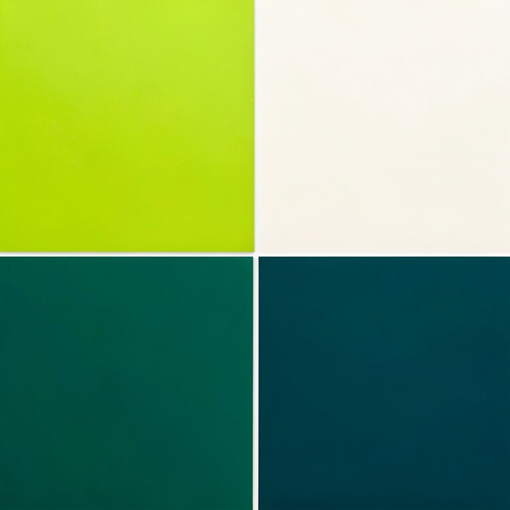
Lime & Lagoon (Lime Green + Deep Teal + Warm White) Lime green feels like a citrus squeeze, while deep teal adds a calm, swim-like depth. Warm white ties it all together so it still feels cozy.
This palette energizes your space and works well with modern furniture. It also makes surfaces feel fresh, especially in bathrooms and entryways.
Start by choosing where the teal goes, since it creates balance, like on a feature wall or large art. Then add lime in smaller items like stools, pillows, or patterned tiles.
If you’re budget-minded, try one lime piece first, like a lamp or a set of matching frames. Trending decor often uses strong color in tiles and backsplashes, so look for affordable options there.
Personalize with your style: go playful with bold stripes or go sleek with solid colors and minimal lines.
-
8. Sunset Studio (Coral + Tangerine + Soft Blue)
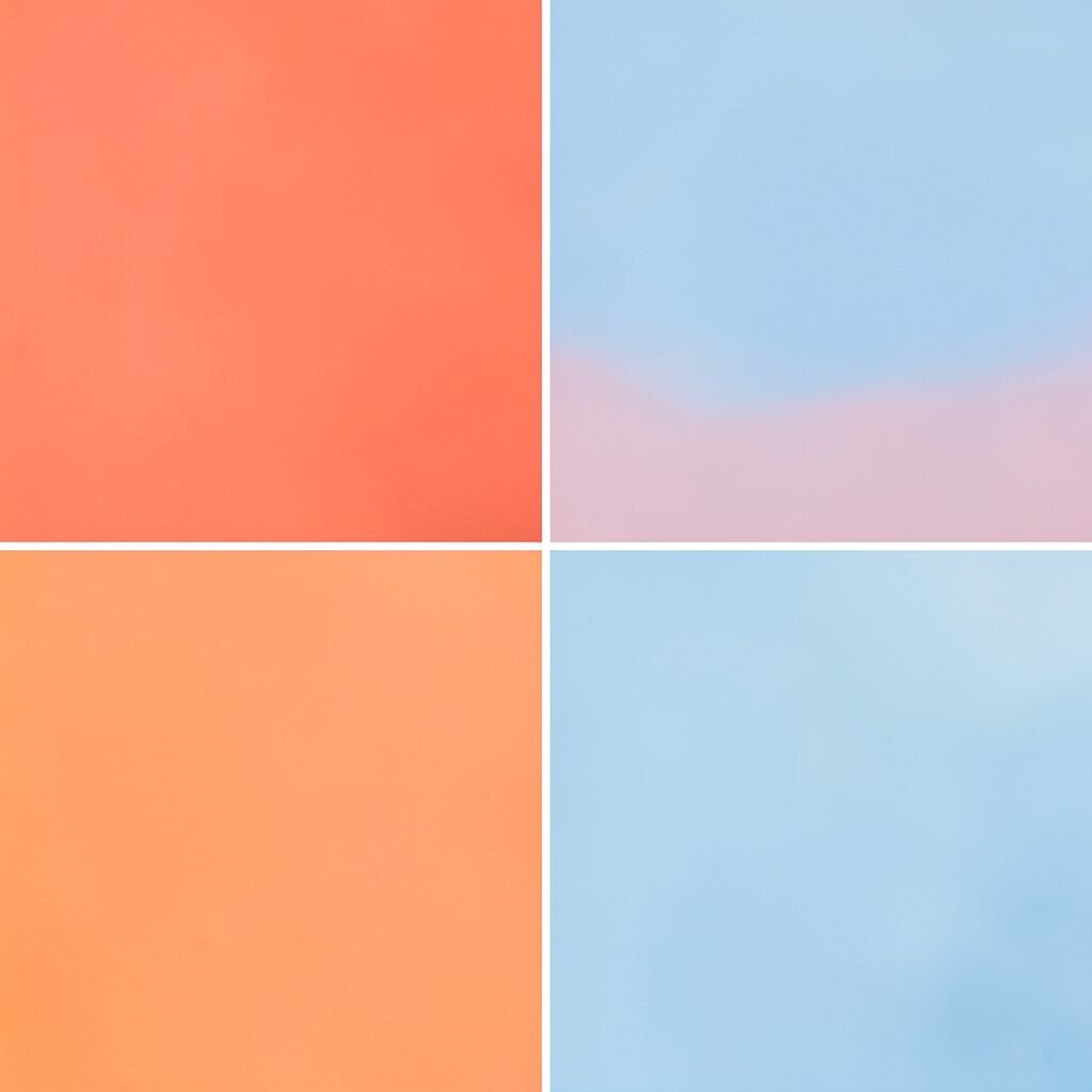
Sunset Studio (Coral + Tangerine + Soft Blue) Think about a sunset where coral and tangerine light meets a soft blue sky. The mix feels happy, creative, and easy to live with.
This palette is great when you want brightness but still want calm. Soft blue also helps your eyes rest, so the room stays comfortable.
Use coral as your main pop, then bring in tangerine through accents like pillows and ceramics. Add soft blue as the “cooling” color in rugs, curtains, or wall art.
For a personal touch, choose a few accessories that match beachy shapes, like seashells, wave patterns, or rounded vases. If you want lower-cost changes, start with a coral throw blanket and a tangerine candle set.
-
9. Royal Pop (Royal Purple + Gold + Cream)
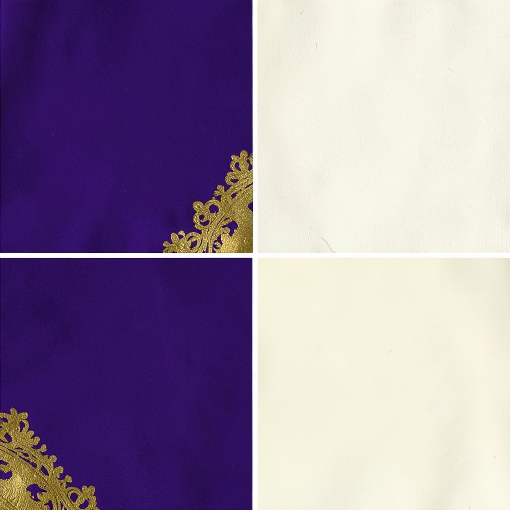
Royal Pop (Royal Purple + Gold + Cream) Royal purple feels bold, rich, and a little dramatic, like theater lights. Gold accents add sparkle, and cream keeps the look elegant instead of heavy.
This palette makes a statement and is wonderful for dining rooms and entry halls. It can also make everyday decor look more “special.”
Choose cream for big surfaces, like walls or upholstery, then layer purple on statement pieces. Add gold in small ways: a mirror frame, picture hooks, or a lamp base.
Personalize by mixing finishes, like matte purple with shiny gold. If you’re cost-conscious, use gold-effect paint for details or pick brass-toned accessories that are easy to swap.
Current trends lean toward “quiet luxury” with bright color bursts, and this palette fits that style. Just keep purple concentrated, so the gold feels like a highlight, not a flood.
-
10. Citrus Grove Calm (Lemon Yellow + Sage + White)
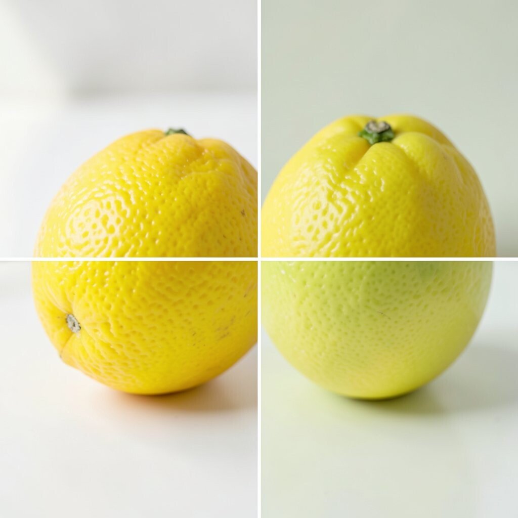
Citrus Grove Calm (Lemon Yellow + Sage + White) Lemon yellow brings instant cheer, while sage adds a gentle, garden-like calm. White keeps it fresh, like clean linen under sunlight.
This palette helps spaces feel open and bright without being too intense. It’s a smart choice for kitchens, bedrooms, and even small offices.
Paint a lower cabinet section or chair frames in lemon yellow, then add sage textiles. Keep white on walls or large rugs so the yellow stays “sunny” instead of overwhelming.
To personalize, choose patterns that fit your vibe: floral for romantic energy, or geometric for modern calm. Budget ideas include thrifted frames, bright placemats, and easy-to-change accessories.
Trending color styling often favors “soft contrast,” and this pairing is perfect for that right now.
-
11. Candy Apple Cozy (Red + Pink + Warm Gray)
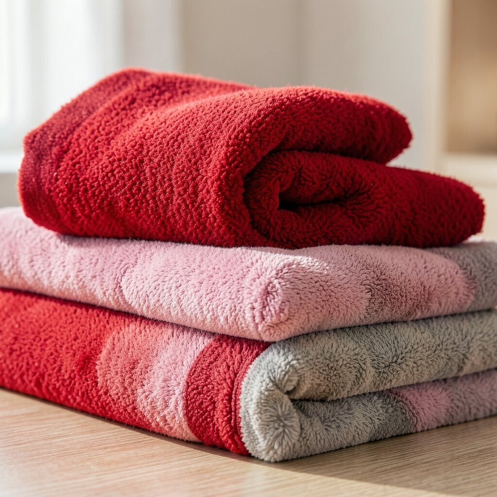
Candy Apple Cozy (Red + Pink + Warm Gray) Red and pink together feel playful, like a candy apple you can almost taste. Warm gray anchors the look, so it still feels smooth and comfortable.
This palette adds warmth and personality fast. It’s also friendly in living rooms, where you want energy but still need comfort.
Use warm gray for the biggest surfaces, like a sofa or wall color. Then add red through artwork, a statement rug, or a couple of bold cushions.
Pink can come in smaller “support” spots, like a bedside lamp, a vase, or curtains with subtle pink undertones. If you want to keep costs low, swap textiles first since they’re usually cheaper than furniture.
For personalization, match the intensity of your reds to your style: soft rose tones feel gentle, while apple red feels dramatic. Current trends also show people leaning into warm maximal color, but with neutral balance.
-
12. Mountain Berry (Indigo + Raspberry + Natural Linen)
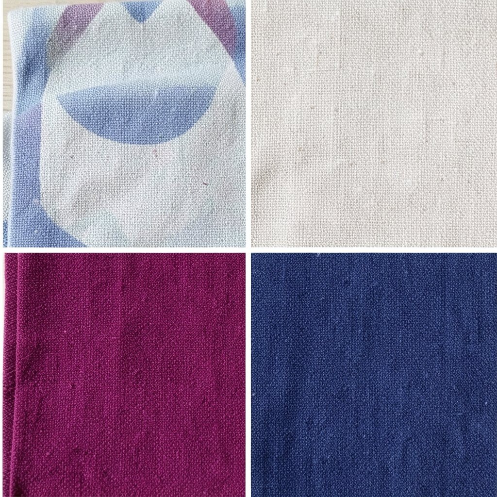
Mountain Berry (Indigo + Raspberry + Natural Linen) Indigo looks deep and cool, like night sky, and raspberry adds a bright berry pop. Natural linen brings texture so the palette feels grounded and real.
This combination is great for bedrooms or reading spaces because it feels both exciting and relaxing. It also photographs well because of the rich contrast.
Choose linen as your main “soft base,” like curtains or bedding, then add indigo on walls or large pieces. Use raspberry in throws, pillows, or a small accent wall painting for a wow moment.
To personalize, layer different fabric textures—knits, woven throws, and chunky rugs—so the colors feel more interesting. Budget-friendly ideas include mixing thrifted frames with one bold raspberry print.
Trending palettes often pair strong jewel tones with natural fibers, and this fits the current look. Keep your raspberry accents limited for a crisp, stylish finish.
-
13. Tropical Tease (Teal + Turquoise + Sunflower Yellow)

Tropical Tease (Teal + Turquoise + Sunflower Yellow) Teal and turquoise feel like lush water, and sunflower yellow adds bright tropical warmth. It looks like sunshine on leaves, and it instantly cheers up plain walls.
This palette works well in kitchens, bathrooms, and sunny hallways. It also helps your space feel more active and lively.
Use teal for large coverage, like a wall or cabinets, then choose turquoise accents for layers. Add sunflower yellow through decor items such as bowls, art, and patterned textiles.
For a simple plan, pick one yellow piece you love—like a chair cushion or a set of dish towels—and build around it. If you want savings, shop for removable wallpaper or peel-and-stick art for quick changes.
Personalize with tropical motifs, but keep some items plain to avoid visual overload. This palette matches a current trend toward bold color and nature-inspired patterns.
-
14. Radiant Lime Noir (Lime + Black + White)
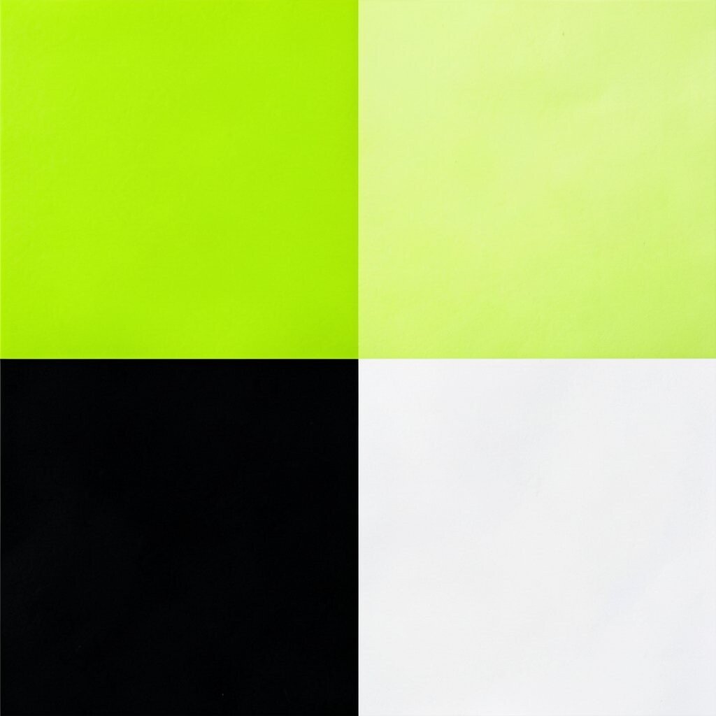
Radiant Lime Noir (Lime + Black + White) Lime against black looks sharp and modern, like street signs glowing at night. White keeps everything crisp and prevents the palette from feeling too heavy.
This combo is perfect for modern apartments and creative studios. It also makes lighting feel brighter because lime reflects more light than you’d expect.
Try black on bigger items like shelves, frames, or a rug, then add lime in smaller bursts. White can live in walls, ceiling trim, or simple furniture lines.
Personalize with sleek shapes, like round mirrors or geometric lamps, to match the “noir” vibe. Budget ideas include switching out wall art and adding lime table runners or a bright desk chair.
Trending color styling includes high-contrast “statement accents,” and lime-black is an easy win. Just keep lime to a few areas so it stays exciting instead of exhausting.
-
15. Warm Coral Limeade (Coral + Lime + Off-White)

Warm Coral Limeade (Coral + Lime + Off-White) Coral brings a friendly glow, while lime adds a fresh pop like a fizzy drink. Off-white keeps the whole space soft and easy to look at.
This palette feels playful and welcoming, especially in breakfast nooks and cheerful kitchens. It’s also a fun way to brighten a hallway without doing a full remodel.
Start with off-white walls, then add coral through curtains, a rug, or a few painted frames. Use lime in smaller details like vases, knobs, or patterned fabric.
For personalization, pick textures that feel crisp, like cotton, linen, or smooth ceramics. If you want a low-cost approach, start with a coral rug and lime throw pillows, then swap extras later.
Current trends show people mixing warm and fresh tones in the same room, and this palette does it naturally. Keep the colors consistent so your space feels designed, not random.
-
16. Rosewood Romance (Rusty Rose + Chocolate Brown + Cream)

Rosewood Romance (Rusty Rose + Chocolate Brown + Cream) Rusty rose and chocolate brown feel warm, like a cozy cafe with soft music. Cream lightens the palette, making it gentle and romantic.
This palette is comforting and still looks vibrant in daylight. It also works well with classic furniture, like wood tables and upholstered chairs.
Use cream on walls or larger surfaces, then place rosewood tones on bedding, curtains, or accent walls. Add chocolate brown through wood, leather, or a grounding rug so the colors feel balanced.
To personalize, choose rose patterns in wallpaper, bedding, or art, but keep the rest simple. Budget ideas include switching bedding sets, buying a rose-colored throw, and using chocolate-toned picture frames you can find easily.
-
17. Azure Punch (Cobalt + Aqua + Soft Ivory)
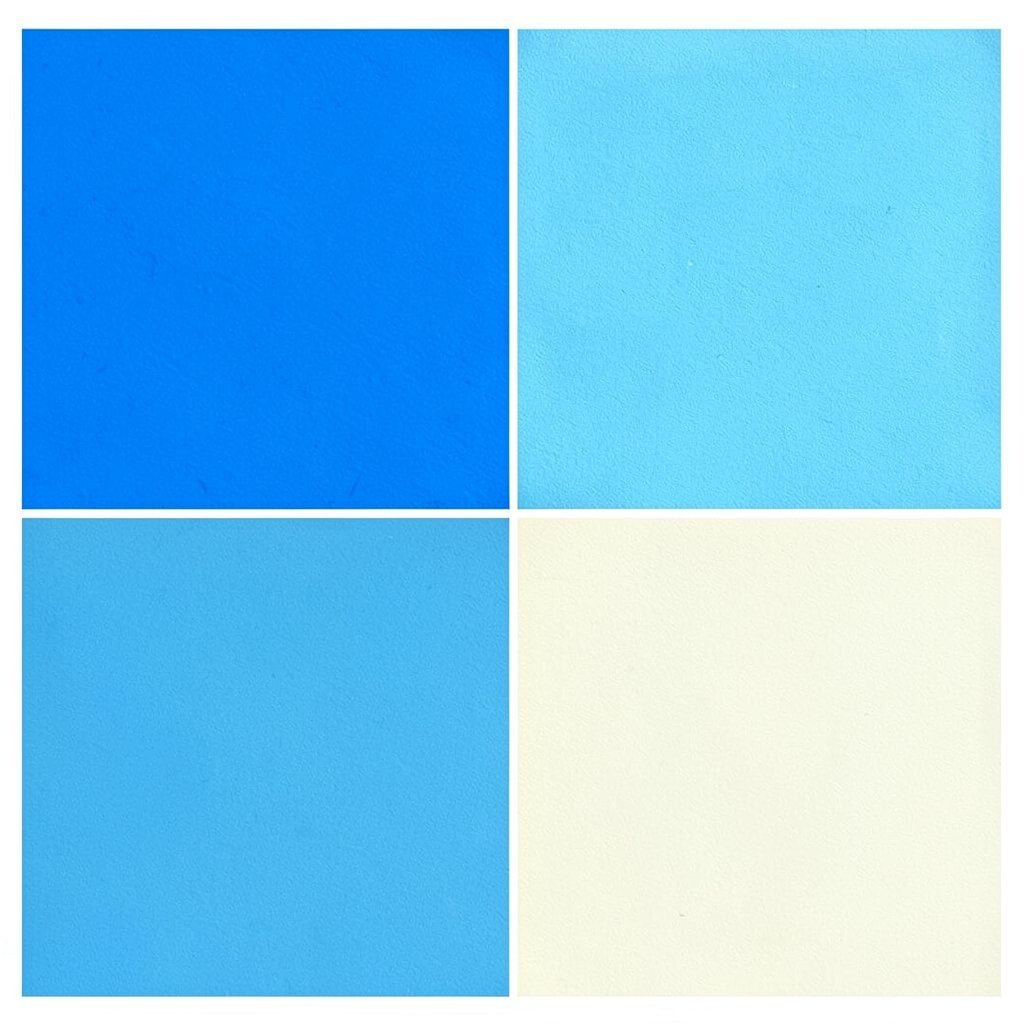
Azure Punch (Cobalt + Aqua + Soft Ivory) Cobalt and aqua create a bold water-like brightness that feels lively and clean. Soft ivory keeps the room soft, so the blues stay friendly instead of cold.
This palette can make a small room feel taller and brighter. It also gives a crisp look that feels modern and fresh.
Apply cobalt to a statement wall or large furniture piece, then layer aqua in art, pillows, or a patterned rug. Use soft ivory in trim, curtains, and textiles to keep everything light.
For personalization, look for fabrics with subtle wave patterns or geometric shapes in aqua. If you’re watching costs, focus on textiles first: a few cushions and a new runner can do a lot.
-
18. Tangerine Noir (Tangerine + Navy + Sand)
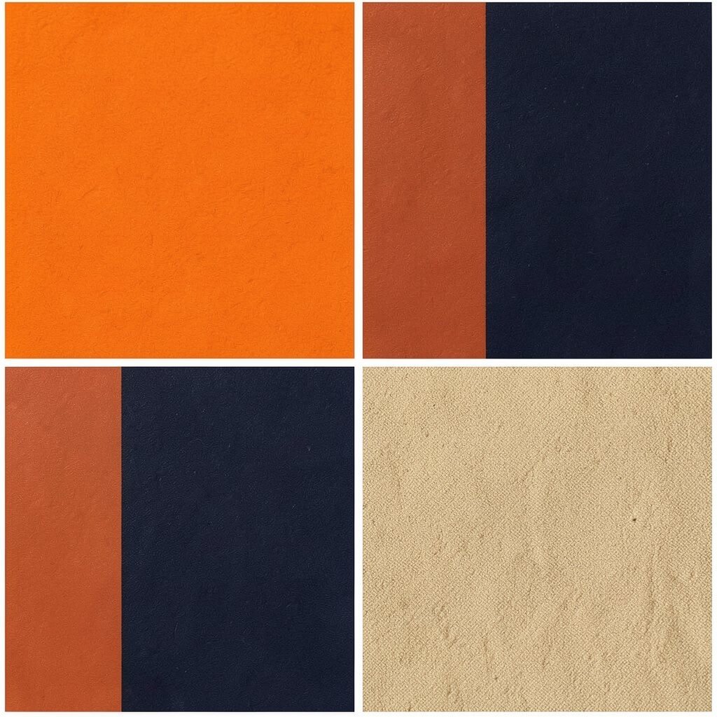
Tangerine Noir (Tangerine + Navy + Sand) Tangerine bursts with energy, and navy adds a deep “night” contrast. Sand tones soften the pairing and make the room feel calm and stylish.
This palette is great for entryways because it welcomes people with bold warmth. It also works well in home offices, where you need motivation.
Use sand as your base for walls or larger furniture, then add navy through shelving, desks, or rugs. Tangerine becomes your accent—think pillows, artwork, and a single standout lamp.
Personalize by choosing textures like woven baskets, matte ceramics, or soft boucle for the sand parts. Budget tips include using spray paint on thrifted frames and switching out handles on furniture.
Trending decor often uses “bold accent with deep neutral,” and this combo matches that exact idea. Keep your navy consistent so the tangerine stays the star.
-
19. Meadow Pop (Grass Green + Mustard + White)
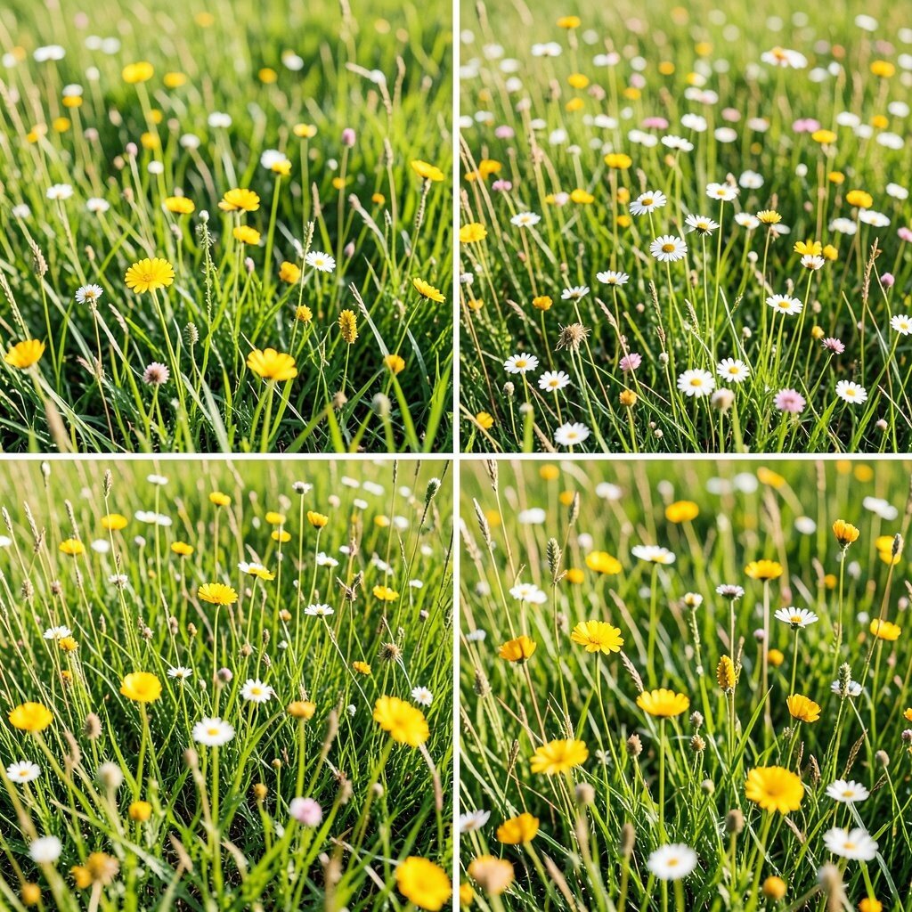
Meadow Pop (Grass Green + Mustard + White) Grass green feels fresh and lively, while mustard adds sunny warmth like late afternoon. White ties it together and keeps the room feeling bright and clean.
This palette creates a happy, everyday mood that’s easy to live with. It’s also great for kitchens, breakfast rooms, and casual dining spaces.
Start with white for the walls or big furniture pieces, then add grass green through cabinets, curtains, or a large rug. Mustard can appear in smaller details like tablecloths, cushions, or a bright set of canisters.
To personalize, choose leaf patterns, small florals, or simple stripes depending on your style. If you’re keeping costs low, add mustard through accessories first, since they’re usually easy to swap.
Current trends favor bright-but-natural palettes, and this one feels like a bright garden path indoors. Balance matters here, so don’t let mustard overtake everything.
-
20. Sunrise Pop Art (Magenta + Yellow + Black)
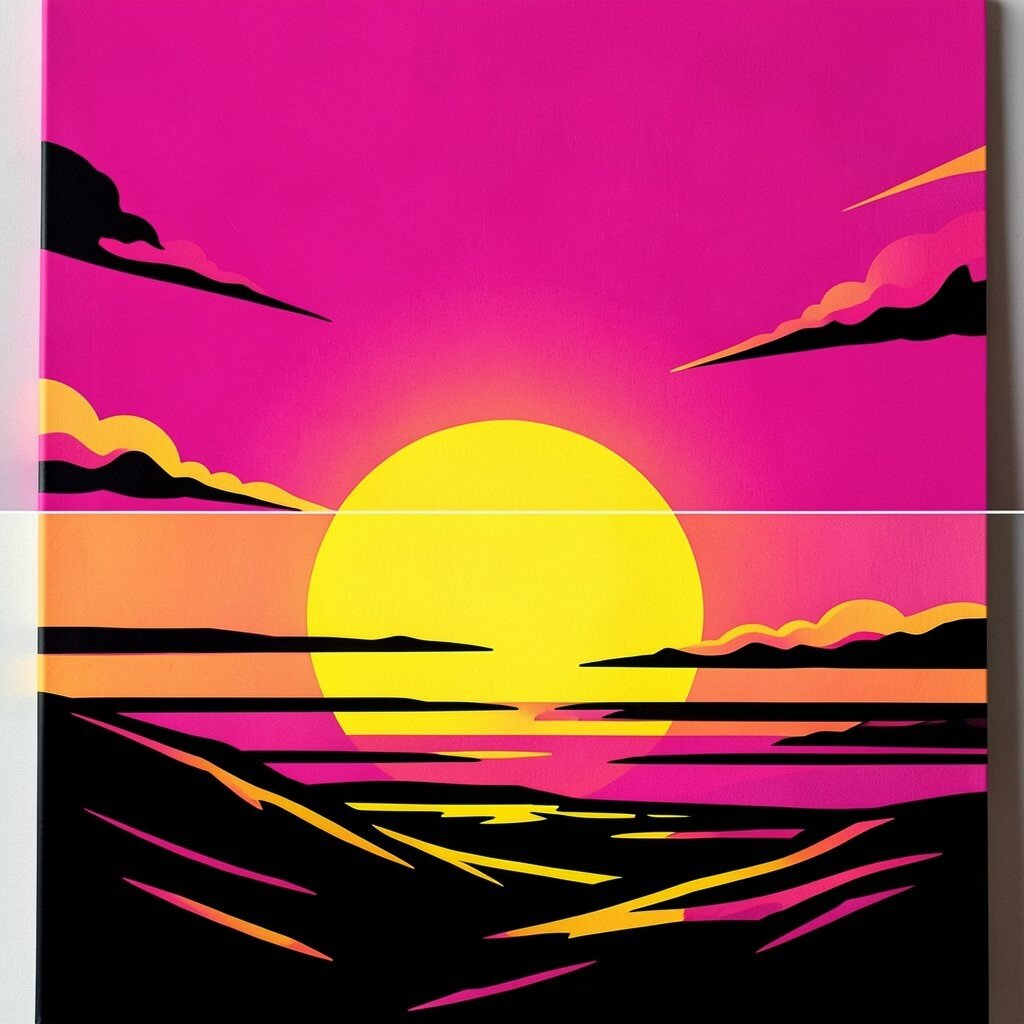
Sunrise Pop Art (Magenta + Yellow + Black) Magenta and yellow together feel like pop art posters on a gallery wall. Black lines add structure and make the colors look even brighter.
This palette is playful and confident, and it’s perfect for living rooms and creative corners. It also helps your decor feel more graphic, like everything has a bold outline.
Use black as your outline color with frames, shelf systems, and a dark rug. Then pick one or two large color blocks in magenta and yellow through wall art, cushions, or a statement wall decal.
Personalize by matching your favorite pop art shapes—circles, bursts, or stars—on prints and throw pillows. Budget-friendly ideas include vinyl wall decals, thrifted frames painted black, and poster swaps instead of new furniture.
Trending styles often celebrate maximal color with strong black accents, and this palette fits that mood. Just keep the number of “major blocks” small so the room stays readable and comfortable.
-
21. Lush Lime Sunset (Peach + Lime + Seafoam)
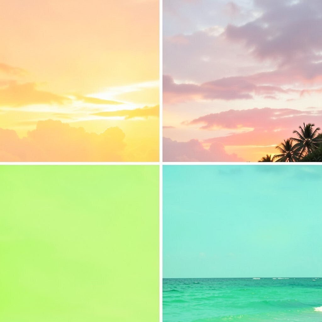
Lush Lime Sunset (Peach + Lime + Seafoam) Peach brings soft warmth, lime adds bright energy, and seafoam adds a breezy calm. The trio feels like a warm sunset with a fresh breeze, and it looks stunning in airy spaces.
This palette brightens rooms without making them feel harsh. It also works beautifully with plants because the colors feel natural together.
Use seafoam as a soothing background on walls or larger textiles, then layer peach in sofas, curtains, or bedding. Add lime through small accessories like vases, trays, and picture mats.
For personalization, combine smooth finishes with textured ones, like a glossy peach ceramic next to a seafoam woven basket. If you want to control costs, repaint only one wall and buy a few key accessories instead of making big purchases.