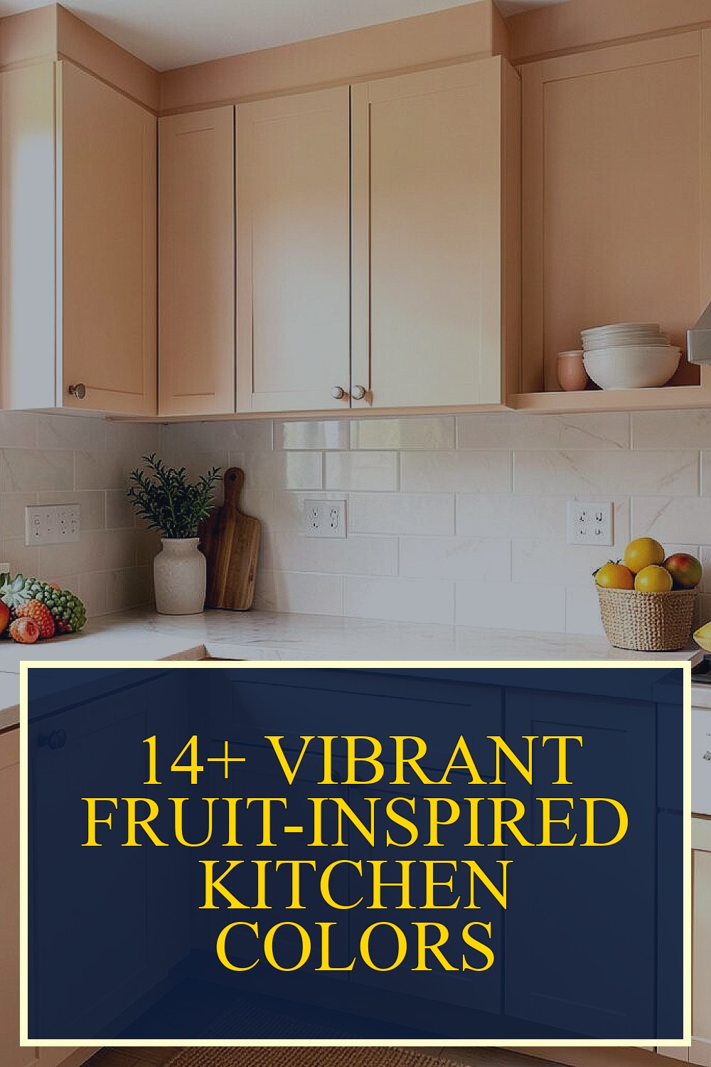
Color can make your kitchen feel like a snack stand on a sunny day.
Pick a fruit-inspired palette, and your everyday meals start looking more fun.
-
1. Citrus Zest: Lemon + Cream + Sunny Yellow

Citrus Zest: Lemon + Cream + Sunny Yellow Picture crisp lemon walls with warm cream trim around cabinets. The whole room looks brighter, like daylight is always on.
Use this scheme to make small kitchens feel bigger and more welcoming. Paint a single wall lemony, or try lemon accents on a backsplash. For an extra pop, choose hardware in brushed gold or warm brass.
To keep it cozy, add cream curtains, light wood cutting boards, and white dishware. A little goes a long way, so you can start with peel-and-stick tile or a bold runner for the floor. If you want a budget-friendly refresh, swap cabinet knobs first, then add a cheerful lemon-themed artwork.
-
2. Berry Pop: Raspberry + Soft Gray + Vanilla
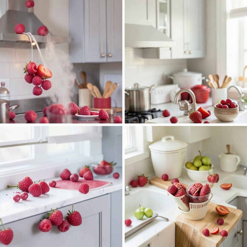
Berry Pop: Raspberry + Soft Gray + Vanilla Imagine raspberry cabinets paired with soft gray walls for a calm backdrop. Vanilla-colored countertops keep everything feeling smooth, not too loud.
This combination helps you get the fun color of berries without turning the room chaotic. It also looks great in modern kitchens and farmhouse kitchens alike. Choose a matte finish for walls so the color feels velvety and not harsh.
Try personal touches like a raspberry fruit bowl, patterned towels, or a small rug with berry tones. If you rent, consider removable wallpaper for the backsplash area. Budget-wise, gray and vanilla are easy to match, so you can afford to splurge on the raspberry pieces that matter most.
-
3. Peach Sunset: Peach + Buttery Tan + Warm White
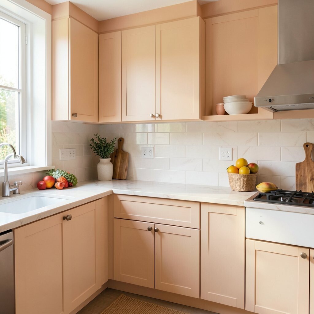
Peach Sunset: Peach + Buttery Tan + Warm White Think of peach sunsets reflected on smooth countertops. Peach-colored shelves and warm white surfaces create a gentle glow.
This palette brings comfort and friendliness, which is perfect for family kitchens. It can also make cooking feel less stressful because the colors are soft and warm. Pair peach with natural materials like rattan baskets and light oak shelves.
For a bright touch, add a peach accent backsplash with small tile shapes. Personalize it with peach-toned canisters, a matching spoon set, or even a small clock with a fruity print. If you’re careful with balance, you can keep it bright without overwhelming the space.
Costs stay manageable when you focus on accents first. Start with paint samples, then move to hardware and textiles once you love the look. This is a great choice if current trends are pushing for cozy, lived-in color.
-
4. Lime Fresh: Lime Green + White + Light Wood
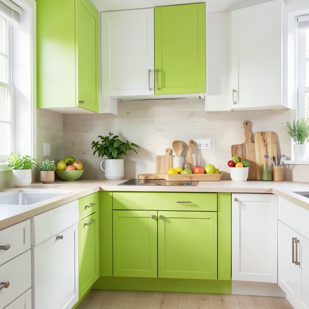
Lime Fresh: Lime Green + White + Light Wood Picture lime green highlights that look crisp like fresh fruit juice. White walls and light wood keep the shade clean and energetic.
This scheme is great for people who want a lively kitchen that still feels tidy. Lime tones also make stainless steel feel more polished. Try lime on stools, pendant light shades, or the inside of open shelving.
If you want it to feel more grown-up, choose a muted lime rather than an ultra-neon shade. Use light wood boards and a white tile backsplash for balance. For personalization, add lime-green plant pots or patterned curtains with a soft geometric print.
Tip: start with one lime element, then build outward so the room stays bright, not busy.
-
5. Cherry Red Glow: Cherry Red + Black Licorice + Cream

Cherry Red Glow: Cherry Red + Black Licorice + Cream Visualize glossy cherry red cabinets with a few black accents and creamy countertops. The contrast makes your kitchen feel dramatic, like a bold fruit poster on the wall.
This palette has a strong “statement kitchen” vibe, and it also helps zones look clear. It’s especially nice if you use black hardware, faucet parts, or light fixtures. Keep the rest of the surfaces light so the red stays exciting, not heavy.
To make it actionable, paint only the lower cabinets cherry red and keep upper cabinets cream. Add black-and-cream patterned backsplash tile for an eye-catching look. If you’re watching costs, swap lighting and hardware first, then plan a cabinet paint job later.
-
6. Watermelon Cool: Watermelon Pink + Teal + Pale Green
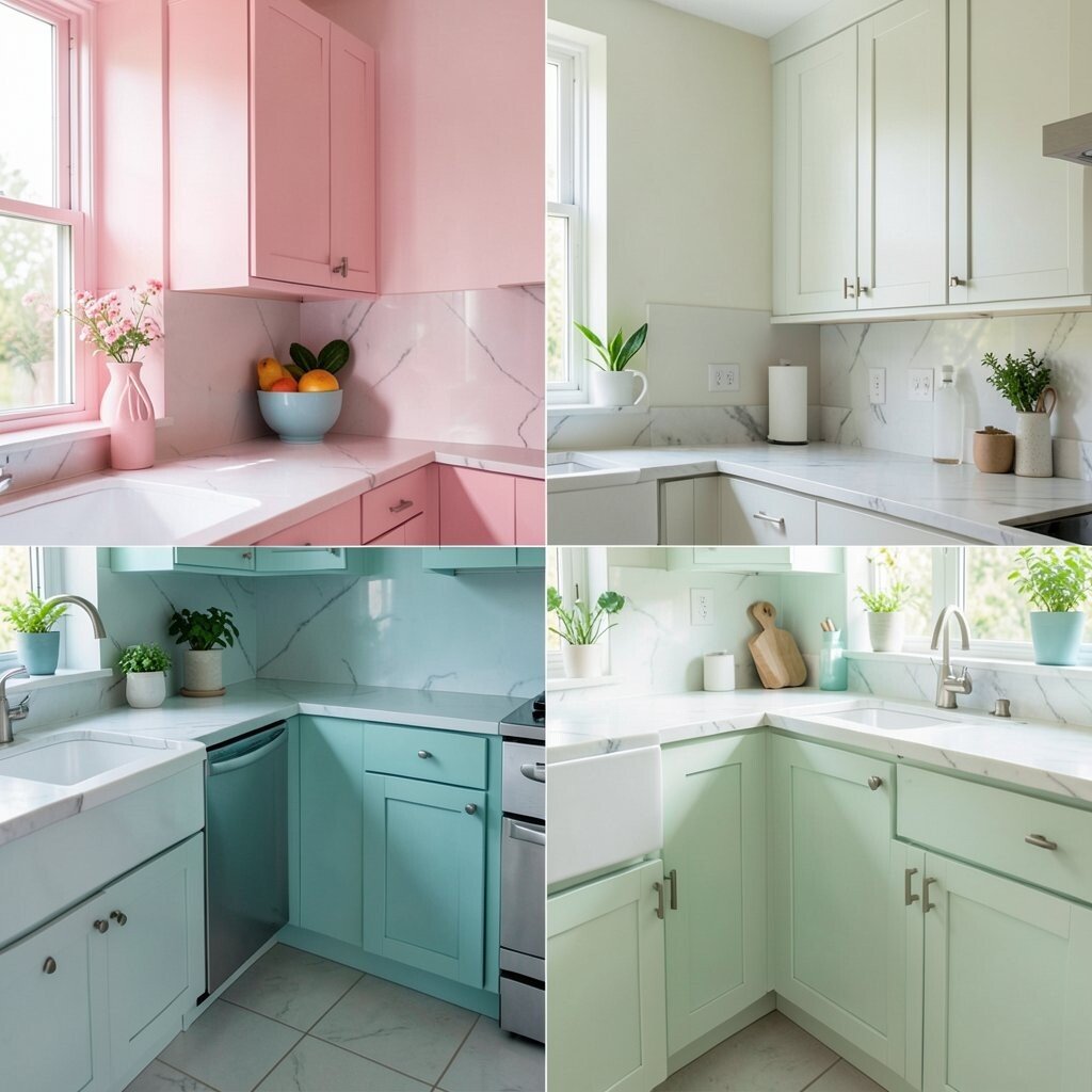
Watermelon Cool: Watermelon Pink + Teal + Pale Green Think of watermelon stripes: pink on top, teal in the middle, and pale green as the finishing glow. The room feels playful, like summer is living inside your kitchen.
This scheme can boost fun and creativity, which is great for trying new recipes. It also works well for kitchens with lots of natural light because the colors bounce around. Choose teal for accents like a backsplash border, and keep pink more limited for balance.
Try personalization by using a watermelon fruit bowl, bright cutting boards, and patterned dish towels. If you want trends, bold mixed colors and playful contrast are very popular right now. For a cost-friendly approach, use paint on one wall and add removable decals to shelves.
-
7. Grape Night: Deep Plum + Soft Taupe + Warm Gold
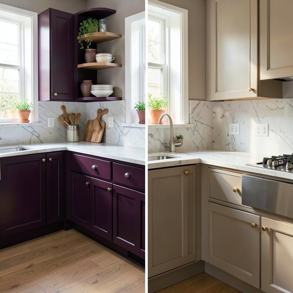
Grape Night: Deep Plum + Soft Taupe + Warm Gold Picture deep plum cabinets with taupe walls that feel calm and smooth. Warm gold details add a cozy sparkle, like kitchen lights at evening.
This palette creates a rich mood and makes cookware look more premium. It also pairs beautifully with dark wood floors and brushed metal fixtures. Use plum in areas like a pantry door, a kitchen island, or upper cabinets.
Personalize it with grape-inspired art, purple glass jars, and a warm-toned runner. If you want to control cost, pick taupe as your main neutral and spend on plum paint only where it counts. Current trends love jewel tones, and plum is a favorite for that “wow” effect.
For tips, match gold tones across faucets, cabinet pulls, and light fixtures so everything looks intentional. A matte plum finish can hide small scuffs better than glossy surfaces.
-
8. Tropical Mango: Mango Orange + Cream + Seafoam

Tropical Mango: Mango Orange + Cream + Seafoam Imagine mango orange paired with creamy whites and a soft seafoam edge. The kitchen feels bright and fresh, like a tropical drink in a real glass.
This combo gives you energy without going full neon. It’s a fun option for open-plan homes because it looks lively from every angle. Use mango on bar stools, accent walls, or cabinet fronts, then calm it down with cream and seafoam tones.
For personalization, add seafoam glass canisters, mango-colored mugs, and a patterned placemat set. Consider using a seafoam backsplash for a gentle pop behind the sink. To manage costs, start with textiles and lighting, then add paint only if you feel confident.
Tip: if you worry about orange being too bold, choose a warm terracotta mango shade instead of a bright neon.
-
9. Kiwi Zing: Kiwi Green + Oat Beige + White

Kiwi Zing: Kiwi Green + Oat Beige + White Picture kiwi slices in color form: lively green with creamy beige and clean white. The result feels fresh, light, and easy to live with.
This palette helps you create a “clean and bright” kitchen vibe. It also looks great with natural textures like linen, cork, and light bamboo. Add kiwi green through accessories like canisters, a rug, or small shelves.
To make it feel unique, use mixed patterns: subtle stripes on curtains and dotted accents in dish towels. If you want a backsplash, choose a white tile with green grout accents for a playful effect. Budget-wise, beige and white are affordable to work with, so you can spend on one bold green piece.
-
10. Fig and Honey: Fig Purple + Honey Amber + Soft White
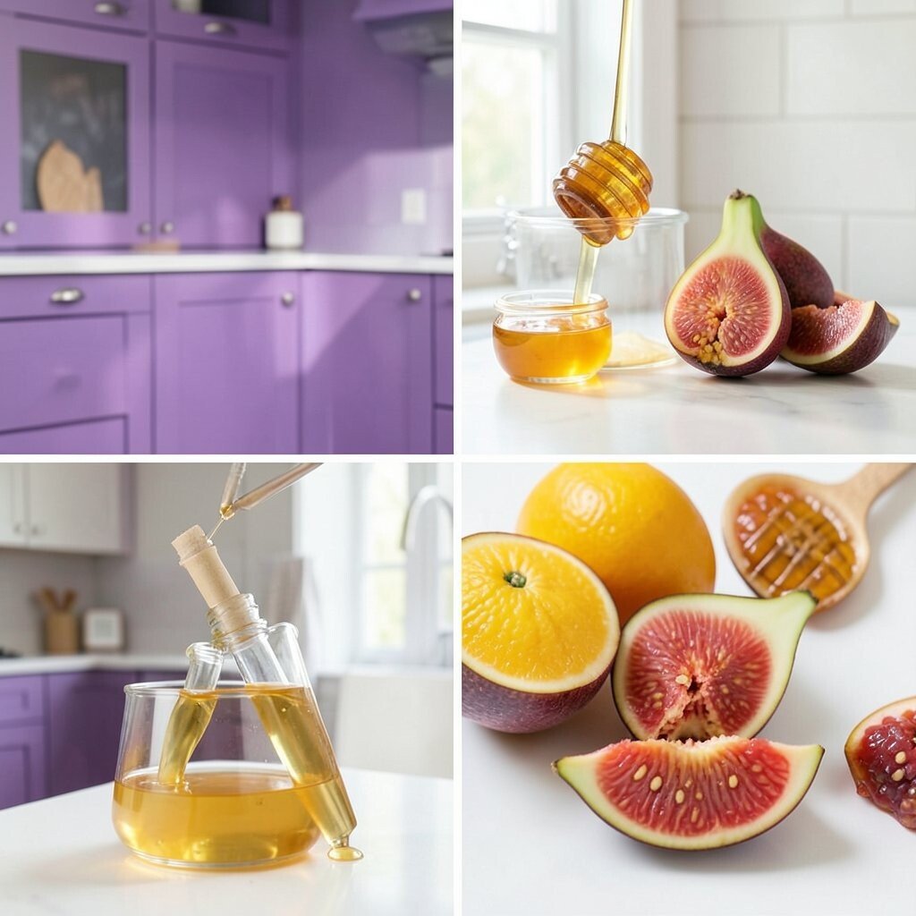
Fig and Honey: Fig Purple + Honey Amber + Soft White Imagine fig purple on cabinet doors with honey amber lighting and soft white walls. It looks warm, artistic, and slightly fancy, like fruit jam on toast.
This scheme feels cozy and soothing, not overly bright. It also makes warm metals like brass look extra nice. Use fig for an accent wall or a set of open shelves, while keeping large surfaces soft white.
Personalize with amber glass jars, fig-colored throw pillows on bar stools, and honey-toned art. For tips, pick one main accent shade and repeat it at least three times so the room feels unified. If you want cost control, choose lighting and hardware first, then paint only a small cabinet run.
-
11. Apricot Cheer: Apricot + Light Gray + Warm Sand

Apricot Cheer: Apricot + Light Gray + Warm Sand Think of apricot fruit: sweet orange with a gentle softness. Apricot walls with light gray and warm sand tones create a friendly, modern kitchen.
This color combo is great for people who want fruit energy but still like a neutral look. It can also hide wear and tear better than very bright colors. Try apricot on a kitchen island, then keep the rest calm with light gray paint.
For personalization, use warm sand baskets, apricot mugs, and a gray-patterned backsplash. If you’re keeping costs low, use peel-and-stick backsplash panels and update cabinet pulls. This palette still feels current because many kitchens are moving toward calm neutrals with one warm accent.
-
12. Blueberry Morning: Blueberry + Chalky White + Toasted Oak

Blueberry Morning: Blueberry + Chalky White + Toasted Oak Picture blueberry-colored cabinet drawers with chalky white walls and toasted oak floors. It feels crisp like morning air, but with a sweet berry twist.
This palette can make your kitchen feel fresh and organized. Blue also encourages a “clean” look, especially when paired with light countertops. Choose blueberry on upper cabinets or a pantry area so it feels like a focal point.
Personalize with blue glass bottles, white ceramic bowls, and oak cutting boards that show the grain. To keep things actionable, start with a blue rug or curtains, then test wall paint. For cost, toasted oak is easy to pair with many budget-friendly countertop options like laminate with warm veining.
-
13. Orange Blossom: Orange + Cream + Soft Terracotta

Orange Blossom: Orange + Cream + Soft Terracotta Imagine orange blossom energy—bright orange accents with creamy surfaces and soft terracotta warmth. The kitchen looks playful and inviting, like fresh fruit on a counter.
This scheme is great for boosting mood while staying warm and cozy. It also pairs well with patterned tiles and handmade-looking ceramics. Use orange as a highlight through pendant lights, a backsplash stripe, or small painted cabinets.
For personalization, add terracotta planters, orange canisters, and matching recipe cards in a frame. Keep countertops light so the color feels sunny instead of heavy. If you want to manage cost, focus on lighting, rugs, and a small area of tile first, then decide on paint later.
Tip: choose a lighter cream for the main background so the orange stays cheerful, not overpowering.
-
14. Pineapple Punch: Pineapple Yellow + White + Charcoal Specks
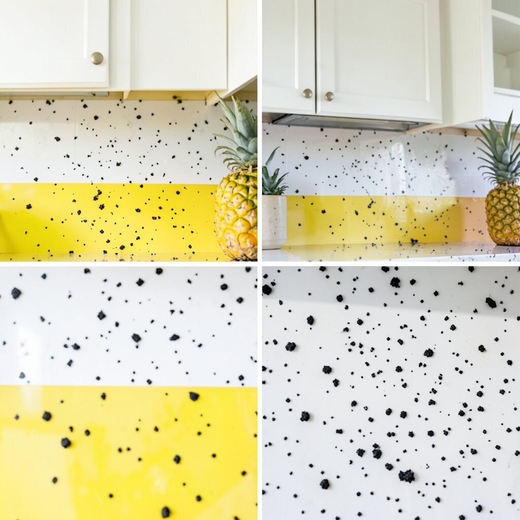
Pineapple Punch: Pineapple Yellow + White + Charcoal Specks Picture pineapple yellow that looks like sunshine, paired with clean white and tiny charcoal accents. The kitchen feels bright, modern, and full of “ready to cook” energy.
This scheme works especially well if you like a sleek look with a fun edge. Charcoal specks can hide crumbs and small marks better than pure white alone. Try pineapple yellow on a feature wall or on the face of a kitchen island.
To personalize, choose charcoal-and-white dish patterns, add a pineapple sign or art piece, and pick yellow flowers for the table. For tips, keep the backsplash simple and crisp so the yellow remains the star. Budget-wise, you can get a big effect by painting just one area and using simple white tiles elsewhere.
Current trends also favor contrast and speckled or textured visuals, so this palette can feel fresh in a modern home.
-
15. Tropical Limeade Sunset: Lime + Pink Grapefruit + Neutral Oak

Tropical Limeade Sunset: Lime + Pink Grapefruit + Neutral Oak Imagine lime-green shelves with grapefruit-pink accents, all grounded by neutral oak floors and furniture. It looks bright, modern, and full of fruit-inspired contrast.
This combination gives you a “lively but balanced” kitchen. It can also make your cooking zone feel separate from dining because the colors naturally guide your eyes. Use lime in places like shelving interiors or cabinet tops, then add grapefruit pink as a smaller pop.
Personalize with a limeade color theme in glassware, fresh fruit on the counter, and a matching curtain. If you want tips for easy styling, repeat the two accent colors across at least a few items: towels, canisters, and a runner. For costs, neutral oak is forgiving, so you can spend on paint and textiles rather than expensive replacements.