
The ocean has a secret language made of color. When you borrow its tones, your project starts to feel calm, brave, and brand-new.
Here are marine palette ideas that you can use for web design, packaging, posters, room styling, or art.
-
1) Sea-Glass Mint & Deep Navy
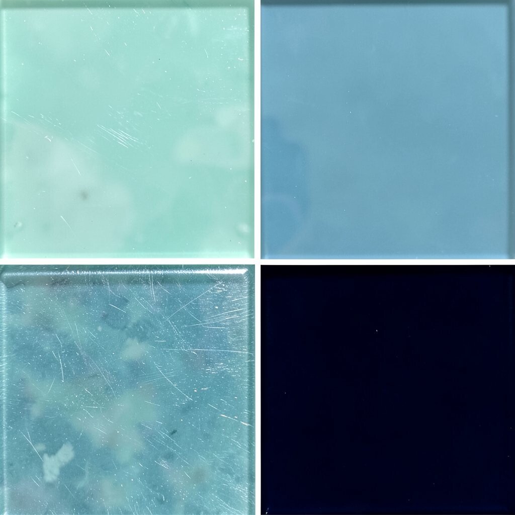
) Sea-Glass Mint & Deep Navy Think of a bottle tossed onto sand, where pale sea-glass glows beside inky waves. Use deep navy for big areas, then add sea-glass mint for highlights and buttons.
This combo feels clean and friendly, like fresh air near the shore.You’ll get a clear look with great contrast, especially for text and calls to action. It also helps your design look more “premium” without being too loud.
Tip: keep mint pieces small, so they sparkle instead of taking over.For personalization, swap mint with a slightly warmer tint, like aqua-teal, if your brand leans cozy. If you’re painting a room or building a mood board, pair navy with natural wood and light linen.
For cost, you can buy navy basics in most craft stores, then use mint as an accent from small sample bottles or fabric swatches. -
2) Tropical Turquoise & Coral Reef Pop
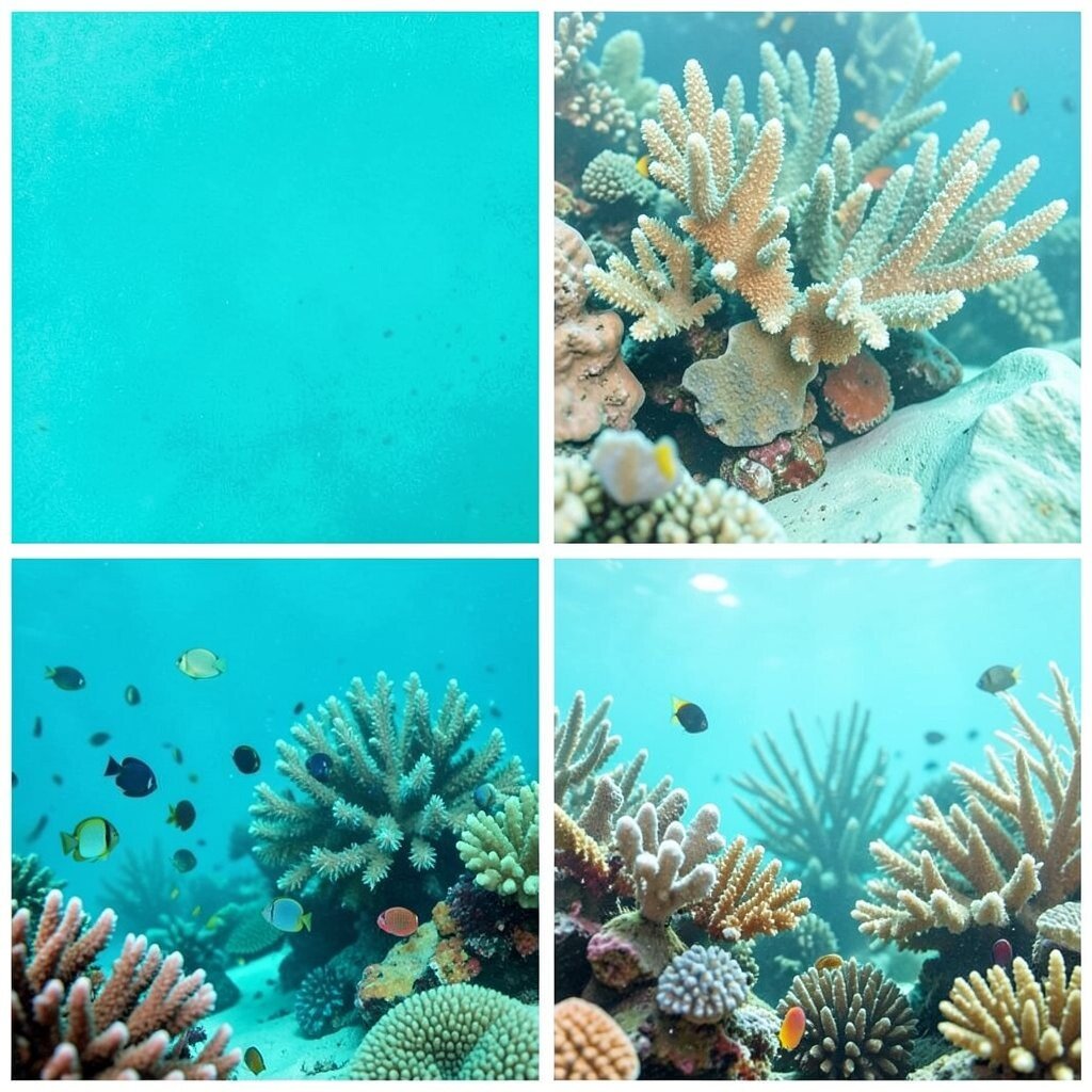
) Tropical Turquoise & Coral Reef Pop Picture bright turquoise water with a coral reef peeking through. Start with turquoise as your main color, then add coral reef tones as small bursts.
This palette feels playful and energetic, great for youth brands or fun events.The benefit is instant attention: turquoise supports readability, while coral adds “stop and smile” energy. Use coral for icons, labels, and key details so viewers notice what matters first.
Suggestion: try coral only on one or two actions per page, like “Sign up” or “Shop now.”Make it unique by choosing a coral that matches your vibe—peachy coral reads softer, while pink-corals feel bolder. For trends, look at recent brand styles that use one strong warm accent against cool ocean bases.
Cost-wise, you can often achieve this with fewer paints by using turquoise in large blocks and saving coral for decals, stickers, or small print areas. -
3) Stormy Slate, Ocean Blue, and Foam White
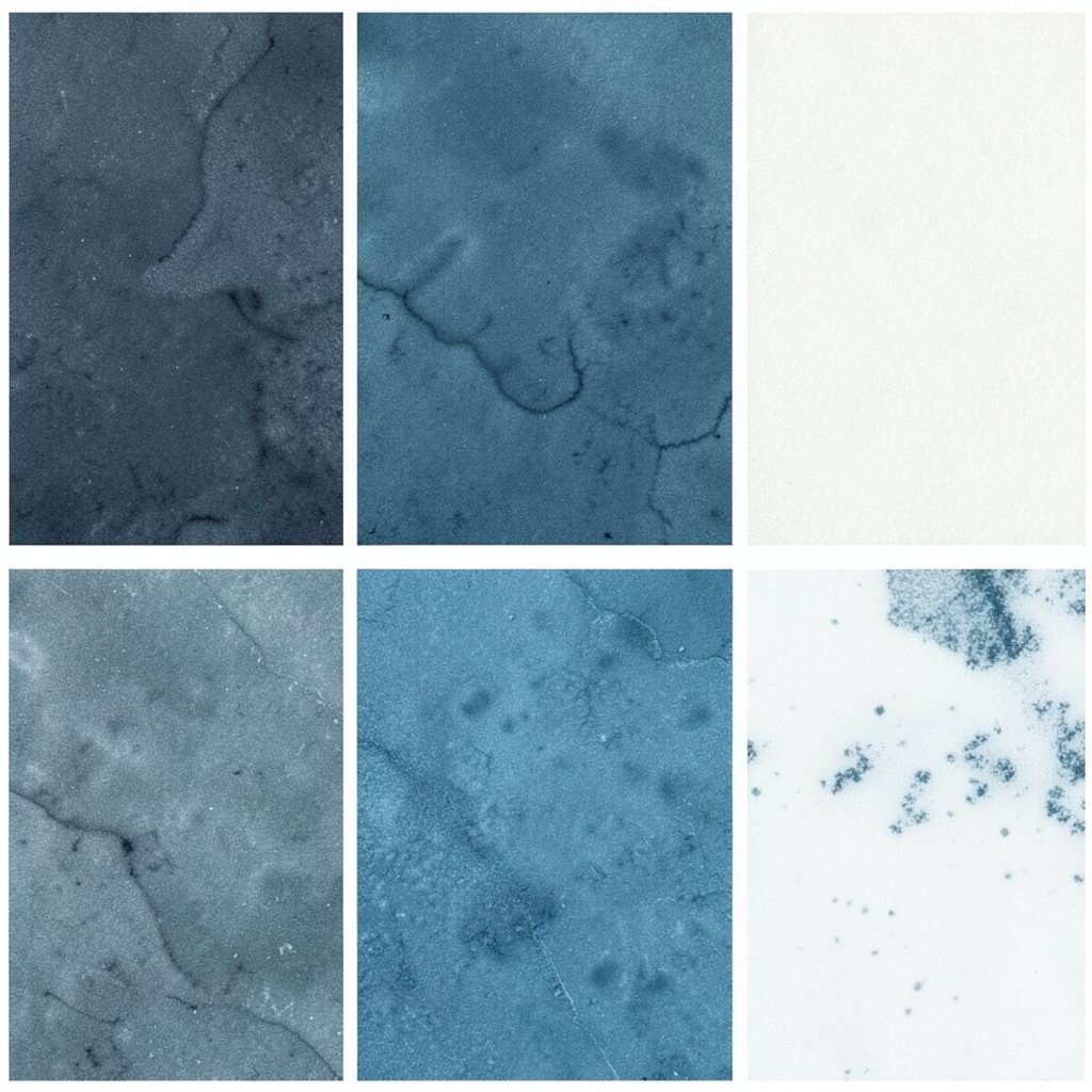
) Stormy Slate, Ocean Blue, and Foam White Imagine clouds gathering over the sea, then the foam breaks in thin bright lines. Use stormy slate for backgrounds, ocean blue for structure, and foam white for the lightest text and borders.
It gives a calm, grounded feel with a “powerful weather” mood.This palette is great for dashboards, editorial layouts, and posters that need a serious look. The contrast between slate and foam white makes headings crisp and easy to scan.
Try this: set body text in ocean blue, then reserve foam white for key highlights.To personalize, add one muted steel accent (like gunmetal) if you want a sharper, modern edge. If your project is a marine-themed brand, this palette fits well because it feels like real ocean conditions.
For cost considerations, slate and ocean blues are usually easier to match in off-the-shelf ink or paint, so you can keep custom mixing to a minimum.Current design trends often lean toward moody color stories paired with high-contrast typography. You’ll get that look while still keeping it friendly and usable.
Finish with subtle texture—like grain in print or slight grain overlays on digital images—to mimic sea foam. -
4) Kelp Green, Brackish Sand, and Wave Teal

) Kelp Green, Brackish Sand, and Wave Teal Envision kelp swaying near shore, with sand tinted by salt and light. Use kelp green as a midtone, wave teal for visual paths, and brackish sand for warm grounding.
Together, they feel natural, balanced, and never too cold.The benefit is harmony: green and teal work like a single family, while sand keeps the palette from feeling heavy. It’s a solid choice for wellness brands, eco projects, or anything that wants a “grounded” mood.
Tip: make sand your page background and let kelp and teal highlight sections. -
5) Cobalt Waterway & Soft Seafoam
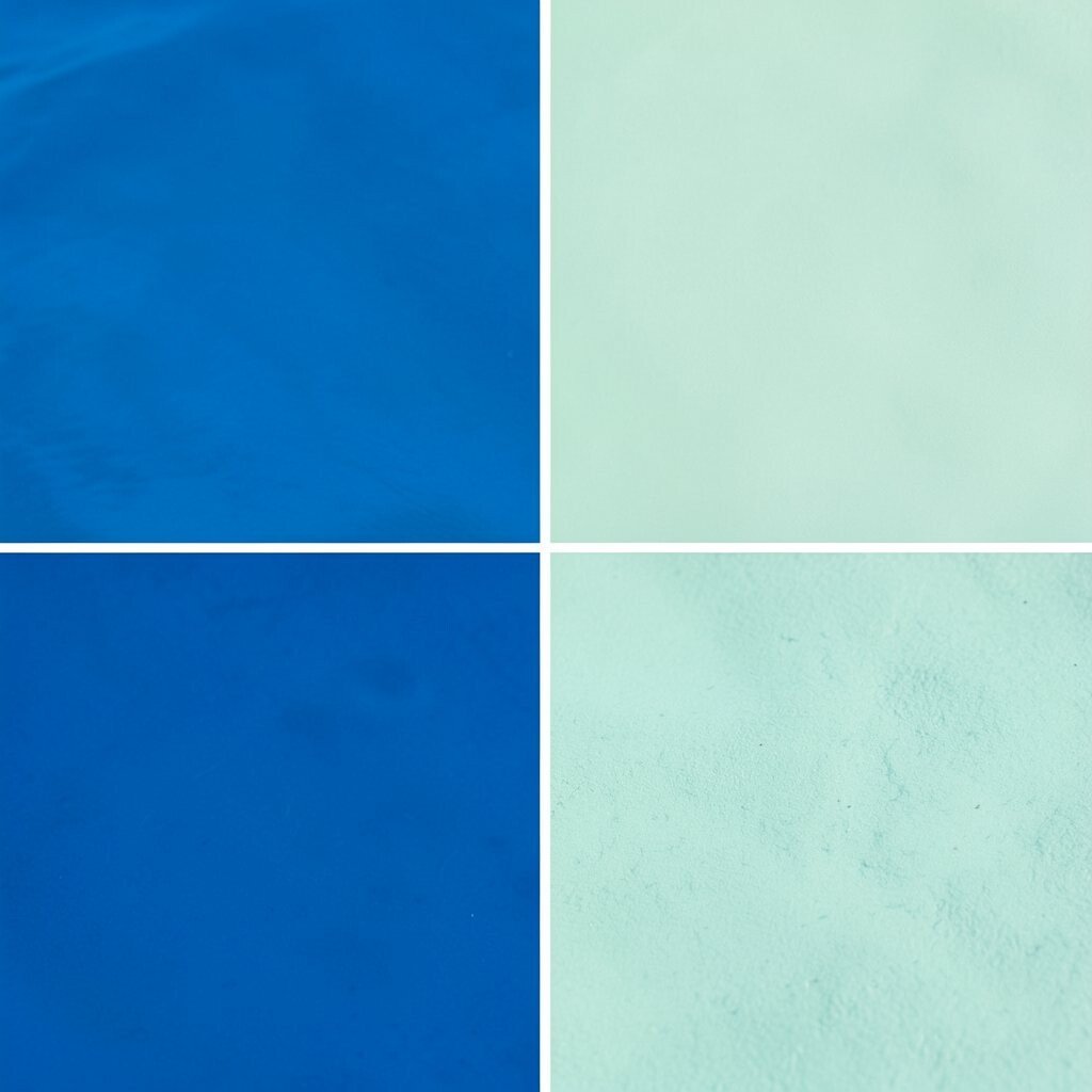
) Cobalt Waterway & Soft Seafoam Think of a canal at noon—deep cobalt that looks almost like glass. Pair it with soft seafoam so the whole palette feels breathable and not harsh.
This combo is bold but still gentle because seafoam lightens everything.You’ll get strong brand recognition since cobalt carries confidence. Use seafoam for cards, strips, and secondary sections so the layout stays calm.
Suggestion: try cobalt icons over seafoam blocks for a clear “tap here” look.To personalize, adjust seafoam toward a cooler light aqua or a slightly warmer cream, depending on your materials. This palette is unique because it feels like daytime water with a clean, airy finish.
Cost is usually manageable: you can pick one strong cobalt product and then use a lighter foam tone as the main support color. -
6) Algae Olive, Ocean Navy, and Sunlit Linen
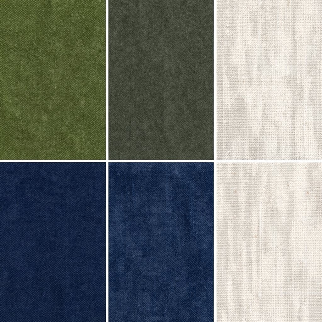
) Algae Olive, Ocean Navy, and Sunlit Linen Picture a beach stroll where green algae meets old navy rope and sunlit linen sails. Start with algae olive as your secondary color, then anchor with ocean navy for depth.
Add sunlit linen to bring warmth so your palette feels inviting.This gives you a “story palette” that feels like a journey instead of a basic set of colors. The benefit is that it works in both modern and vintage styles because linen softens the navy.
Tip: use linen for backgrounds and navy for headings, then sprinkle olive for details.Make it personal by matching olive to the mood you want: more gray-green feels calm, while more yellow-green feels lively. For trends, many designers are mixing calm earth tones with ocean shades for a natural, less artificial look.
Cost-wise, linen tones are easy to source in paper, fabric, and paints, so you can keep spending under control while still getting a rich feel.If you’re building packaging, olive can be your label color, while navy can frame the design. Finish with a subtle matte finish to mimic sailcloth and beach fabric.
That texture will make even simple graphics look special. -
7) Dark Teal Depth, Pale Harbor Blue, and Shell Pink
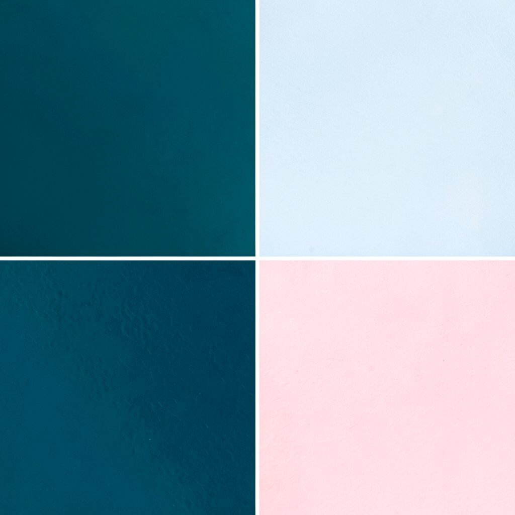
) Dark Teal Depth, Pale Harbor Blue, and Shell Pink Think deep teal water at dusk, then a pale harbor glow near the docks. Shell pink shows up like a soft memory from seashells and beach flowers.
The result is dreamy, modern, and easy to style.This palette helps you create a gentle hierarchy: dark teal gives structure, pale harbor blue keeps sections light, and shell pink acts like friendly emphasis.
Suggestion: use shell pink for small highlights like badges, quotes, and “limited time” tags.Personalize by choosing shell pink from a dusty rose to a more peachy shell shade. This makes the palette feel more like your story and less like a generic template.
Current trends favor “soft contrast” palettes like this, where one color provides comfort and one color provides direction.On cost, pale blues and shell pink often come in many ready-made shades for paint, printing, and fabric. That means fewer custom mixes and fewer headaches.
If you’re designing digitally, use shell pink sparingly to keep text legible and the design looking clean. -
8) Royal Sea & Bright White Compass
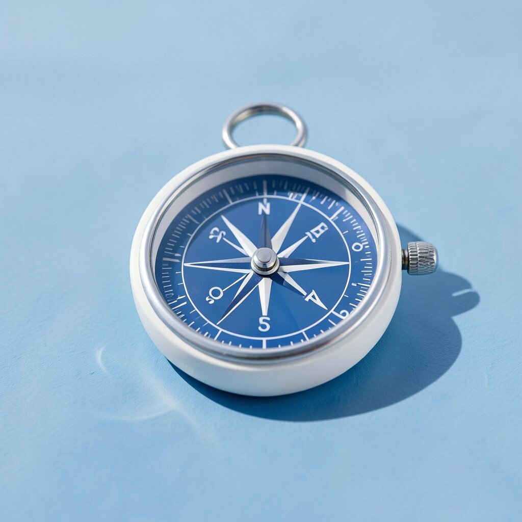
) Royal Sea & Bright White Compass Imagine a classic ship sign with royal sea blue and crisp white text. This palette is sharp, direct, and great for clear branding.
It feels like a compass that always points the viewer to the right place.The benefit is readability and bold structure, especially for signage, menus, and landing pages. Use royal sea as the main brand color, then rely on bright white for text and icons.
Tip: add one darker navy shade as a shadow or border to create depth. -
9) Tidepool Purple-Blue, Wet Sand, and Oyster Cream
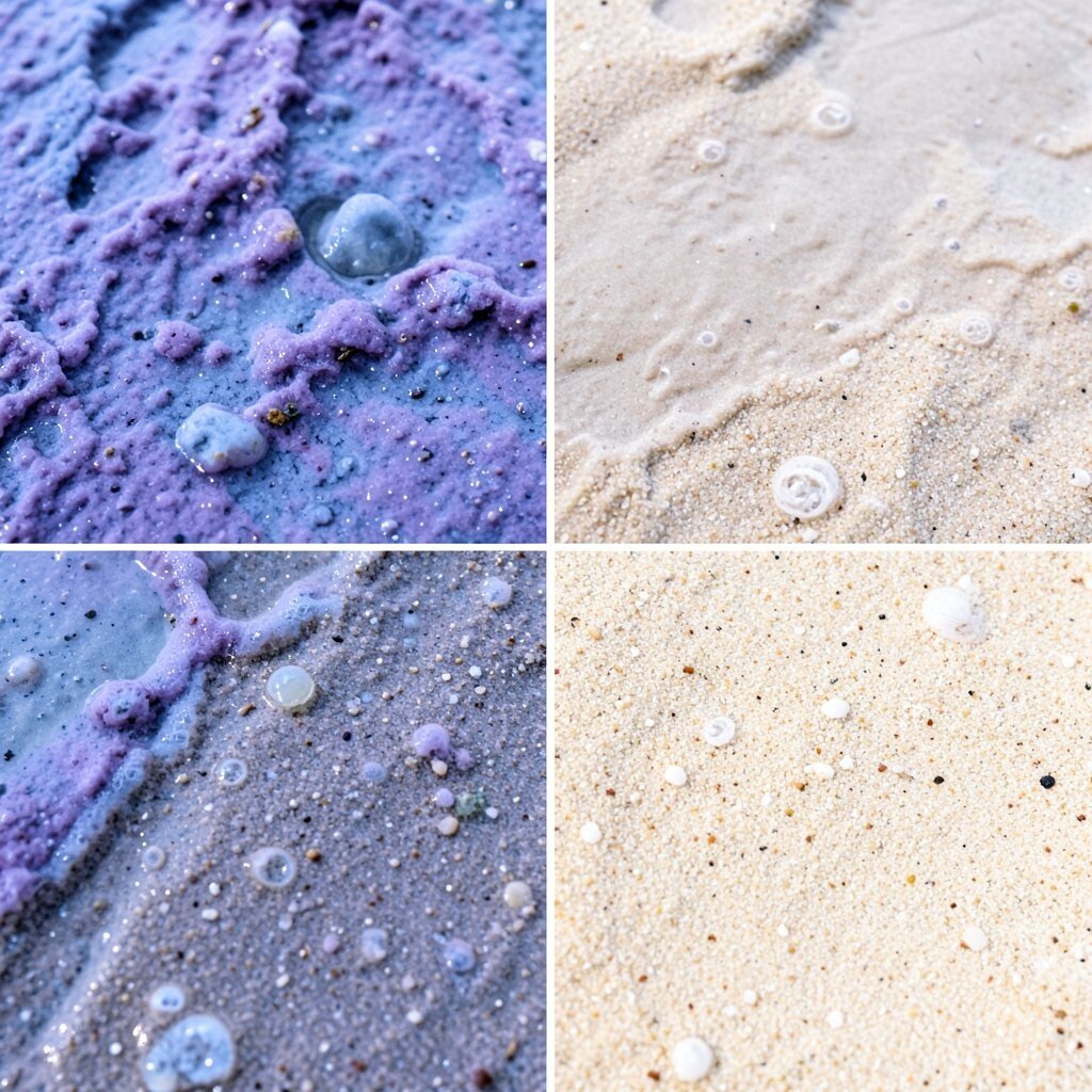
) Tidepool Purple-Blue, Wet Sand, and Oyster Cream Picture tidepools where colors look purple-blue because of reflections and tiny life forms. Pair that with wet sand and oyster cream, which feels smooth and calm.
This palette is unique because it blends cool and warm in a soft, natural way.You’ll benefit from flexibility: purple-blue adds a creative twist, while cream helps keep the tone friendly. This works well for art prints, boutique brands, and product packaging that wants a “handpicked” feel.
Suggestion: use tidepool purple-blue for headers and oyster cream for cards and panels.Personalize by shifting the purple-blue toward indigo for a deeper mood or toward periwinkle for a lighter mood. For trends, purple accents are showing up more often in modern color stories, especially when paired with gentle neutrals.
Cost considerations are good here because cream and sand tones are easy to find in many materials, and the purple-blue can be used mainly for accents.If you need a design rule, think “one bold color, two soft neutrals.” That keeps things balanced even when your purple-blue is playful.
Add tiny graphic patterns like wave lines to make it feel truly marine. -
10) Morning Surf Blue, Sea Salt Gray, and Coral Knockout
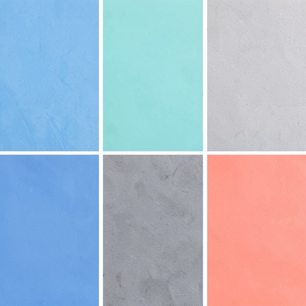
) Morning Surf Blue, Sea Salt Gray, and Coral Knockout Morning surf looks like bright blue with a gentle haze, and sea salt gray keeps it calm. Add coral knockout as the surprise pop that feels like a buoy in sunlight.
Together, they create a fresh, modern look with a friendly punch.The benefit is momentum: blue supports clarity, gray reduces glare, and coral draws attention fast. Use coral for important highlights like pricing, warnings, and major product names.
Tip: keep gray text on light backgrounds for easy reading.For personalization, pick a coral tone that matches your brand personality—bright coral feels sporty, while softer coral feels more elegant. Current trends often show bold accent colors on top of calm bases, and this palette fits right in.
Cost-wise, gray tones are common in print and paint, so you can keep your custom mixing small. -
11) Deep Ocean Black, Misty Blue, and Coastal Sand
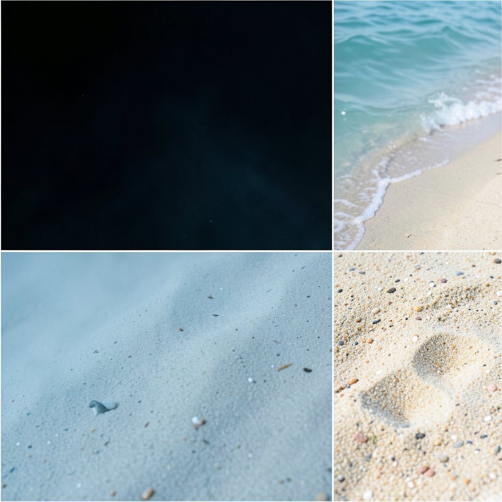
) Deep Ocean Black, Misty Blue, and Coastal Sand Imagine the ocean when night falls, with misty light hovering near the surface. Deep ocean black creates drama, misty blue brings softness, and coastal sand warms the scene.
This palette is bold, stylish, and great for high-end or moody designs.You’ll benefit from a strong visual hierarchy: black anchors the design, misty blue gives gentle contrast, and sand prevents the palette from feeling too dark.
Suggestion: use misty blue for links, underlines, or secondary buttons, and keep black for main headings or nav bars.To personalize, adjust the sand from pale beige to a slightly darker taupe so it matches your images or paper stock. This palette is unique because it mixes night depth with daylight warmth.
For cost considerations, black and sand are typically inexpensive and widely available, while misty blue can be handled through one custom accent or a small set of consistent materials.If you’re printing posters, choose a matte finish to reduce glare and make misty colors look smoother. For digital use, consider pairing with clean fonts and lots of spacing so the palette feels breathable.
That “space” is what makes deep palettes feel premium. -
12) Seaweed Teal, Blue-Rim Ceramic, and White Foam Edge
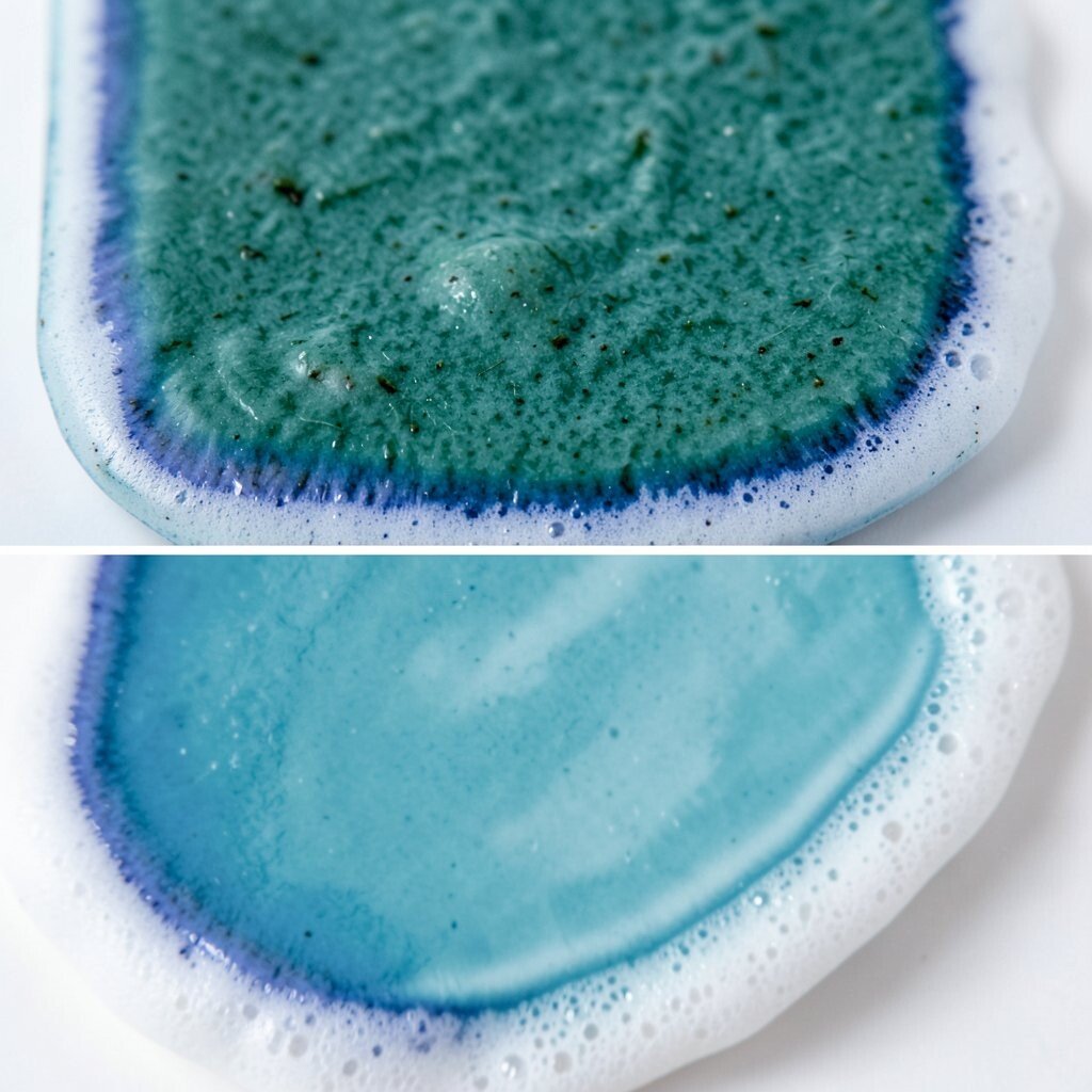
) Seaweed Teal, Blue-Rim Ceramic, and White Foam Edge Picture ceramic bowls from the coast: teal glaze, blue-rim lines, and a crisp white edge. Start with seaweed teal as the main mood, then use the blue-rim as a supporting accent.
Finish with white foam edge for the sharpest details.This palette is great for crafts, product branding, and recipes because it feels tactile and charming. The benefit is that it naturally supports icons, borders, and labeled sections.
Tip: use the foam edge to outline cards or highlight text, not to fill large backgrounds.Personalize by deciding how “ceramic” you want it: more muted blues feel calm, while brighter rim tones feel playful and cheerful. For trends, handmade and earthy visuals are popular again, and ceramic-inspired color palettes match that vibe.
Cost-wise, you can build this palette with simple materials: one teal base, one rim-blue accent, and a foam-white that works across most papers and paints. -
13) Sunrise Over the Reef: Lagoon Blue, Peach Dawn, and Sandstone
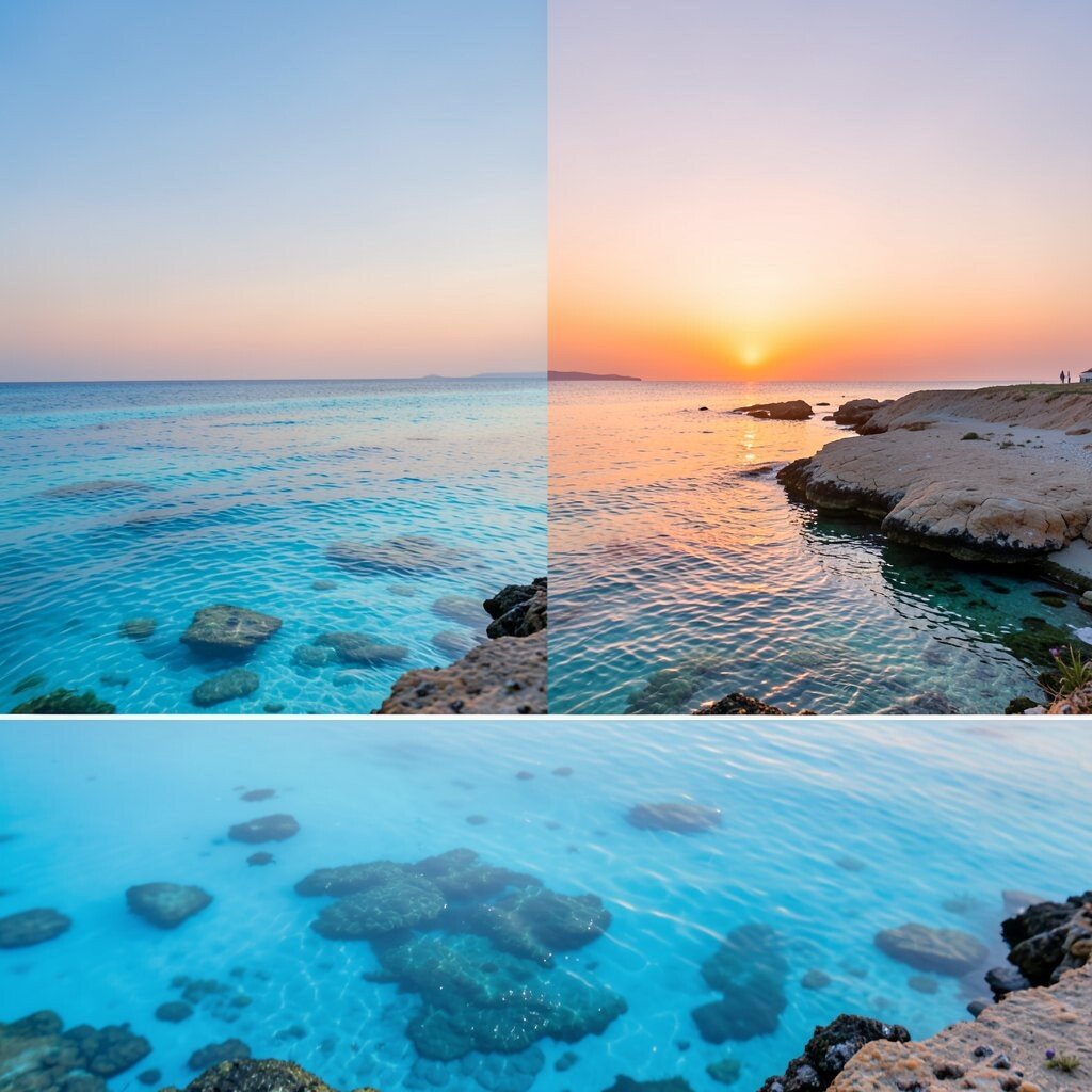
) Sunrise Over the Reef: Lagoon Blue, Peach Dawn, and Sandstone Imagine sunrise reflecting on the reef: lagoon blue spreads across the scene while peach dawn glows like warm light. Sandstone helps everything feel steady, like the shoreline holding the moment in place.
This palette feels hopeful, modern, and full of life.The benefit is emotional balance: blue cools the mood, peach adds friendliness, and sandstone keeps the palette natural. Use peach dawn for section titles, icons, or promotional badges so your layout feels upbeat.
Suggestion: pair sandstone with blue for large areas, then let peach sparkle on top.Personalize by picking a peach that fits your brand: apricot-peach feels soft and gentle, while brighter coral-peach feels adventurous. This palette also works with current “sun-warm accent” trends where designers add warmth to cool ocean themes.
Cost considerations are helpful here too—sandstone neutrals are usually easy to find, and peach can be limited to small print areas or digital highlights.